The Ceiling as a Signature Move
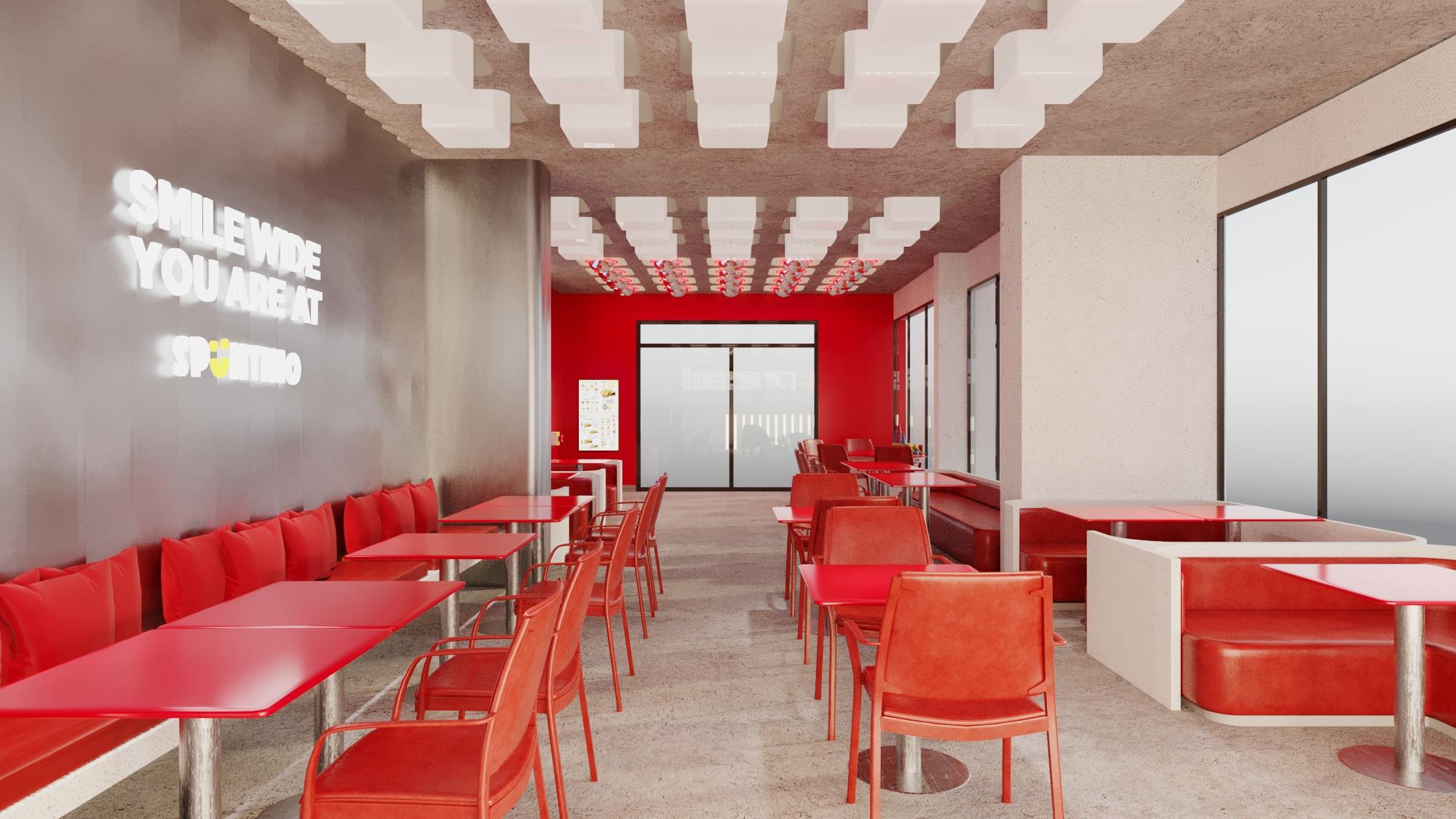
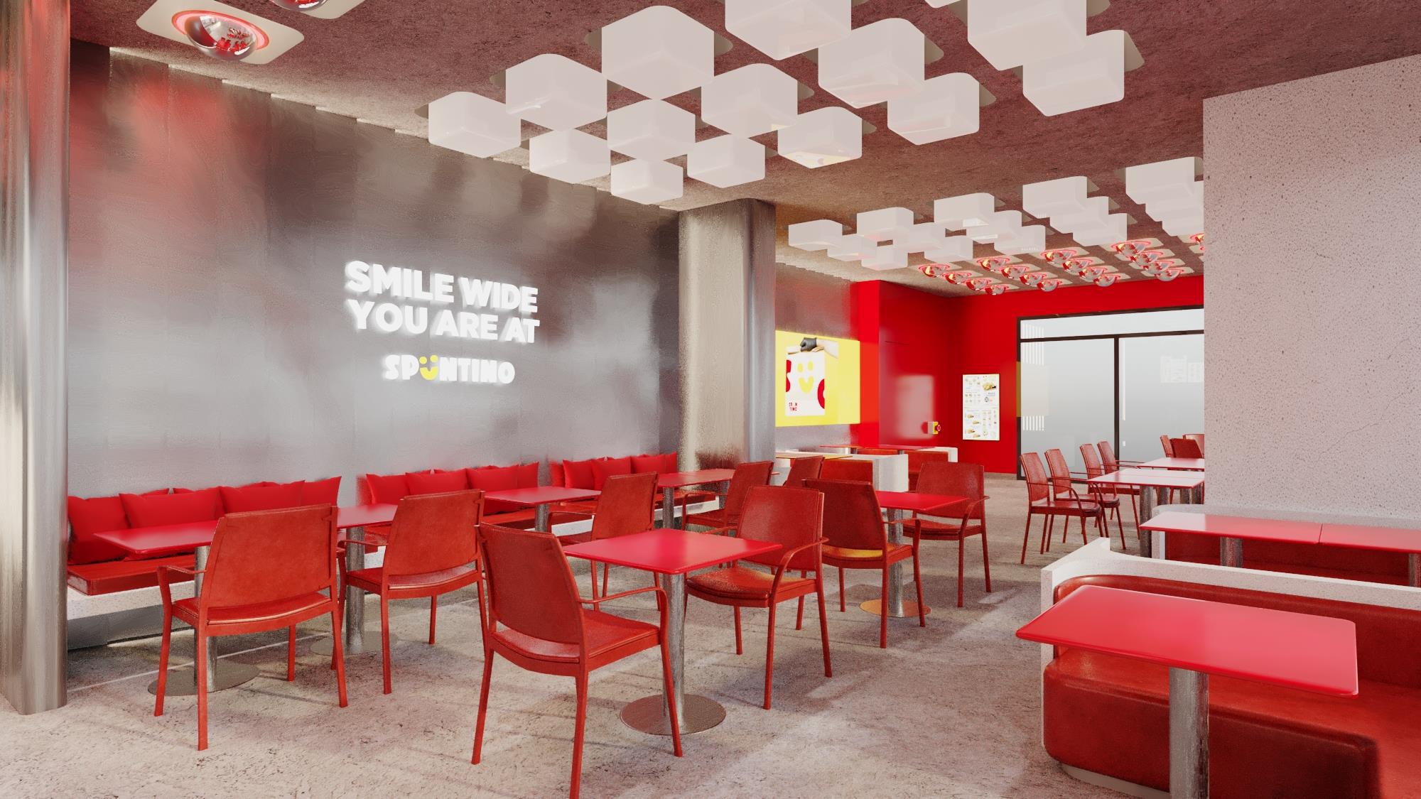
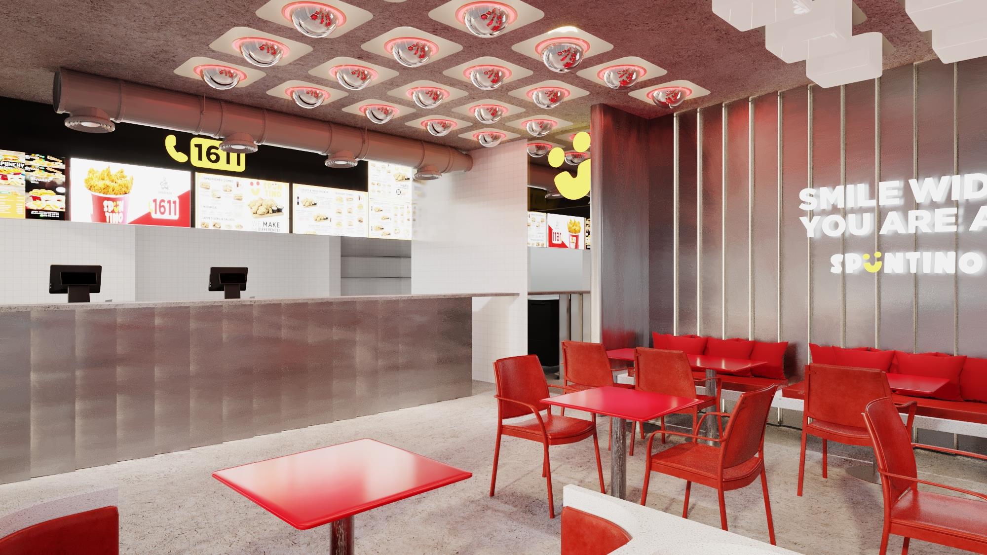
Look up in any Spuntino, and the design language announces itself immediately. Sculptural white geometric panels ripple across the ceiling like folded origami. Interspersed with them are rows of dome-shaped convex mirrors, each haloed in red light, turning a purely functional ceiling into a piece of kinetic art.
Those mirrored domes do double duty. They add a playful, almost retro-futuristic texture overhead, and they subtly reflect the activity of the room back down onto itself, making even a half-full space feel alive. It’s a ceiling you’ll catch yourself looking up at more than once.
“Smile Wide, You Are At Spuntino”
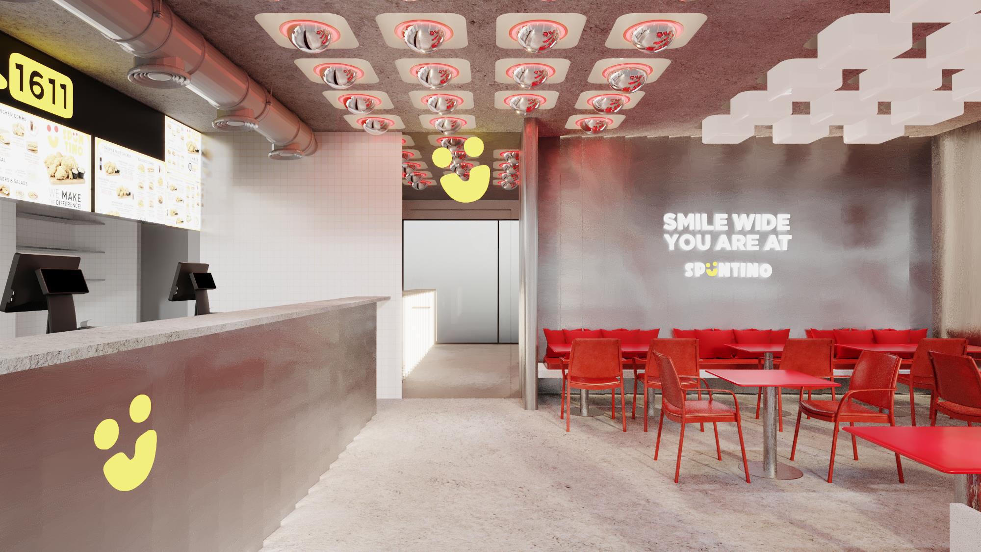
Great hospitality brands don’t just serve food, they deliver a feeling, and Spuntino says it outright. Illuminated on the signature dark steel feature wall, the phrase “Smile Wide, You Are At Spüntino” greets guests in bold white type, anchored by the brand’s cheerful yellow smiley mark beneath it. It’s a simple line, but it does a lot of work: it sets tone, builds warmth, and gives the space a voice before a single word is exchanged with staff.
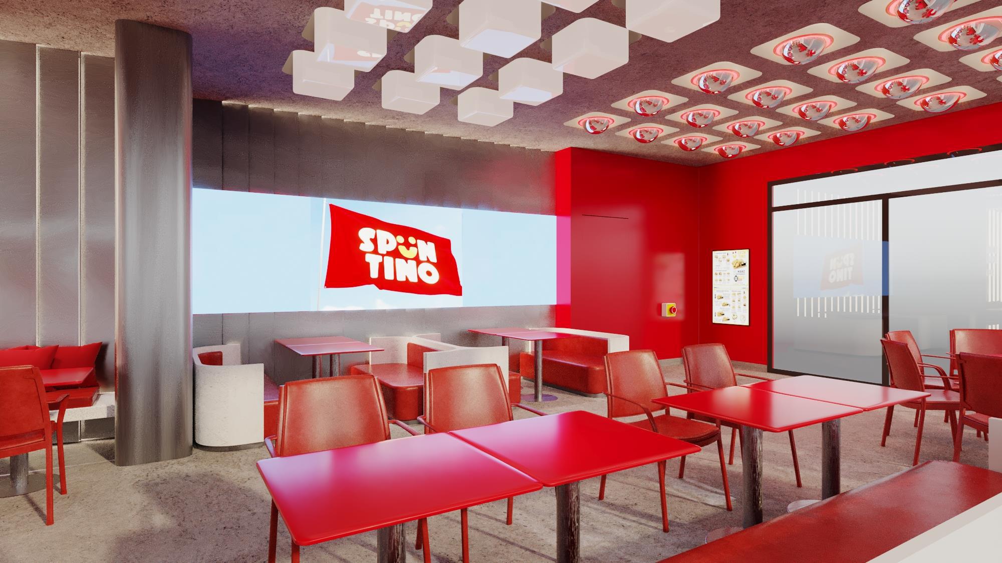
That smiley brand identity shows up again and again, stamped subtly onto counters, painted large on side walls, and woven into the flag-style “Spüntino” logo that hangs like a banner across illuminated backlit panels near the seating zones. The repetition isn’t accidental. In fast, high-turnover environments, brand recognition has to happen in seconds, and Spuntino’s visual system is built for exactly that kind of instant read.
Zoning for Every Kind of Guest
Behind the color and the character, the layout does real functional work. Booth seating lines the perimeter walls for guests who want a bit of enclosure, while looser café-style tables and chairs fill the central floor for faster turnover. A dedicated family zone, complete with a rounded kids’ table and toy bin, signals that Spuntino isn’t only chasing the quick solo diner, it’s built to hold a family group comfortably too.
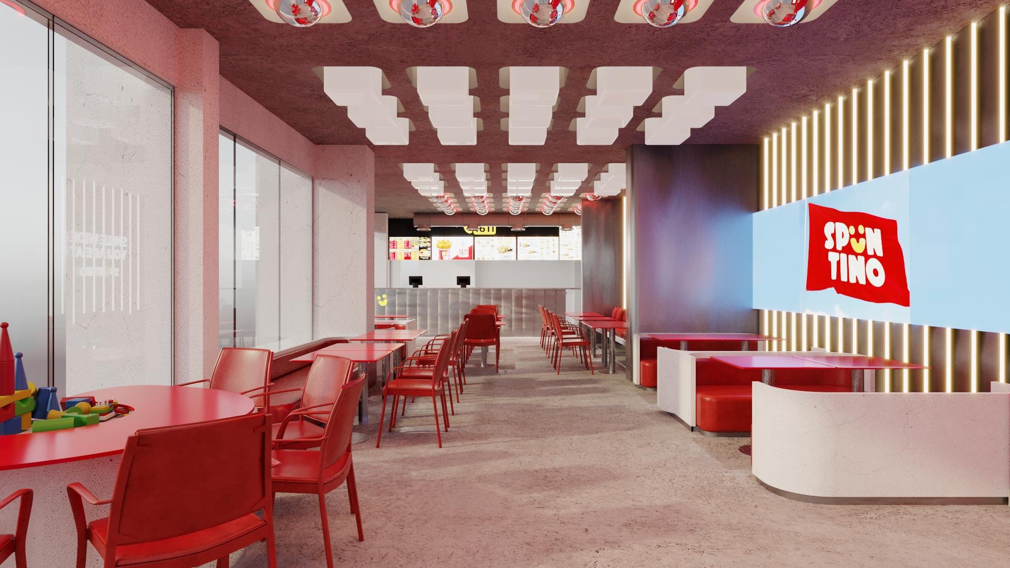
The counter zone keeps things efficient with self-service ordering kiosks, backlit menu boards, and a clear call-to-order number displayed prominently overhead, all finished in the same steel-and-concrete material palette that runs through the dining room. Frosted glass partitions and full-height storefront glazing bring in daylight and keep sightlines open from the street, so the energy of the space is visible before anyone even walks through the door.
Designing for Brand Memory
What makes this project work isn’t any single element, it’s how the pieces reinforce each other. The red seating, the mirrored ceiling domes, the smiley mark, the “Smile Wide” message: none of these ideas are subtle on their own, and that’s the point. In a category where guests make split-second decisions about where to eat, a space has to communicate personality instantly and consistently, every time, at every location.
Spuntino’s interior does exactly that. It’s playful without being childish, bold without losing warmth, and systemized enough to scale across multiple sites while still feeling distinctly like itself.