
There’s a moment every parent knows. The birthday is over, the cake is gone, and you ask: “So, was it nice?” The child shrugs. It was fine. A whole afternoon dissolves, because the place gave them nothing to hold on to.
We’ve been designing spaces long enough to know why. Most playgrounds are not designed to be remembered. They’re designed to be passed; soft floors, safe rails, primary colors applied like a uniform. They entertain a child for an hour and then release them, unmarked.
For this project, the brief was one sentence: not typical. Not “bigger”, not “more colorful”, not “more games”. Not typical. Meaning the kids who walk out should walk out different, carrying the place with them. That sentence became our only client, and everything after it was a negotiation with memory itself.
Memory doesn’t happen in beige
Children don’t remember places the way adults do. They don’t remember square meters or finishes or lighting schemes. They remember one overwhelming thing — a color, a shape, a moment of scale that made them feel small in a good way. So we stopped trying to give them everything and gave them two things instead, each at full volume.
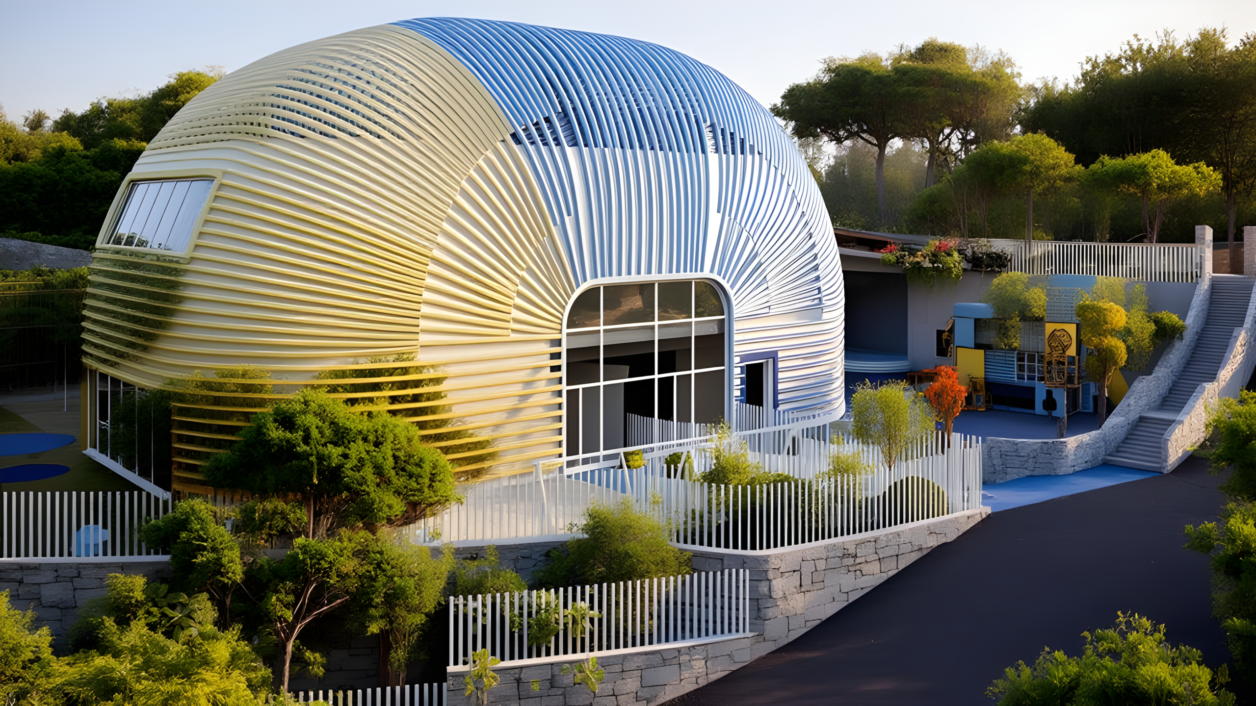
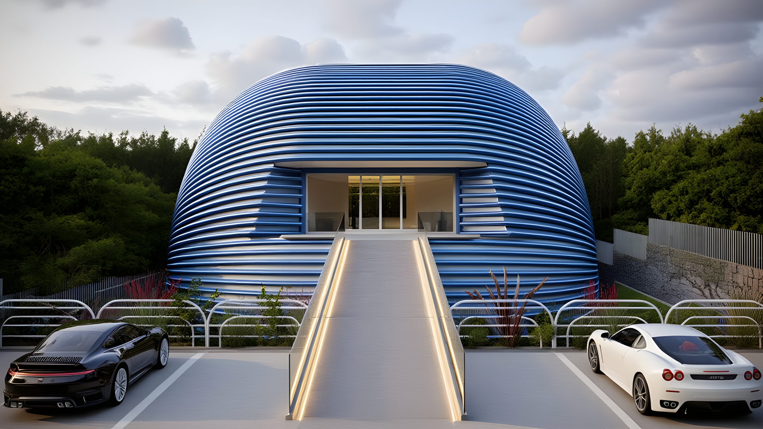
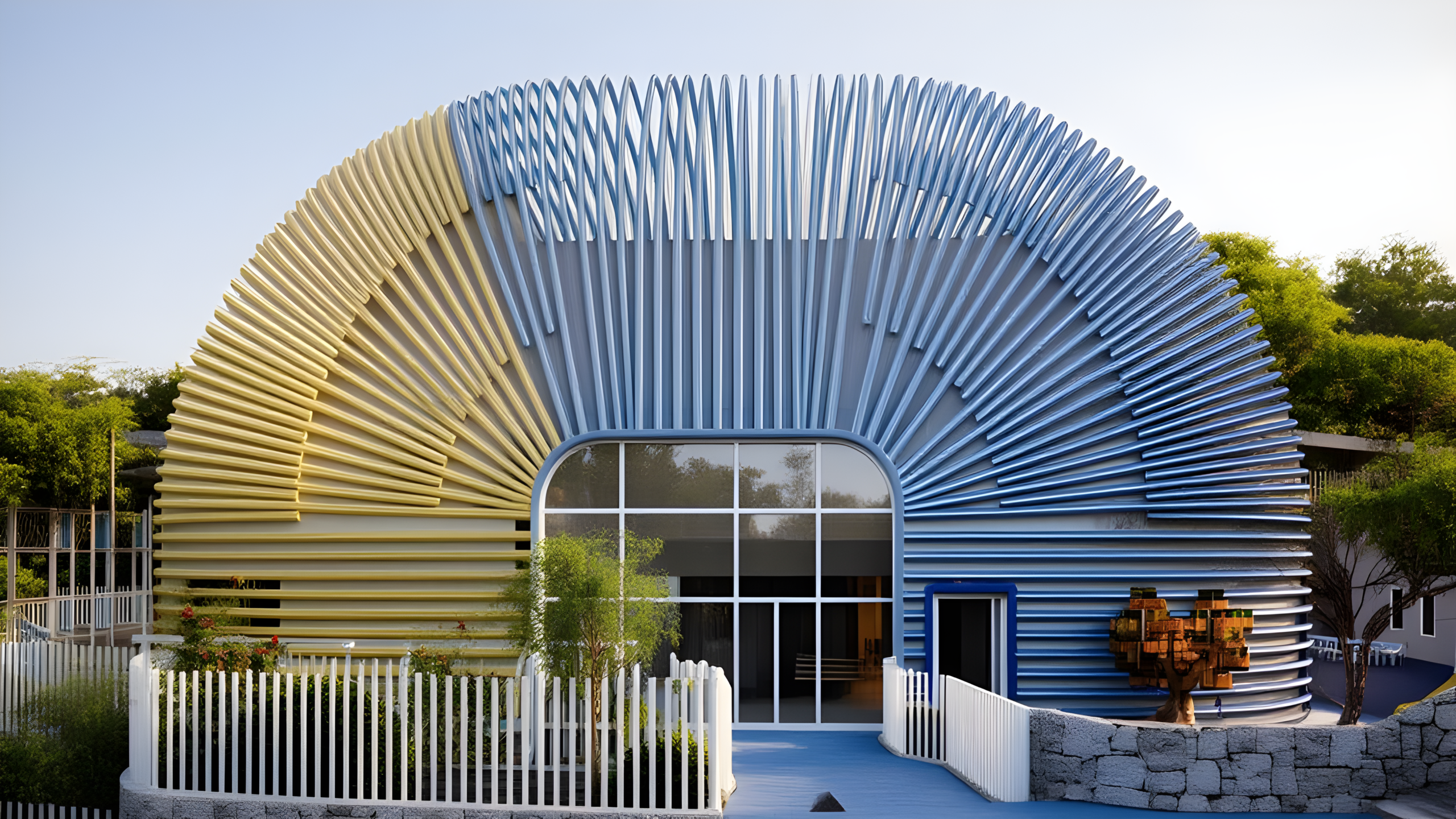
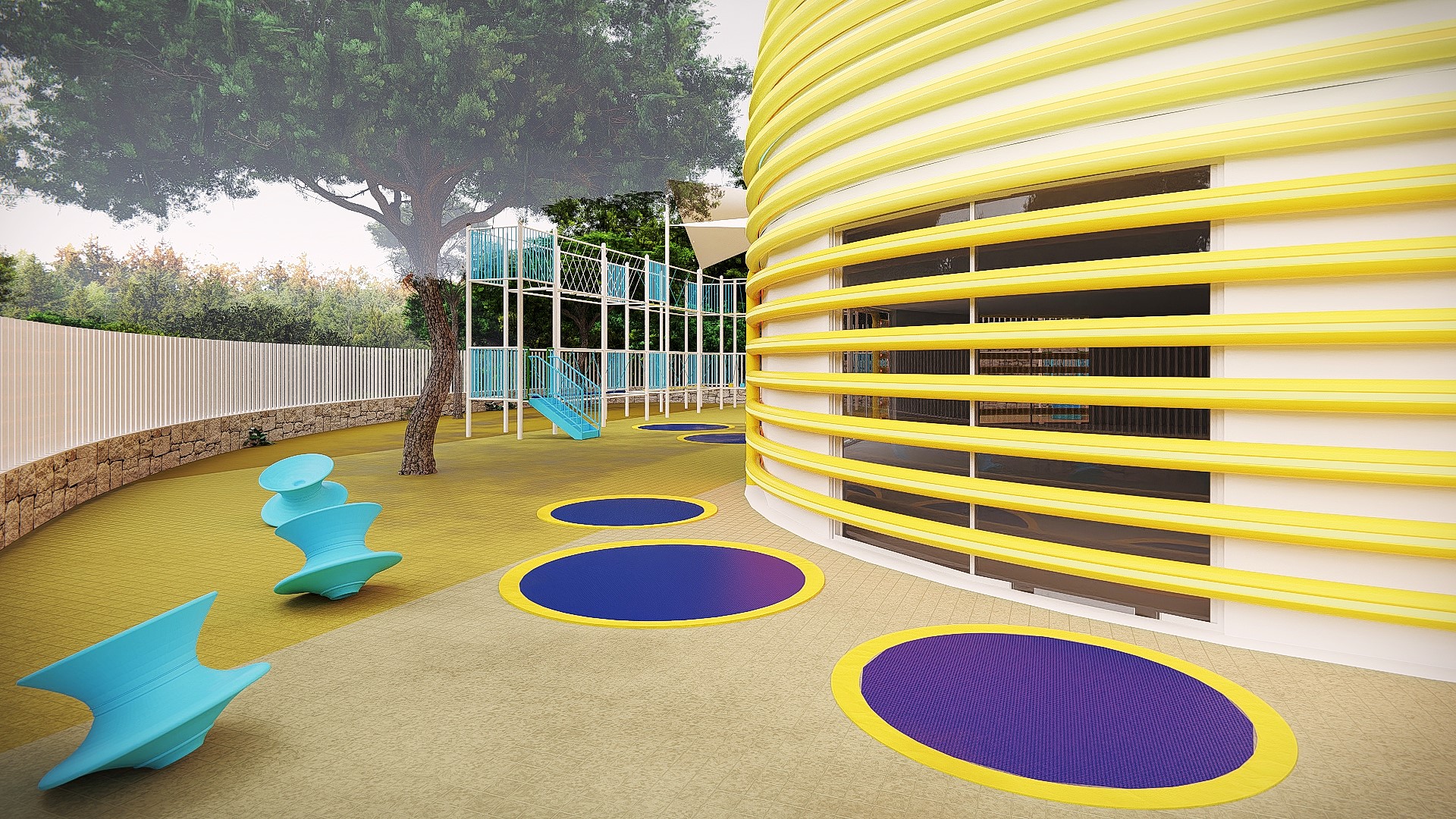
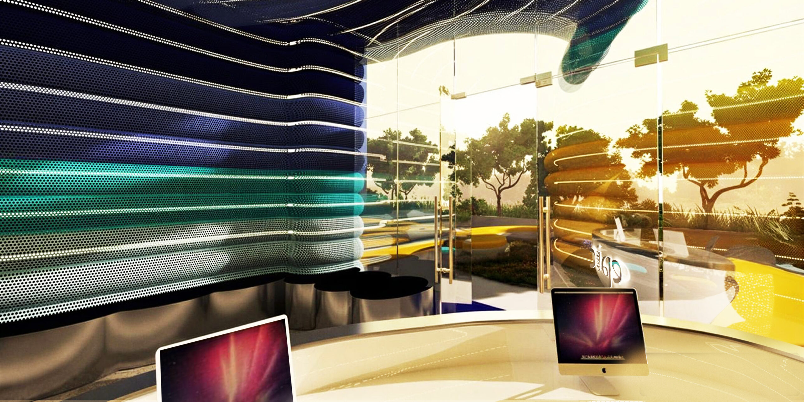
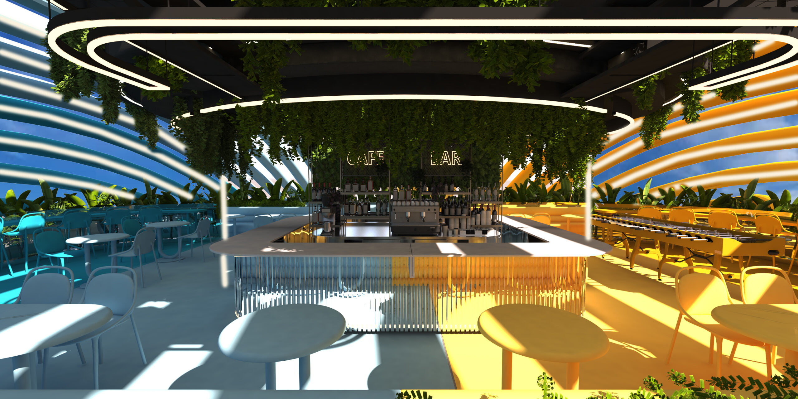
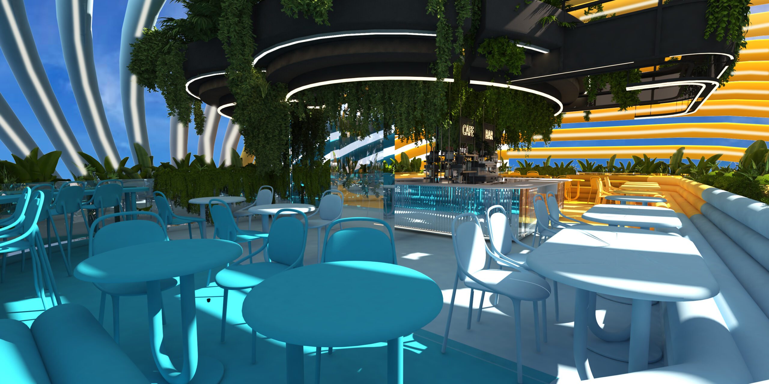
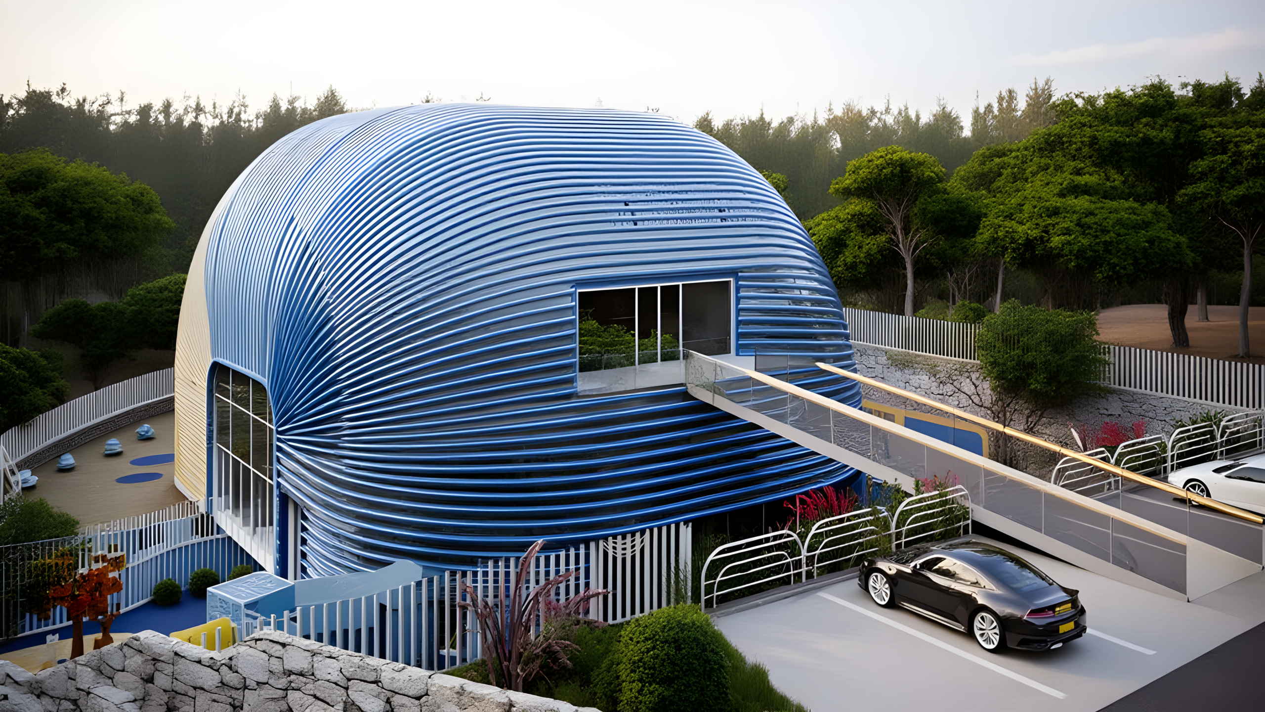
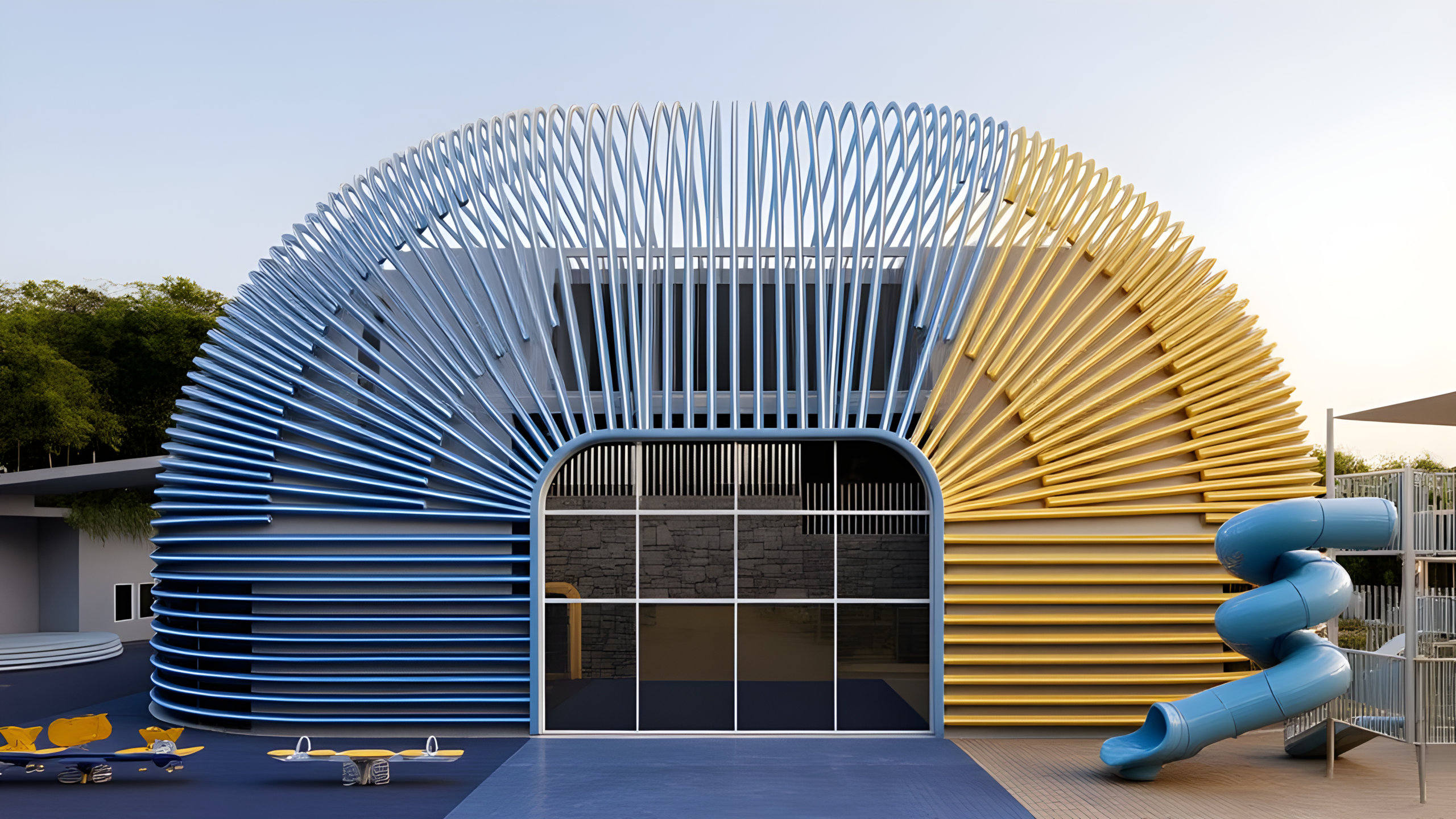
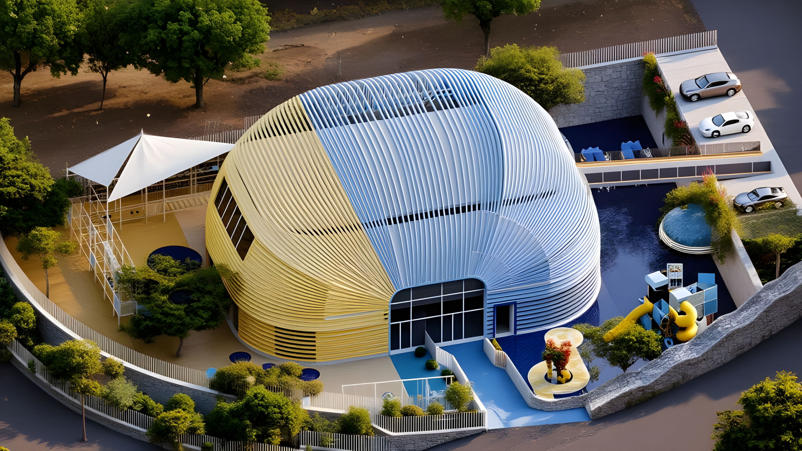
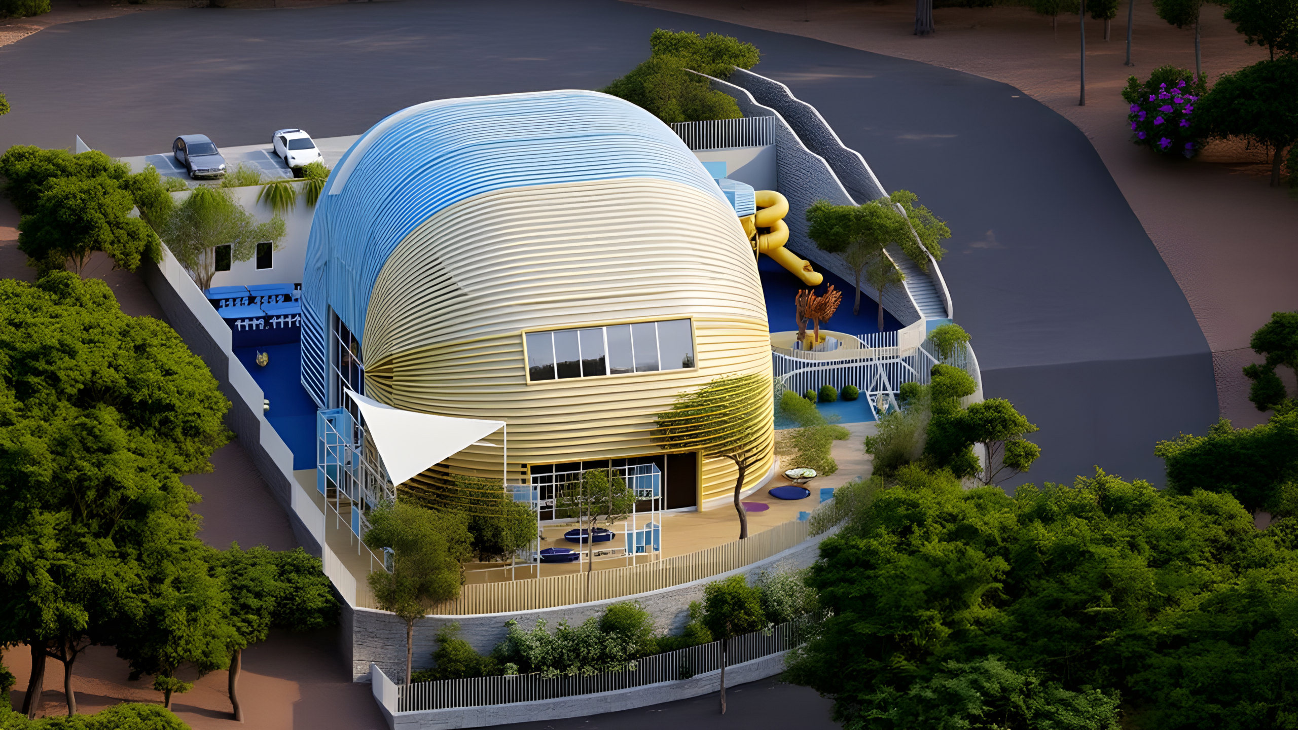
The building outside is split in half: one half yellow, one half blue. Not stripes, not accents — two halves of a single ribbed shell, each running the full height of the curve. Walk around the building and you don’t walk past a façade, you cross a border. One side is the sun. The other side is the water. A child doesn’t need that explained; they name it themselves within thirty seconds, and from then on the whole place has a geography. Meet me on the yellow side.
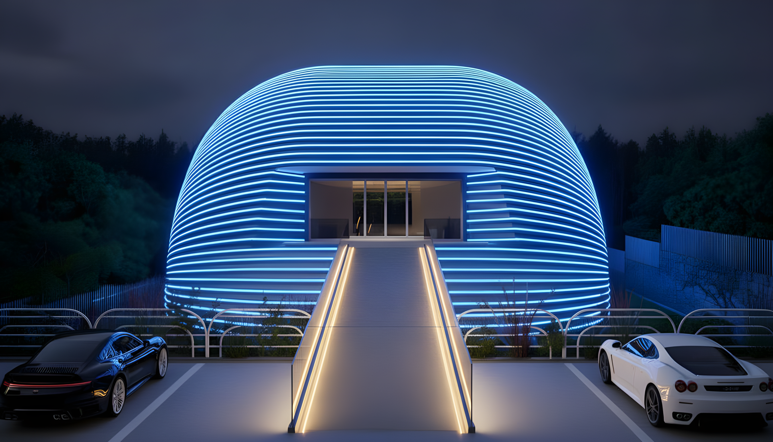
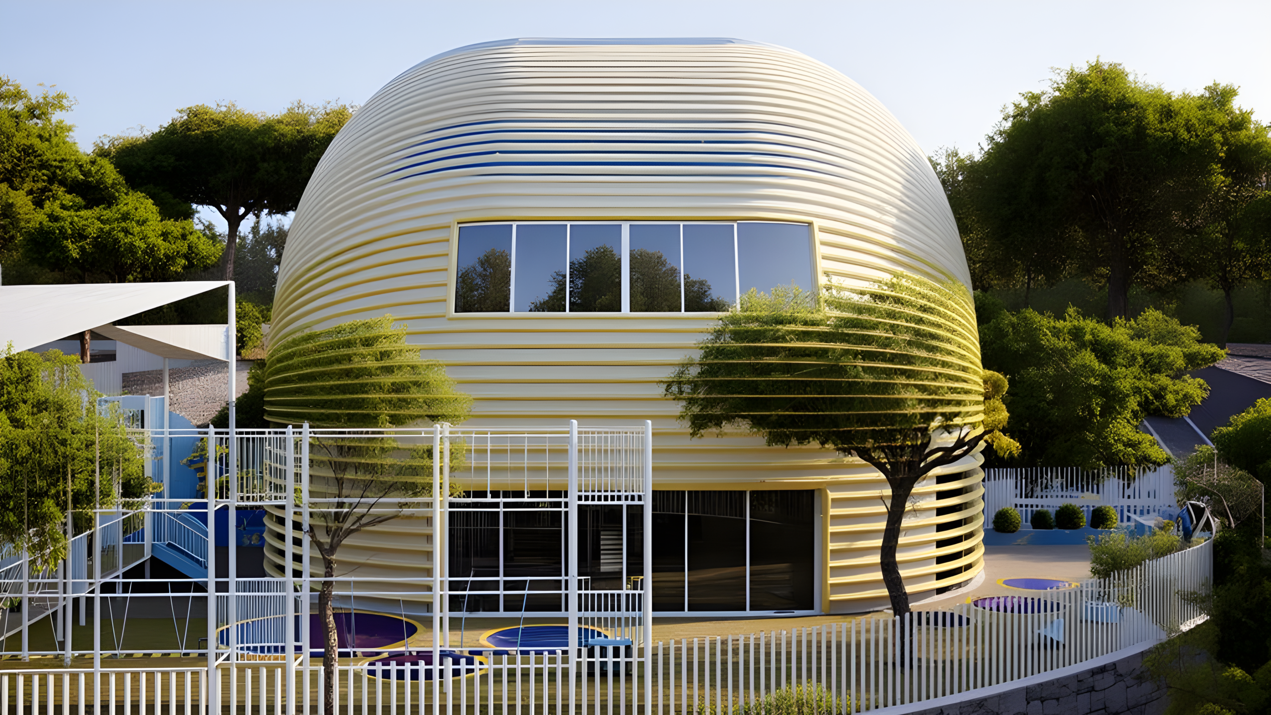
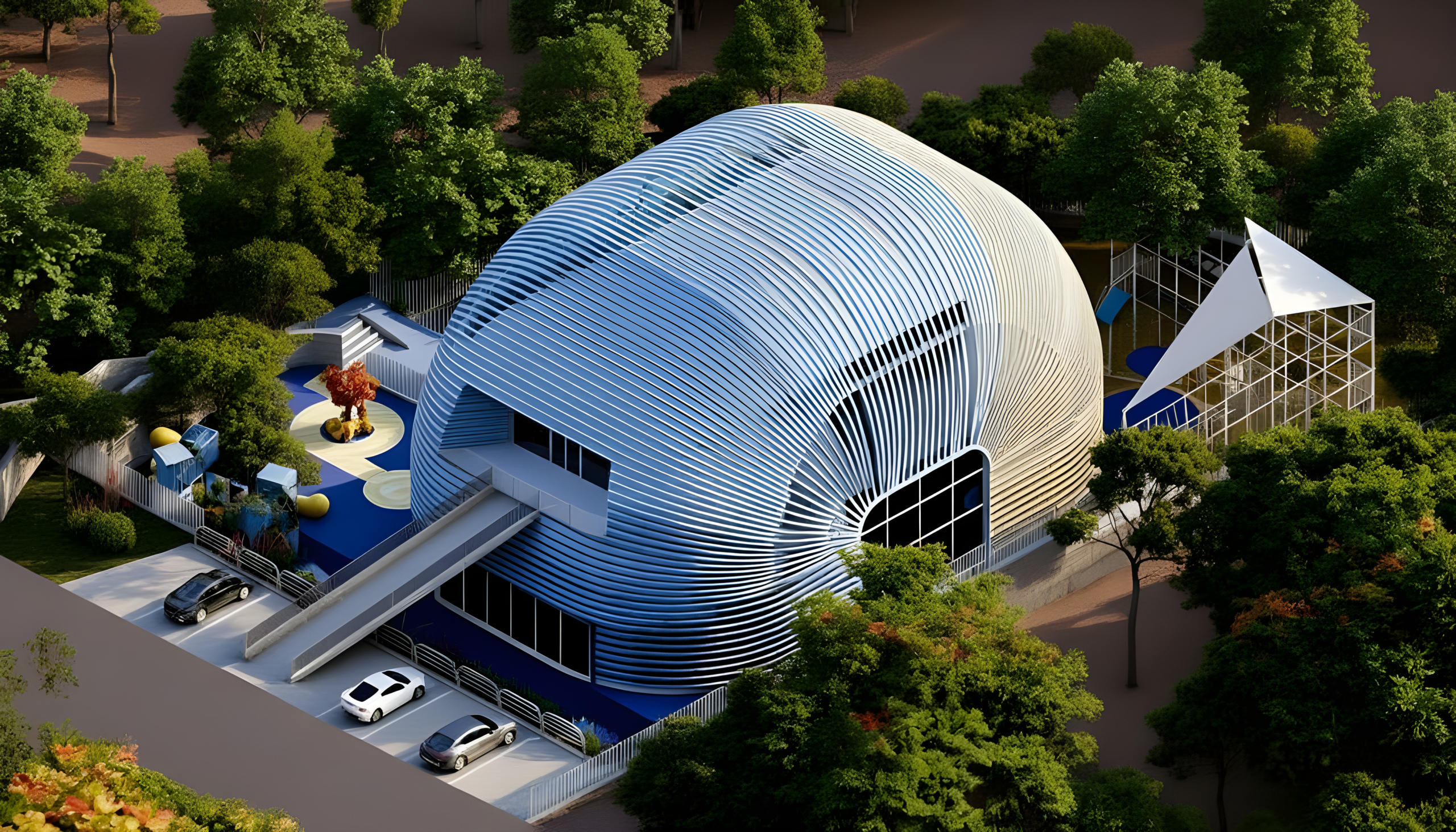
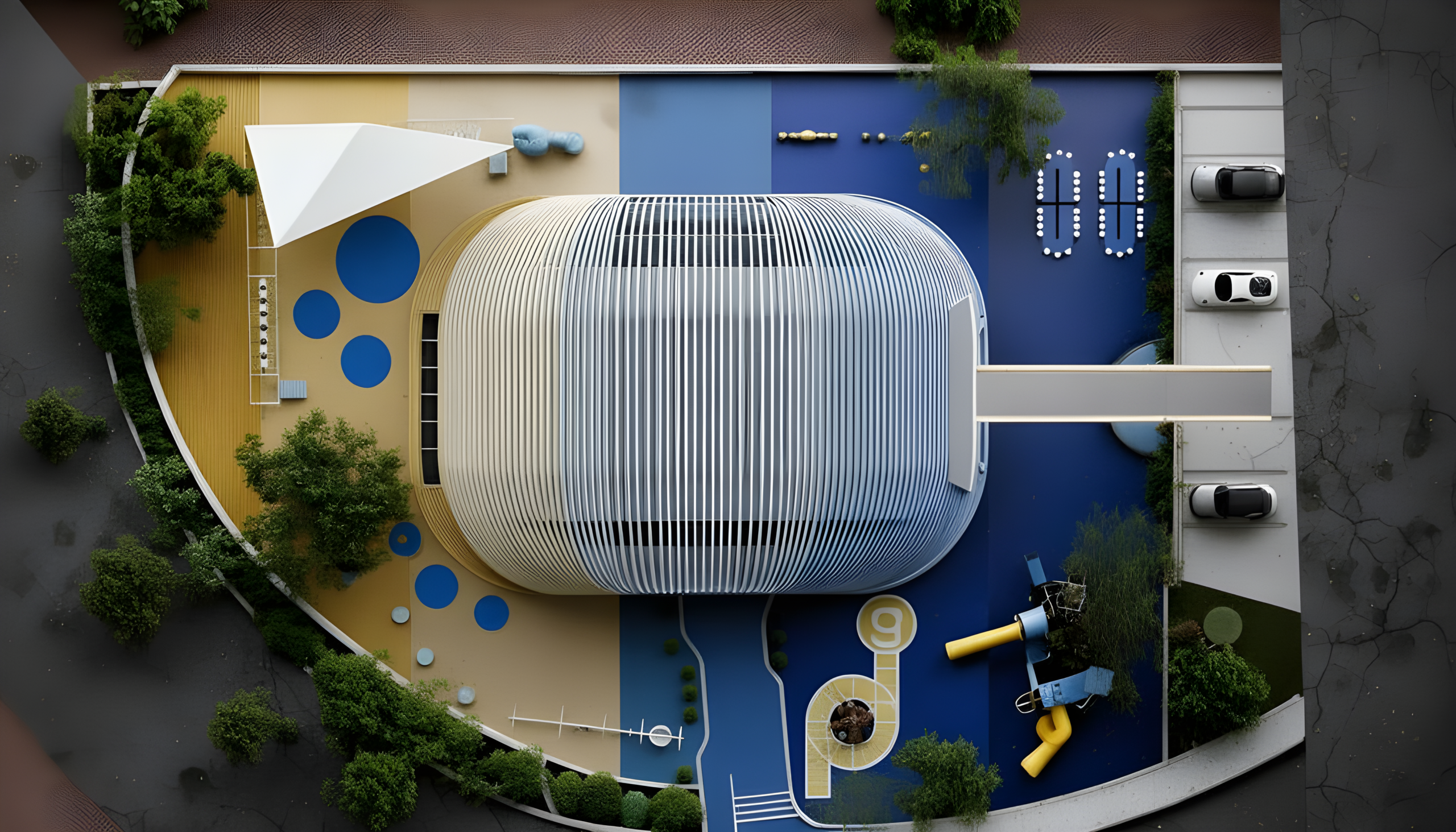
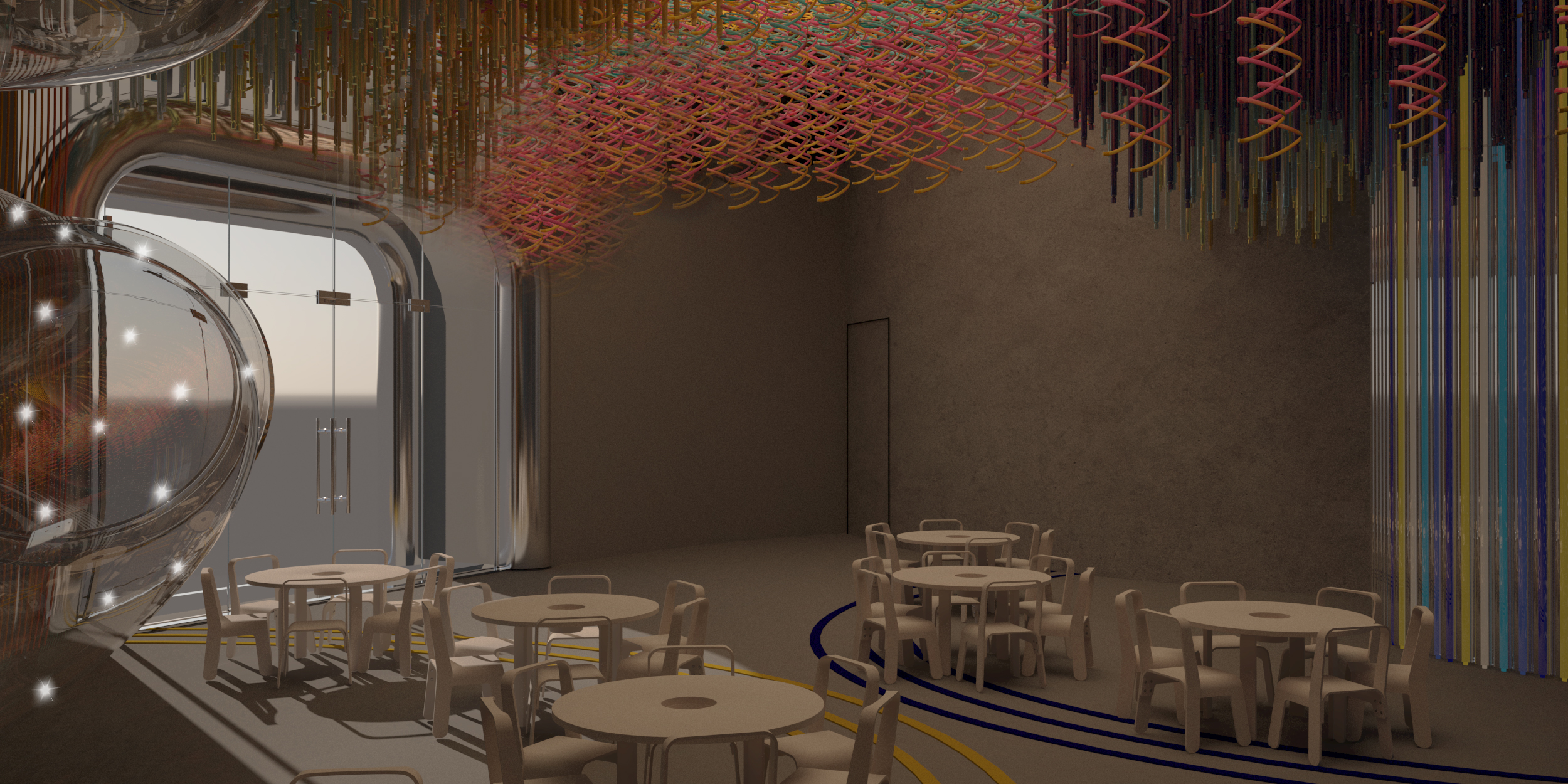
The split doesn’t stop at the wall. It runs out into the ground and divides the whole site into two temperatures of play. The yellow ground is the loud one — trampolines, climbing frames, tube slides, the running, shouting, falling-over half of childhood. The blue ground is the slower one — the tables, the swings, the shaded corners, the part of the afternoon where kids sit down without being told to. Every child uses both, in an order only they understand.
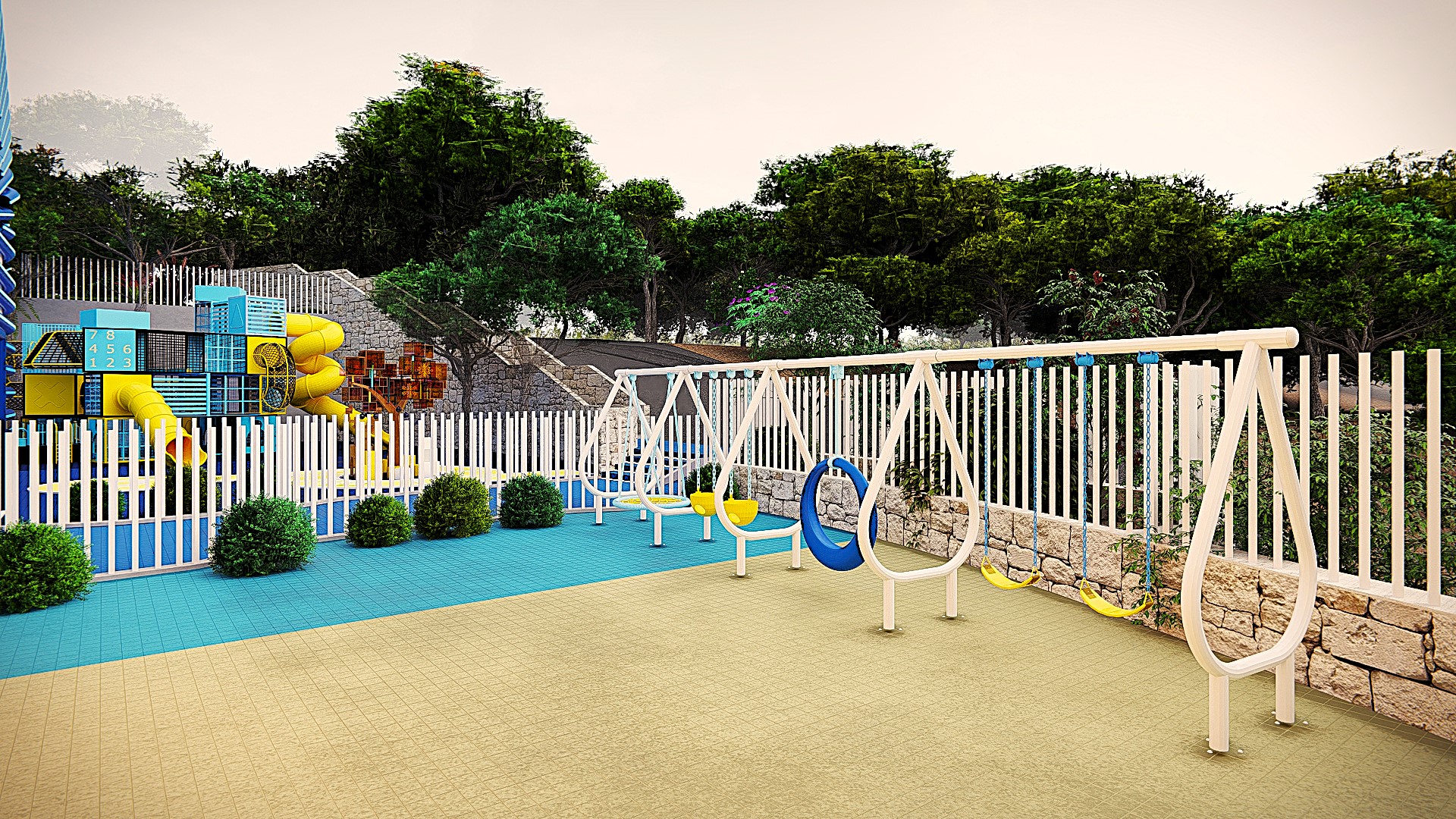
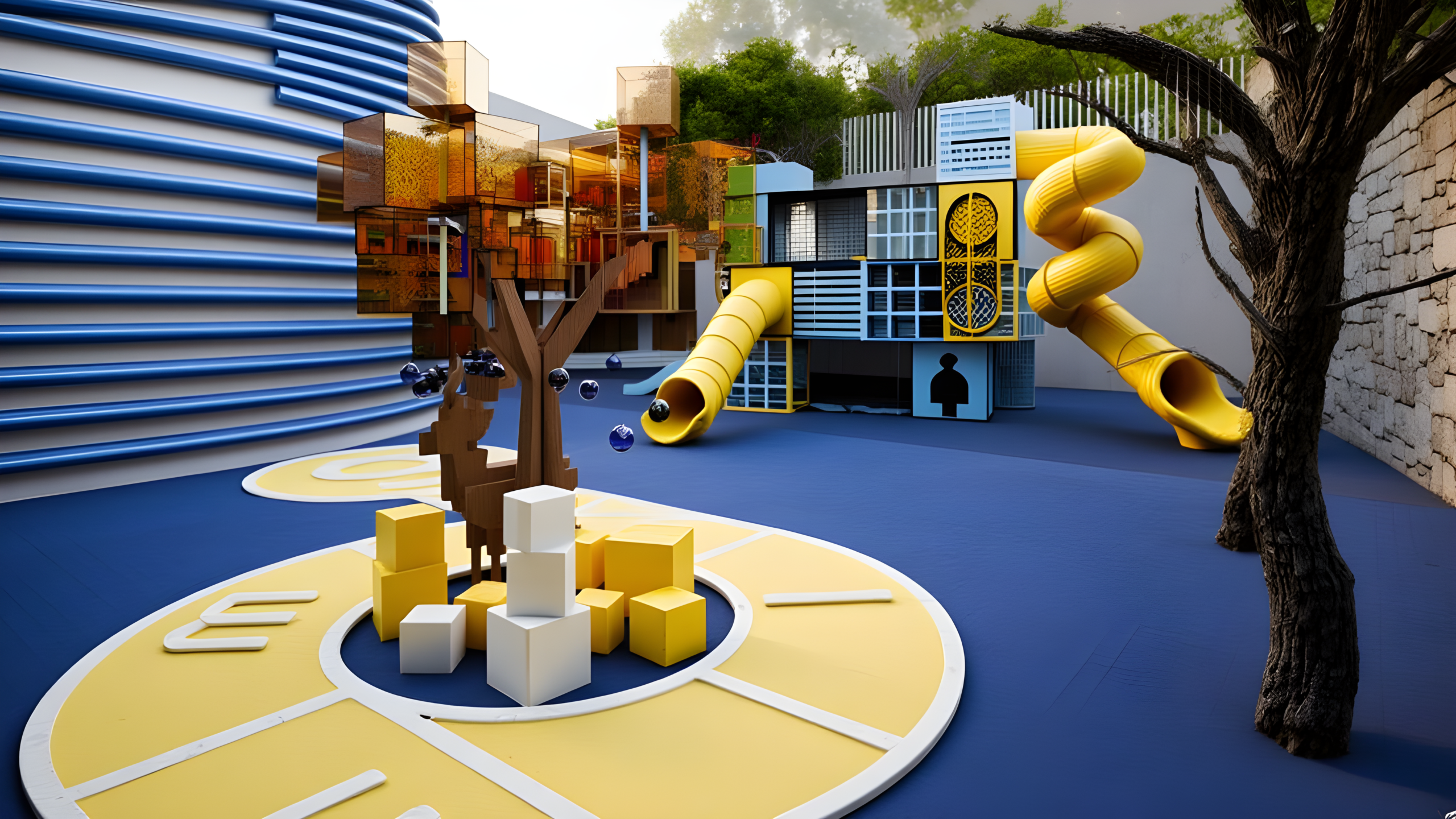
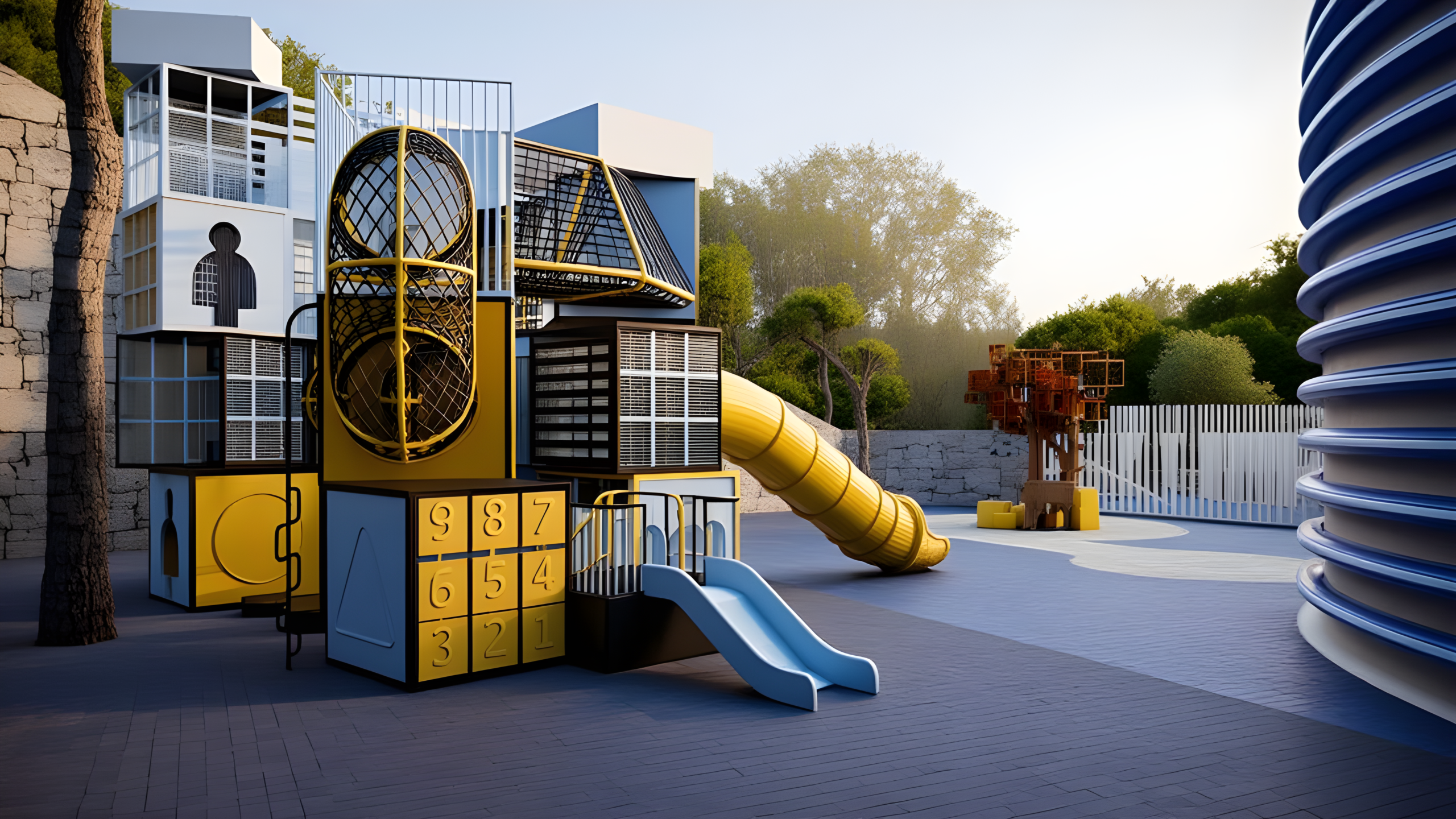
The ceiling above both zones is where the two worlds meet. A geometric lattice in deep navy, cut through with angular light strips running like arrows. It does not hover — it moves. That sense of direction overhead was deliberate. A ceiling that sits still feels wrong for this generation.
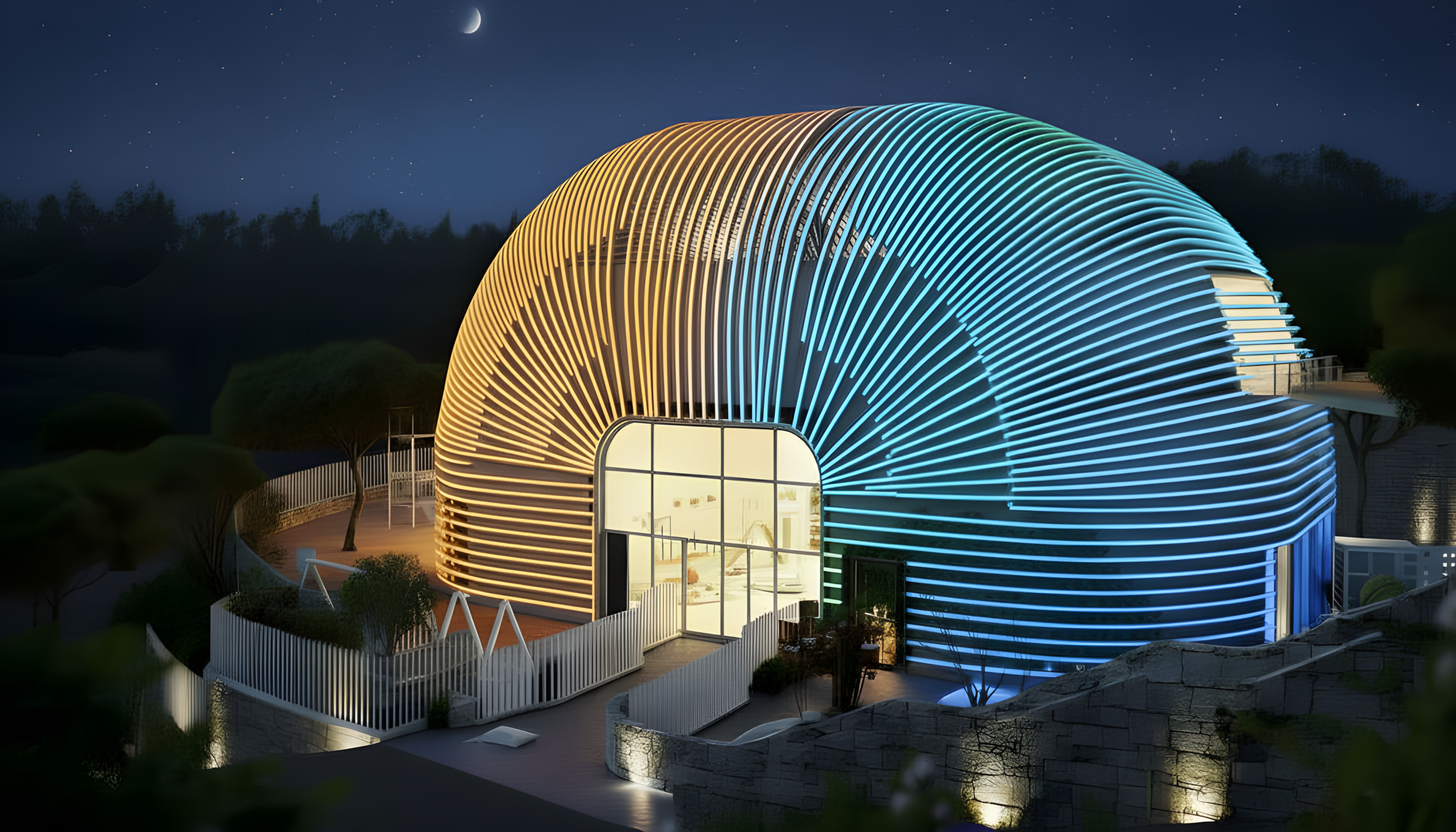
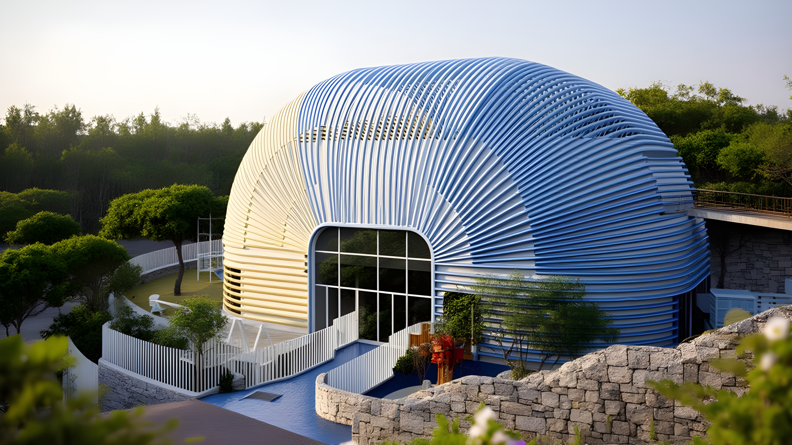
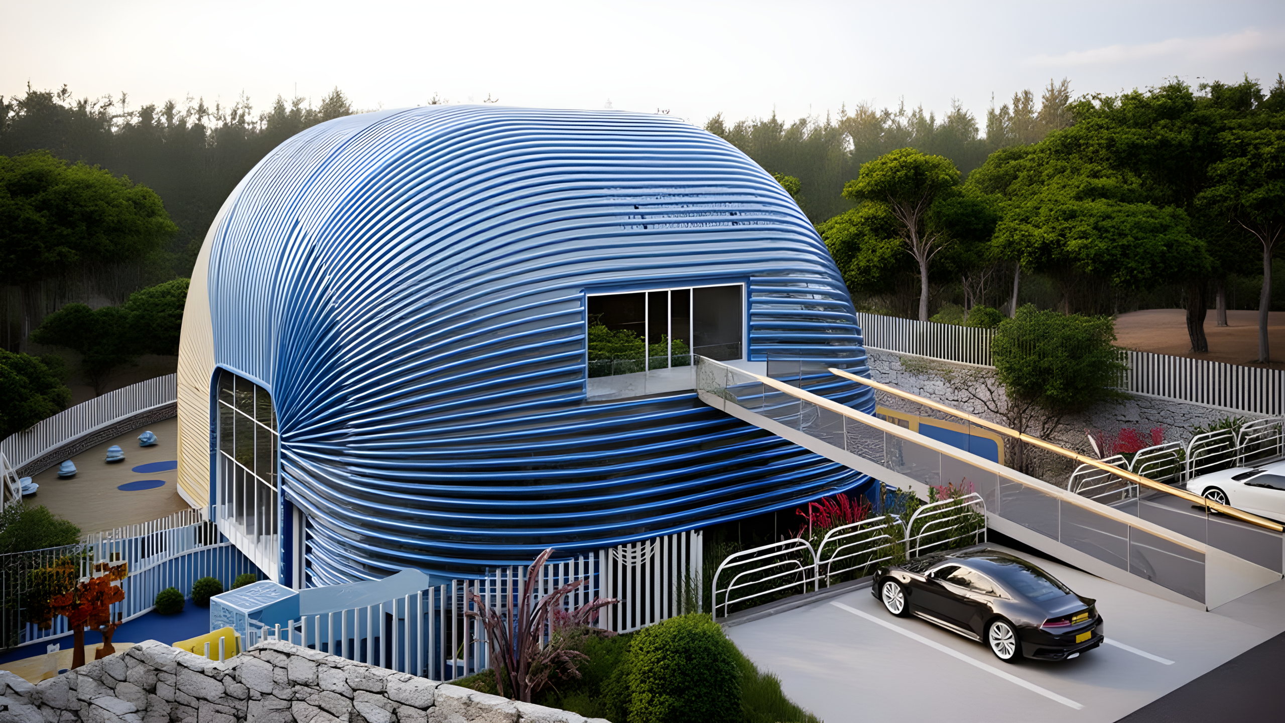
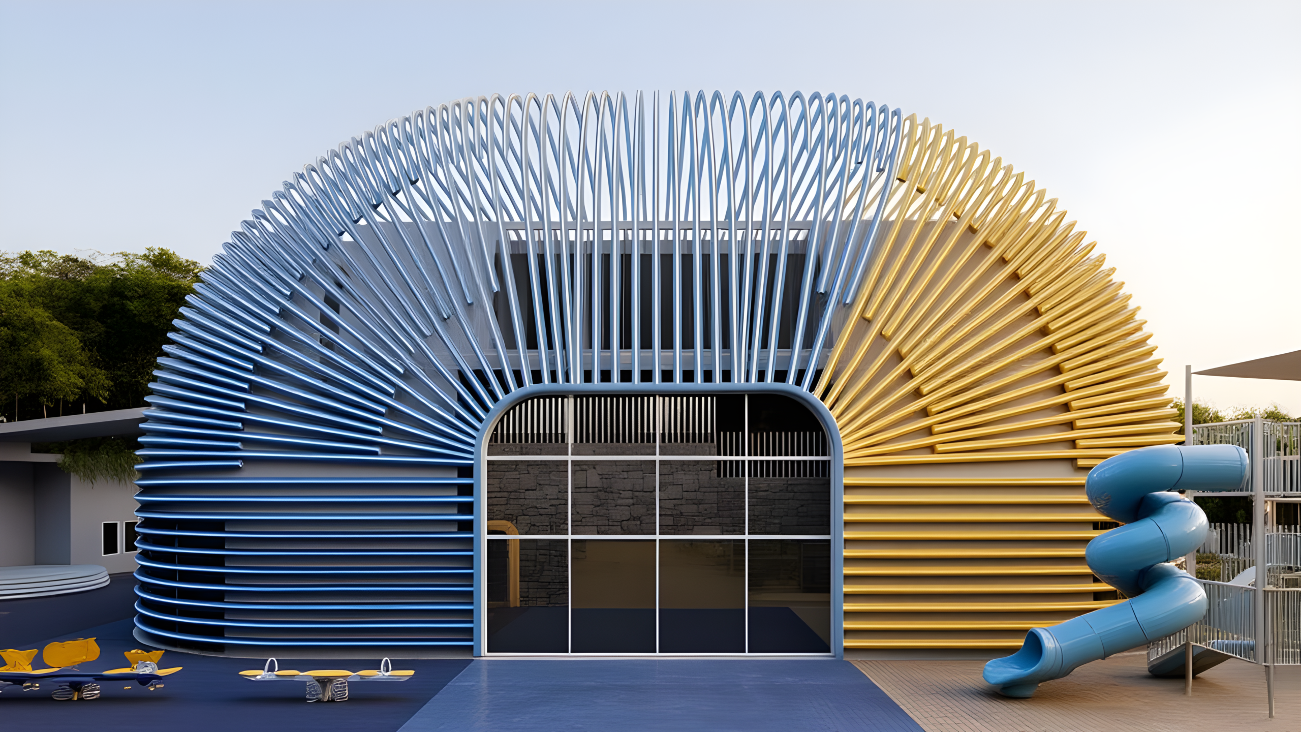
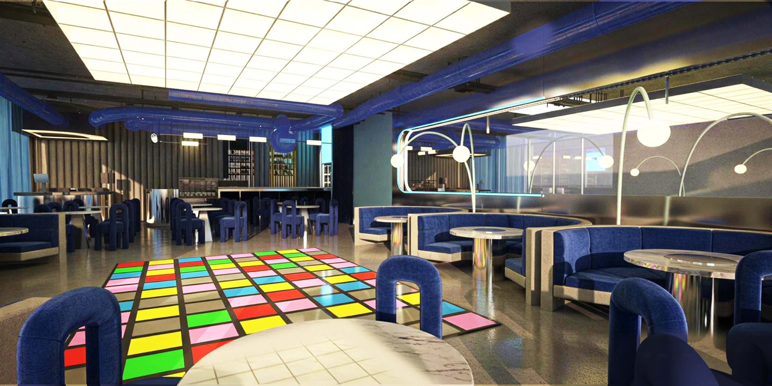
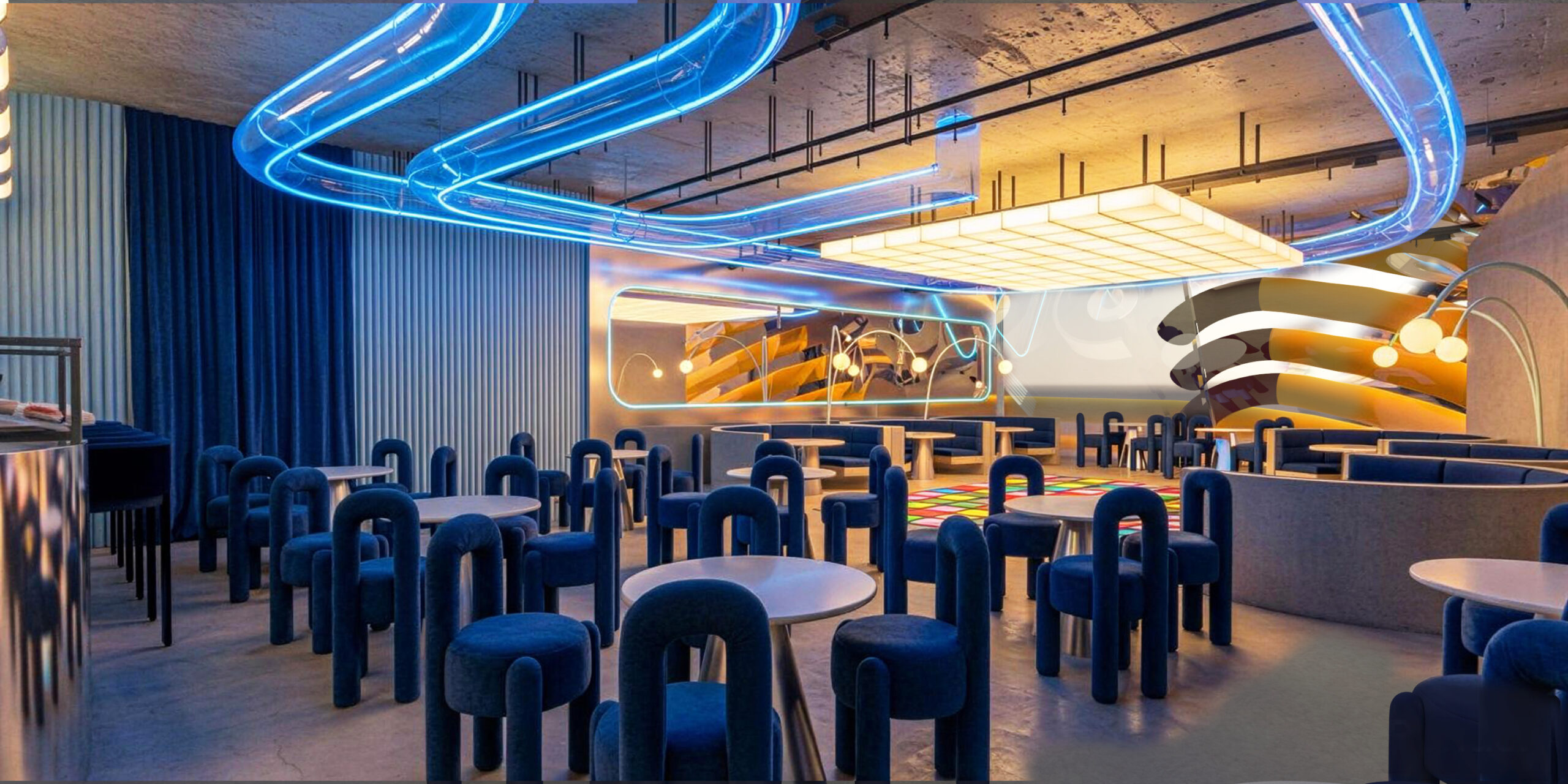
Inside, the temperature drops. The indoor world is blue — deep, upholstered, nocturnal blue. Velvet booths in curved pods, a ceiling of glowing tube-loops frozen mid-swim, a floor that bursts into disco color where the music lives. If the yellow outside is the space at full shout, the blue interior is the space leaning in. Kids need both. A place that only screams exhausts them; a place that only whispers bores them.
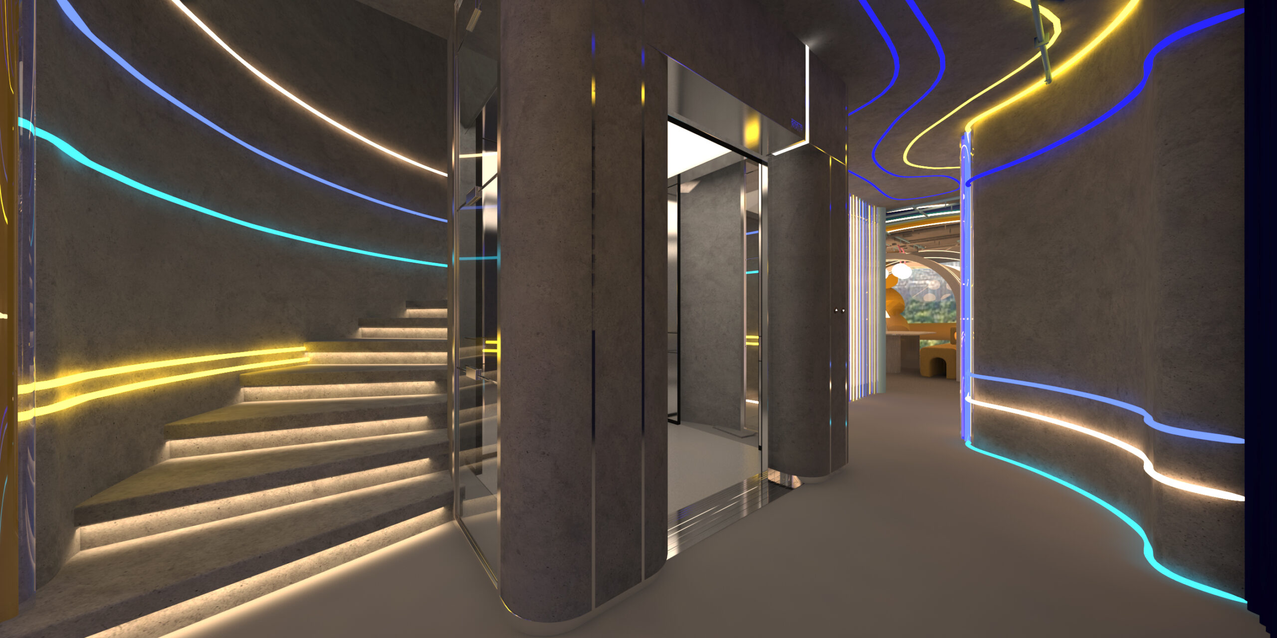
Play shouldn’t stop where the furniture starts
The mistake most play spaces make is zoning play into a corner — here is the toy area, there is the grown-up area, and never shall they mix. We did the opposite: the whole venue is the toy.
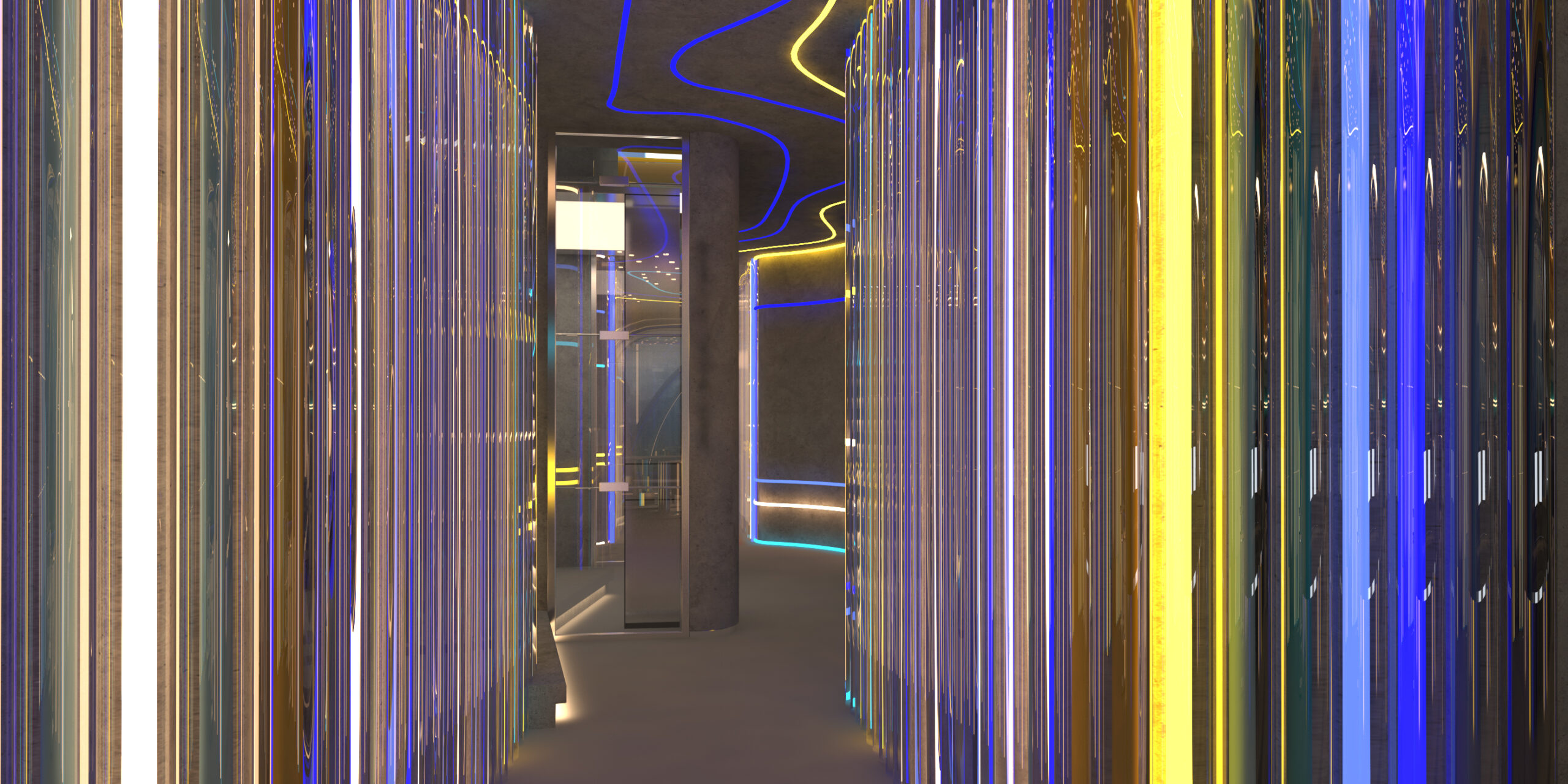
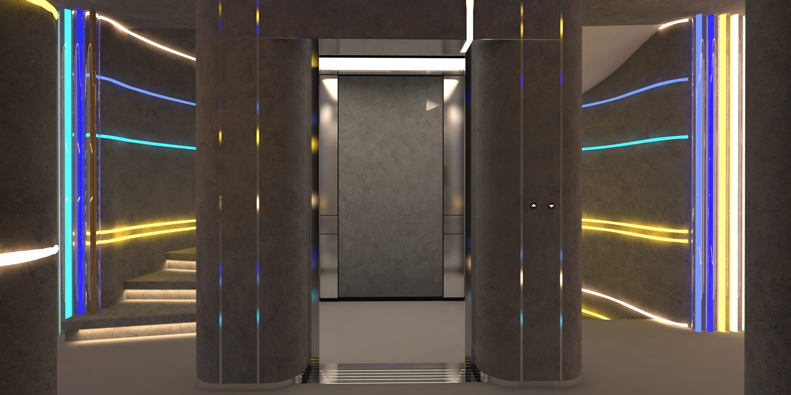
The ribs you see outside come back inside as light. The corridors are not corridors; they’re passages that change color as you move through them, so getting from one room to another is already an event. Even the stairs glow. Nothing here is a waiting area.
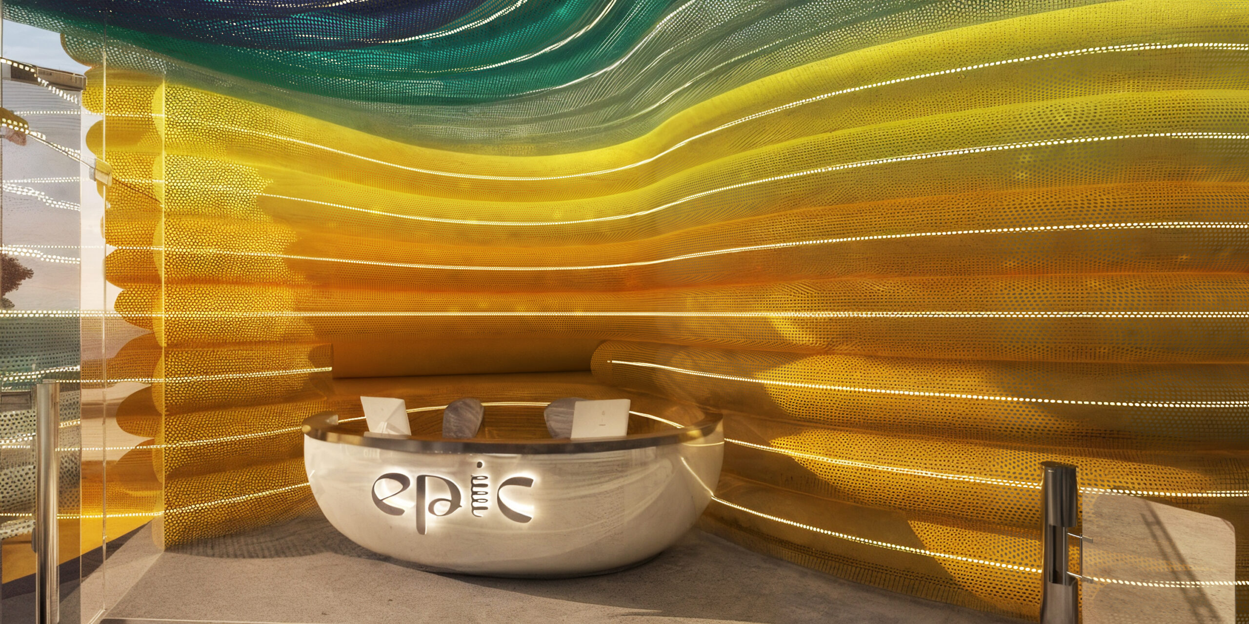
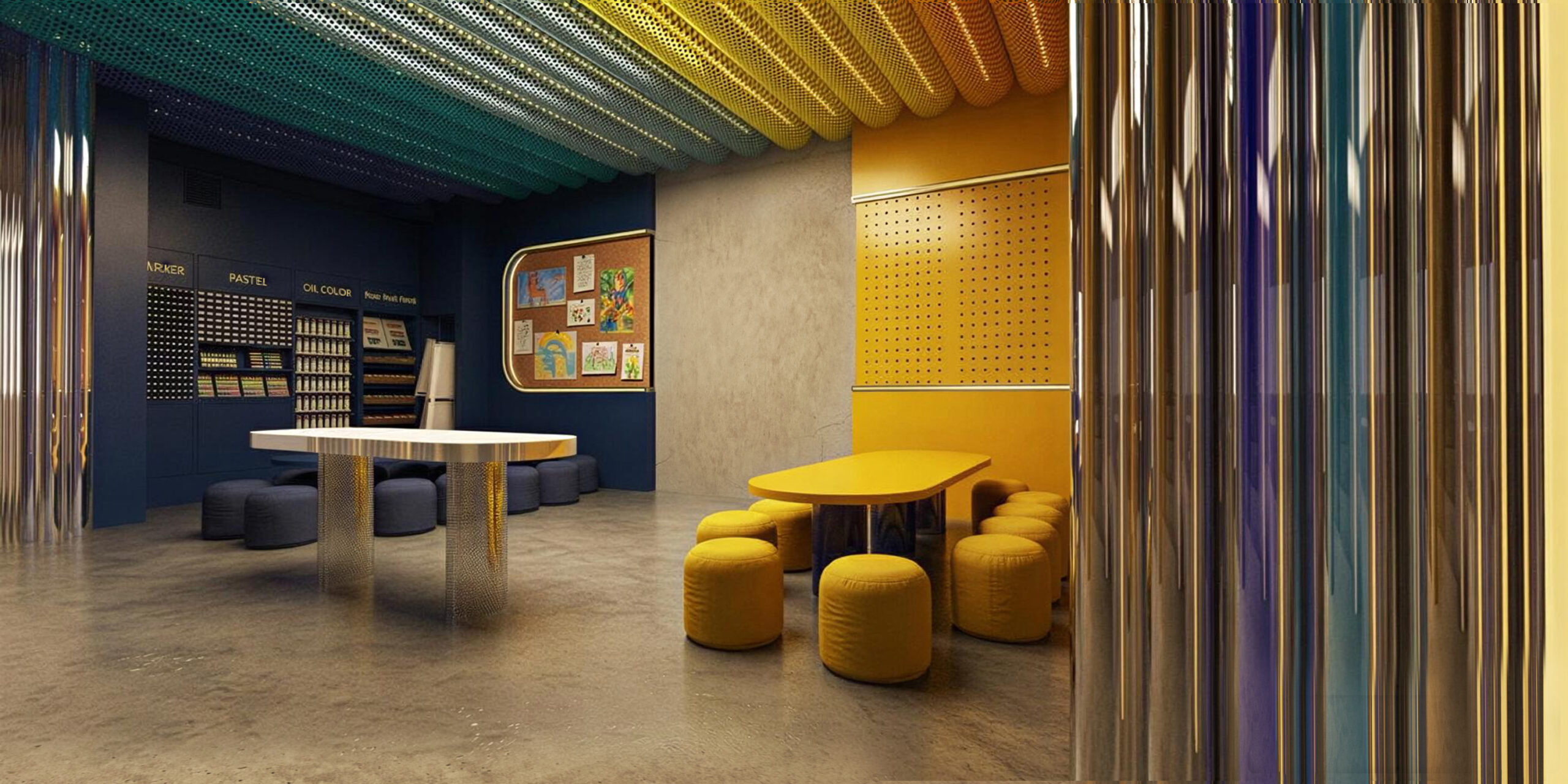
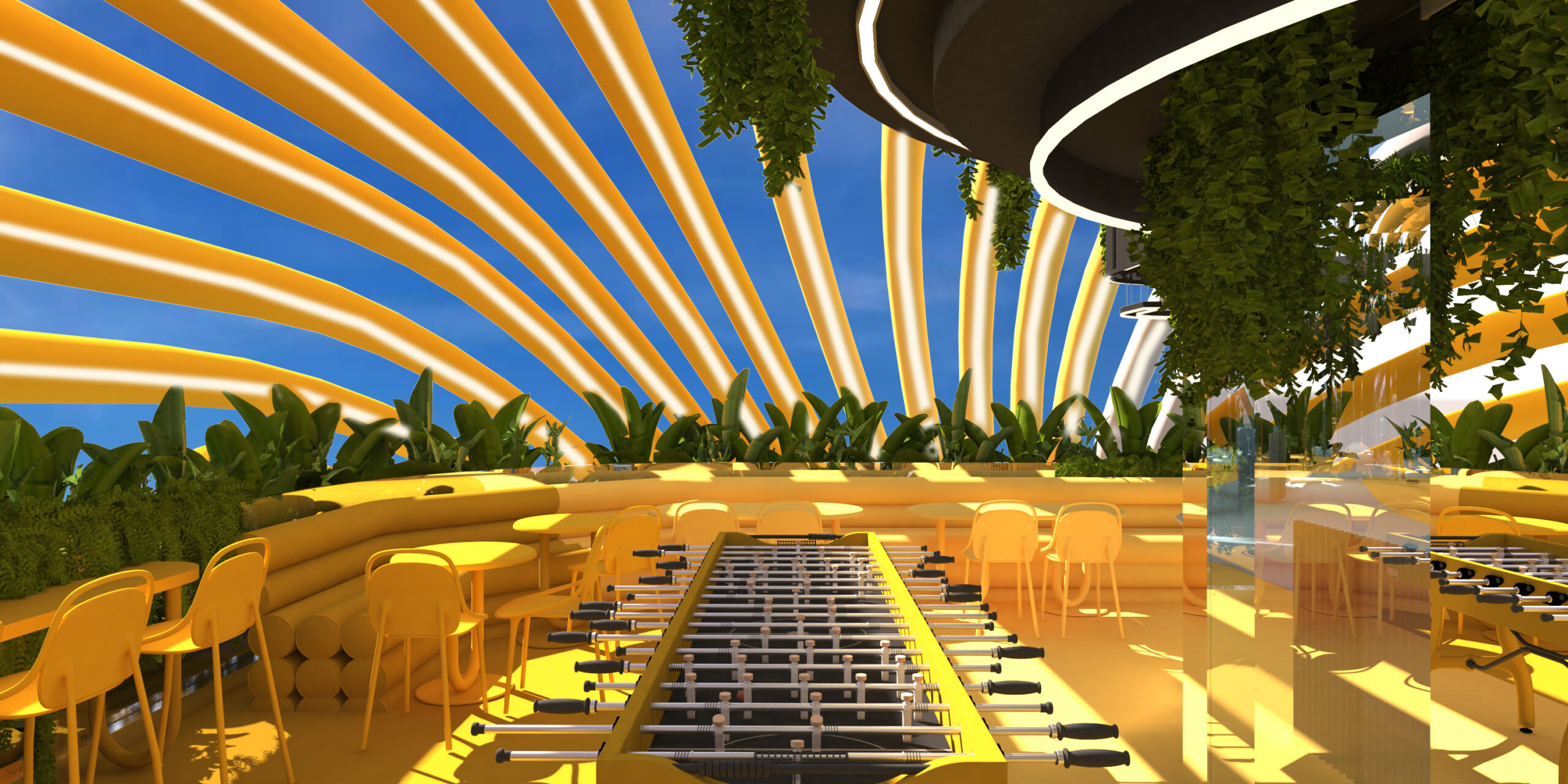
The furniture misbehaves on purpose. Benches curve like tubes, seats are shaped like arches, counters are sculpted rather than built. The foosball tables sit where dining tables usually go, at café scale, so a match draws an audience. The making rooms are loud with the children’s own work — drawings taped up the walls, paint out on the table, the place slowly becoming theirs.
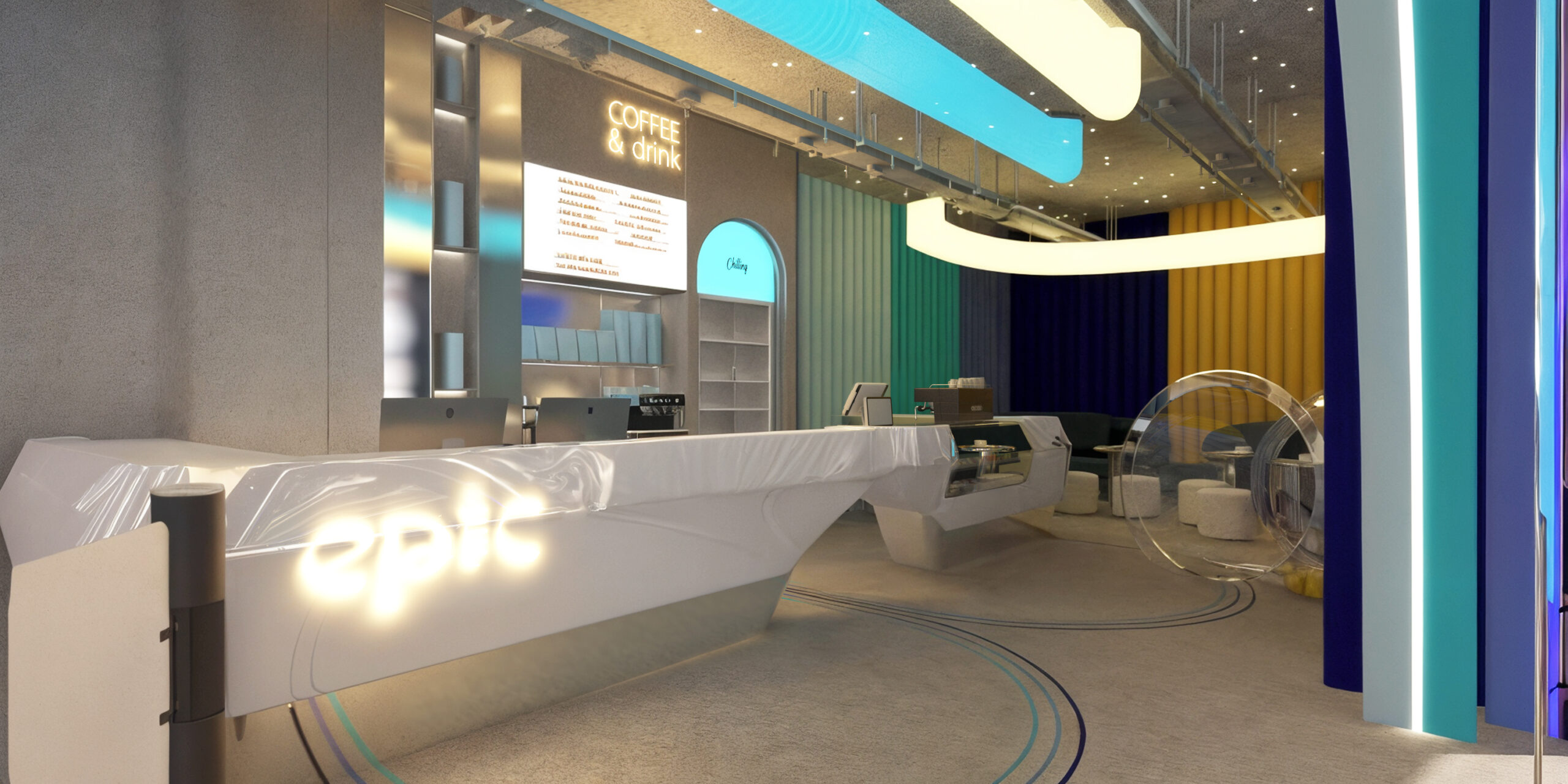
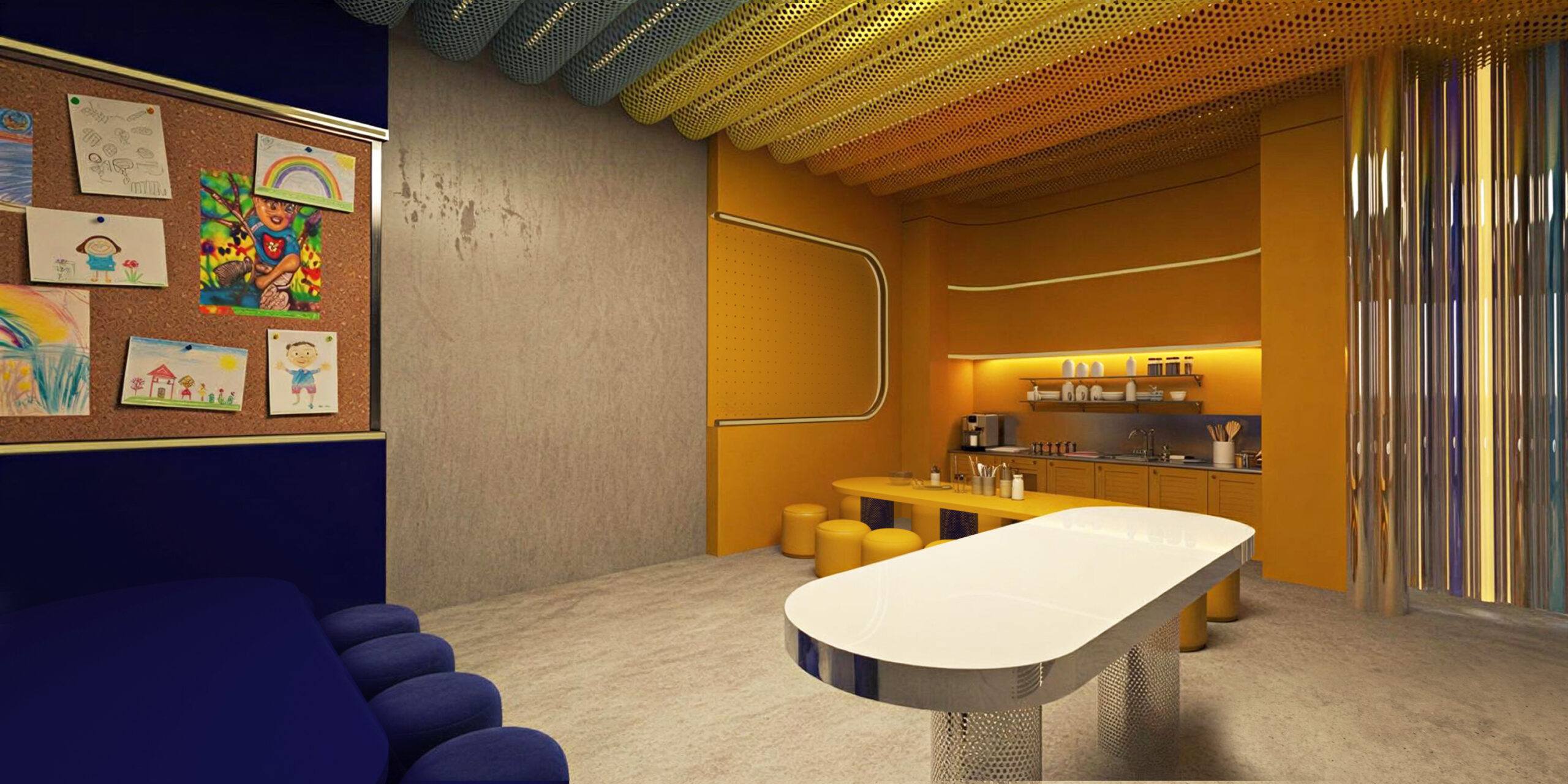
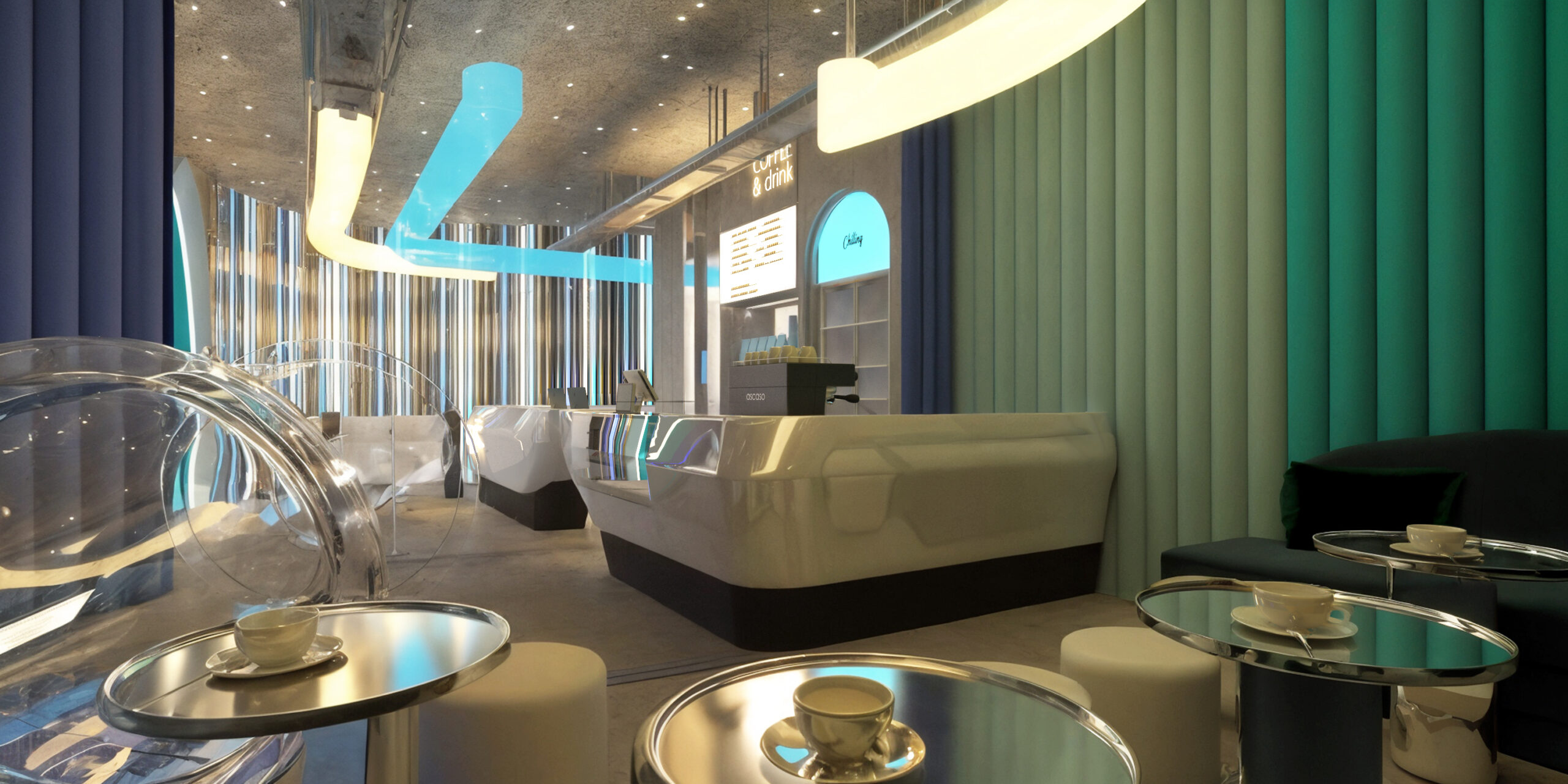
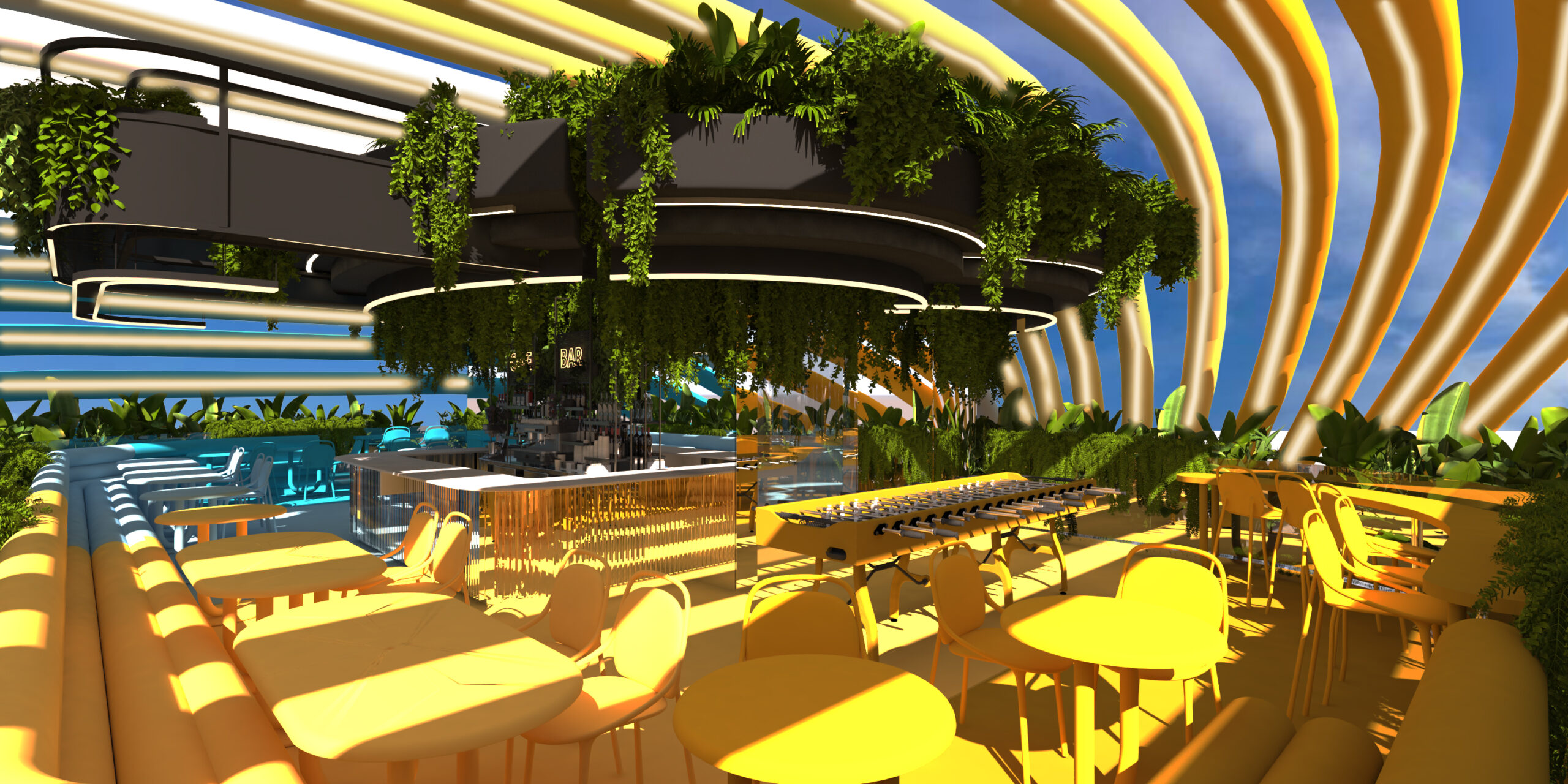
And the parents? They’re designed for too, but quietly. Their world is the rooftop — the counter, the espresso machine, the pastries under warm light, hanging plants heavy enough to feel like shade, and the same yellow and blue ribs overhead so they’re never outside the story. A space where a child plays for two hours only works if the adult wants to stay for two hours. We’ve watched too many parents count minutes on a hard plastic chair to design one more of those.
The test we design against
A place kids remember is, in the end, a place that respected them first. Every decision in this project — the building cut in half between sun and water, the ground that follows it, the games that interrupt the dinner — was made against the same question: will a kid still be able to see this place with their eyes closed, a year from now?
For us, the design ends there. The building now belongs to the people who run it, and the memories belong to the kids. That’s our favorite part of finishing — handing over a place we no longer have to explain, because children will explain it better than we ever did.
But if you’re carrying a brief of your own — a sentence like not typical, a place you want people to describe with their eyes closed — that’s the part we’re still here for. Tell us about your project.