
New Branches & Renovations
A collection of international projects for Dip n Dip, including new branches and renovation projects across different markets and in Lebanon. The design work focuses on translating the brand’s recognizable dessert experience into contemporary spaces while adapting each project to its specific location.
Dip n Dip Kaslik is open

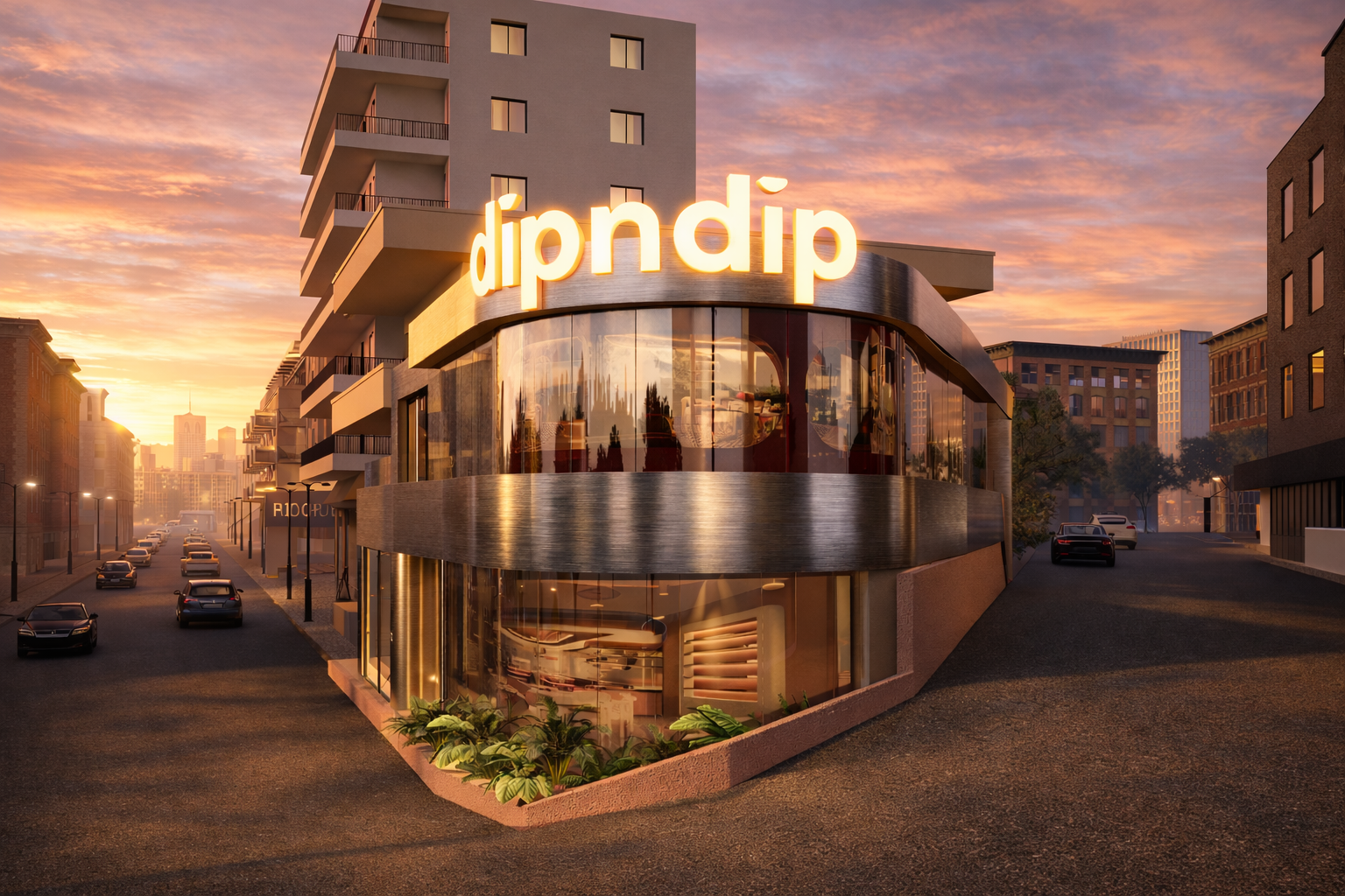
On September 29, Dip n Dip opened its new Kaslik branch. We designed it as a full interior rebrand, rethinking the brand’s space from the facade to the restrooms.
Kaslik is one of three Dip n Dip branches we’re designing in Lebanon, with two more to follow. It’s also part of a bigger shift. Dip n Dip is rebranding internationally, and we’re designing its full international portfolio. Beyond Lebanon, that includes two branches in Saudi Arabia, two in Malaysia and two in Libya, all now in progress.
Kaslik is the first of these branches to open, so it’s the first built version of the brand’s new identity.
The concept: a chocolate lab
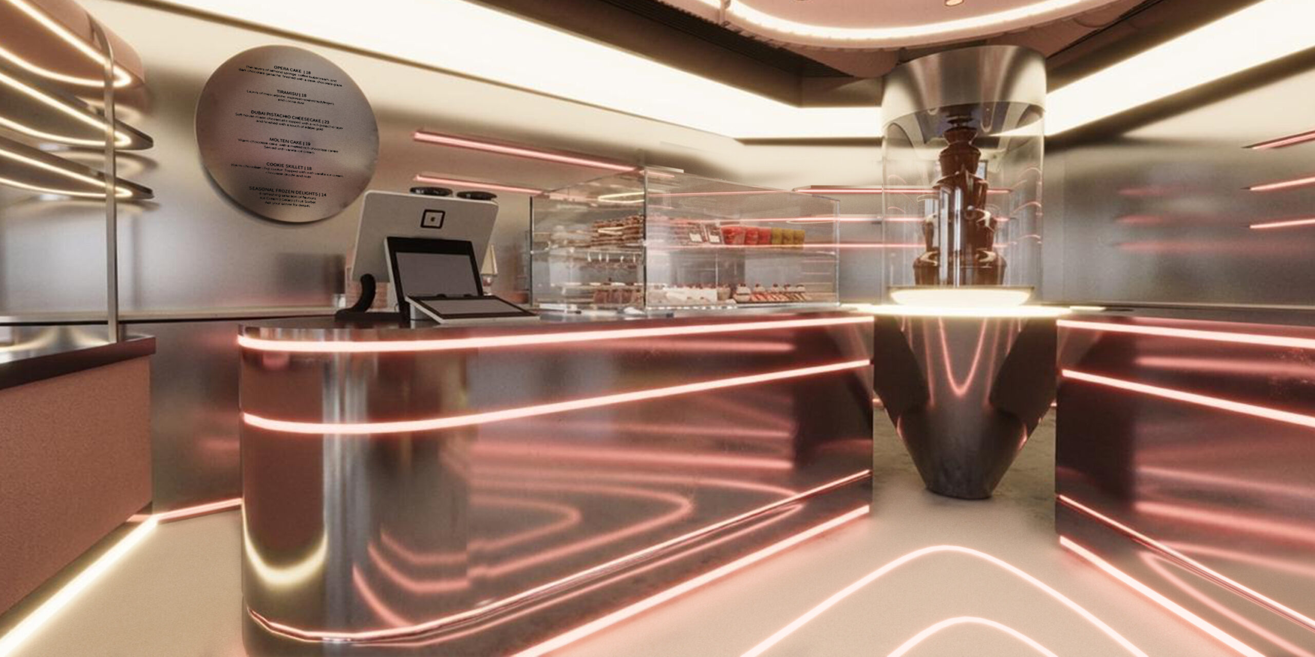
We started from one idea: a chocolate lab. Dip n Dip is built around chocolate, so we designed the branch as the place where it’s made, served and put on display.
That’s why stainless steel runs through the whole project. It’s the material of professional kitchens and laboratories: precise, clean and built for work. Here it’s used on the facade, the counters, the display units, the shelving and the restrooms, so the concept carries through every part of the branch.
The two elements that define the concept sit at the center of the room. The first is a stainless steel center counter. The second is a stainless steel chocolate fountain set inside a glass cylinder, so guests can watch the chocolate move from wherever they sit. The steel gives the space its structure, and a palette of blush, rose and warm white keeps it welcoming.
The facade
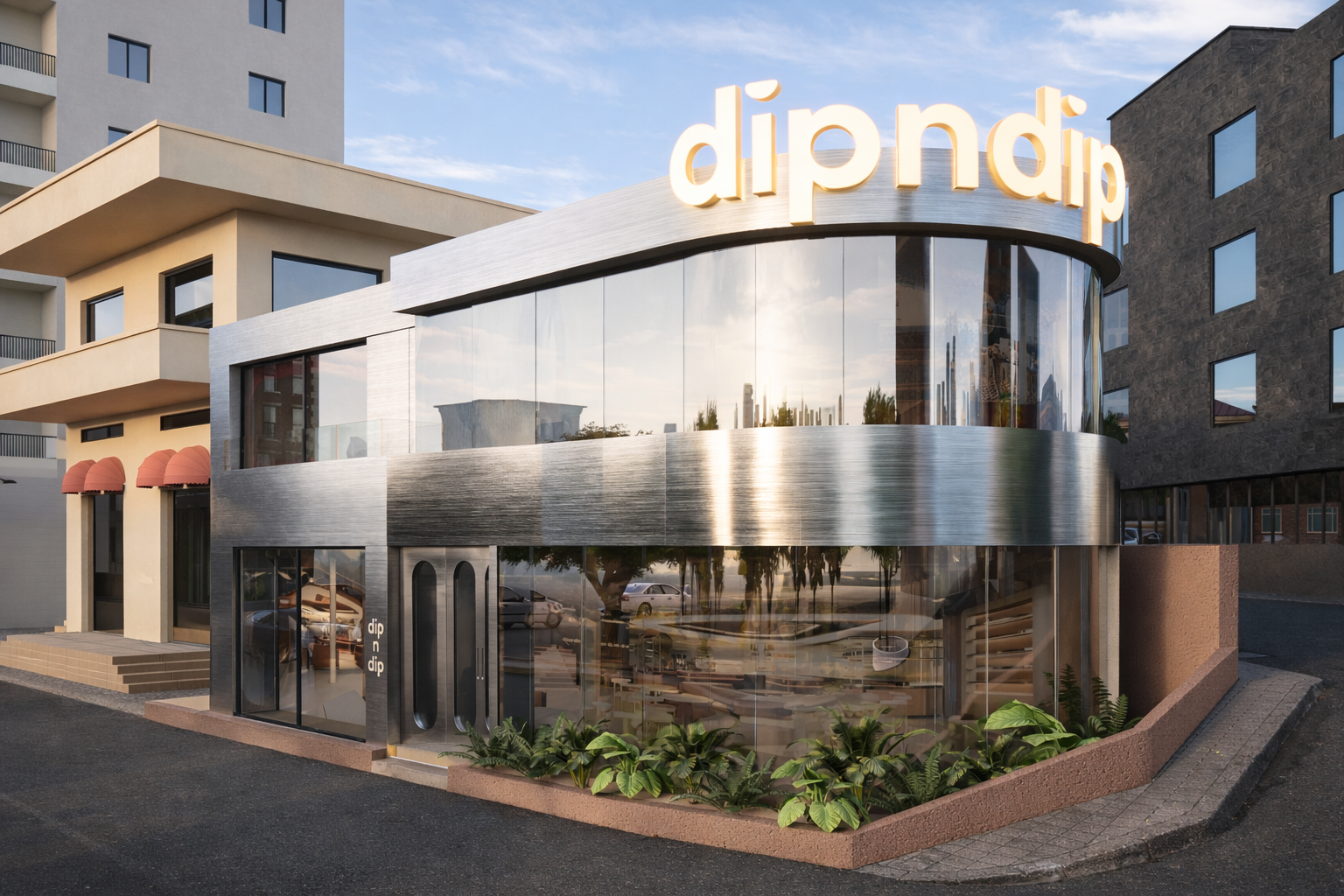
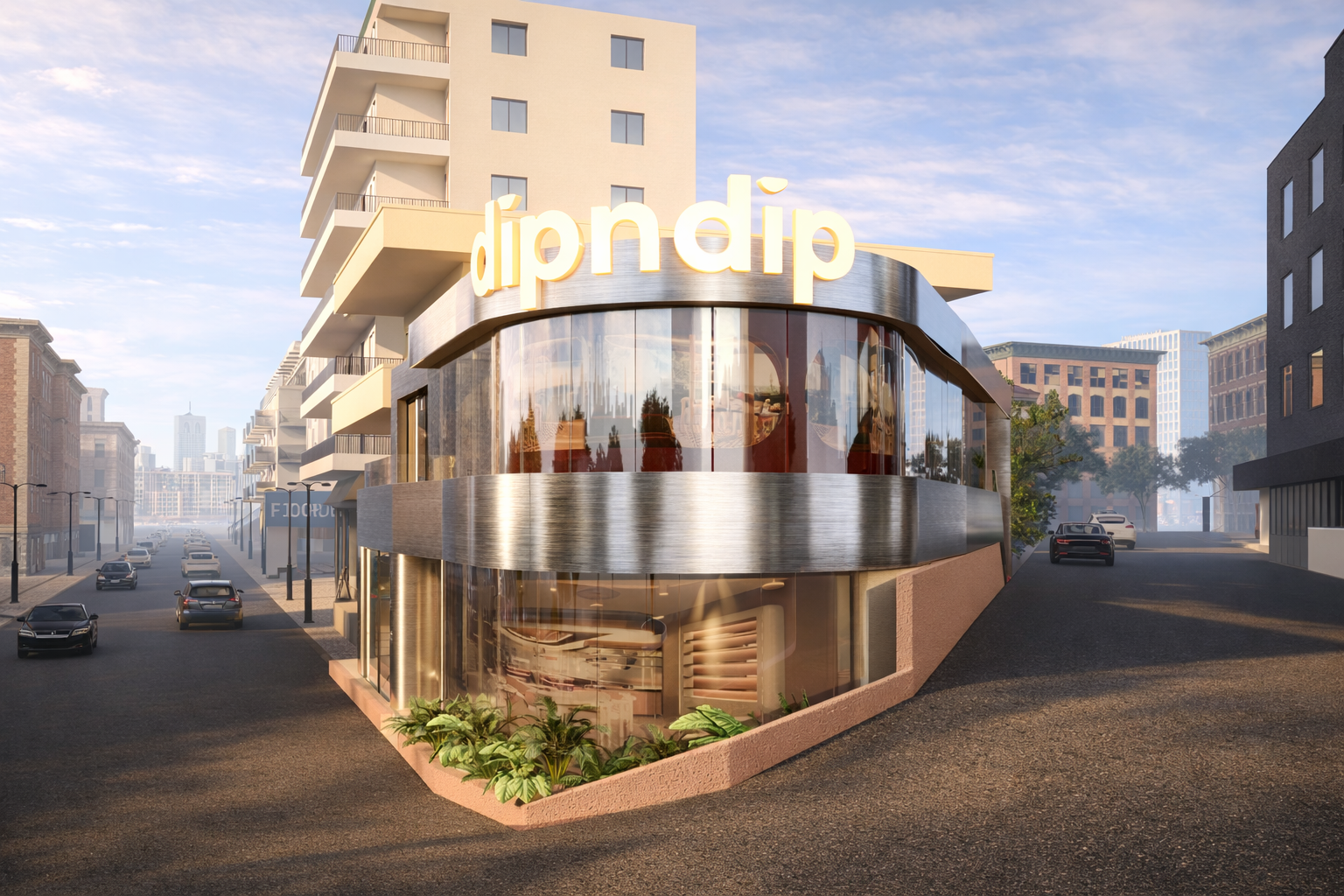
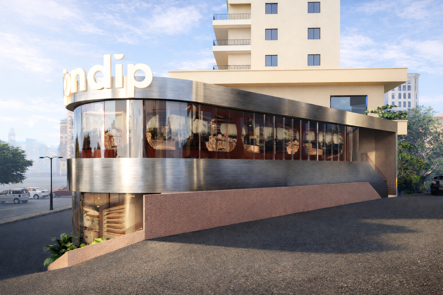
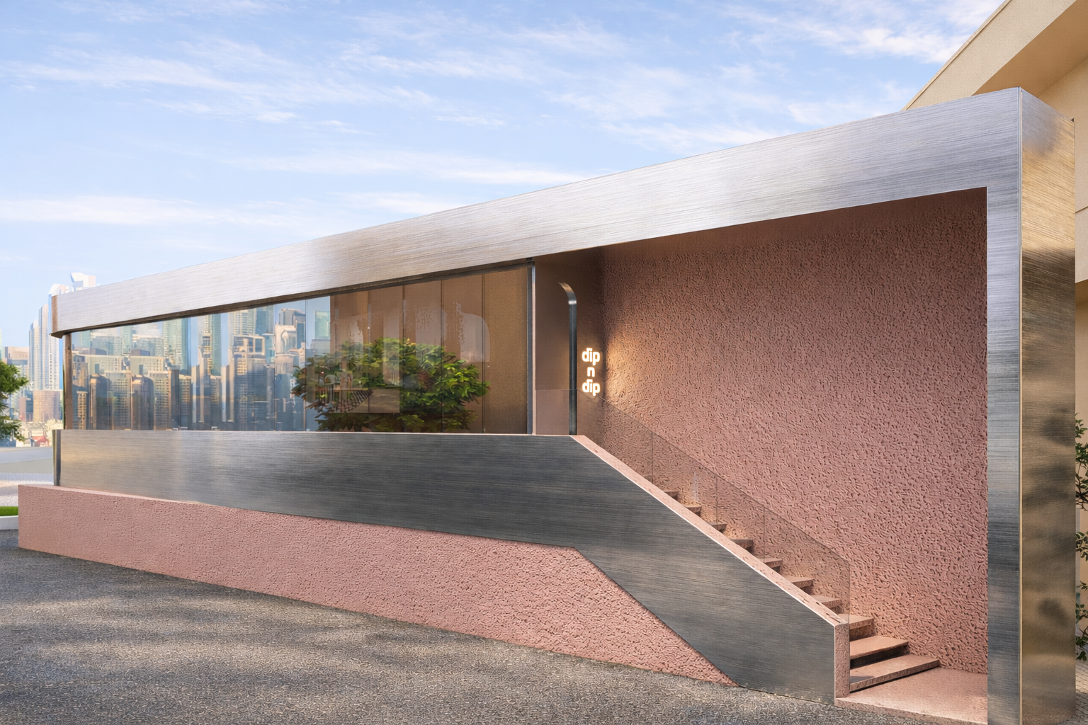
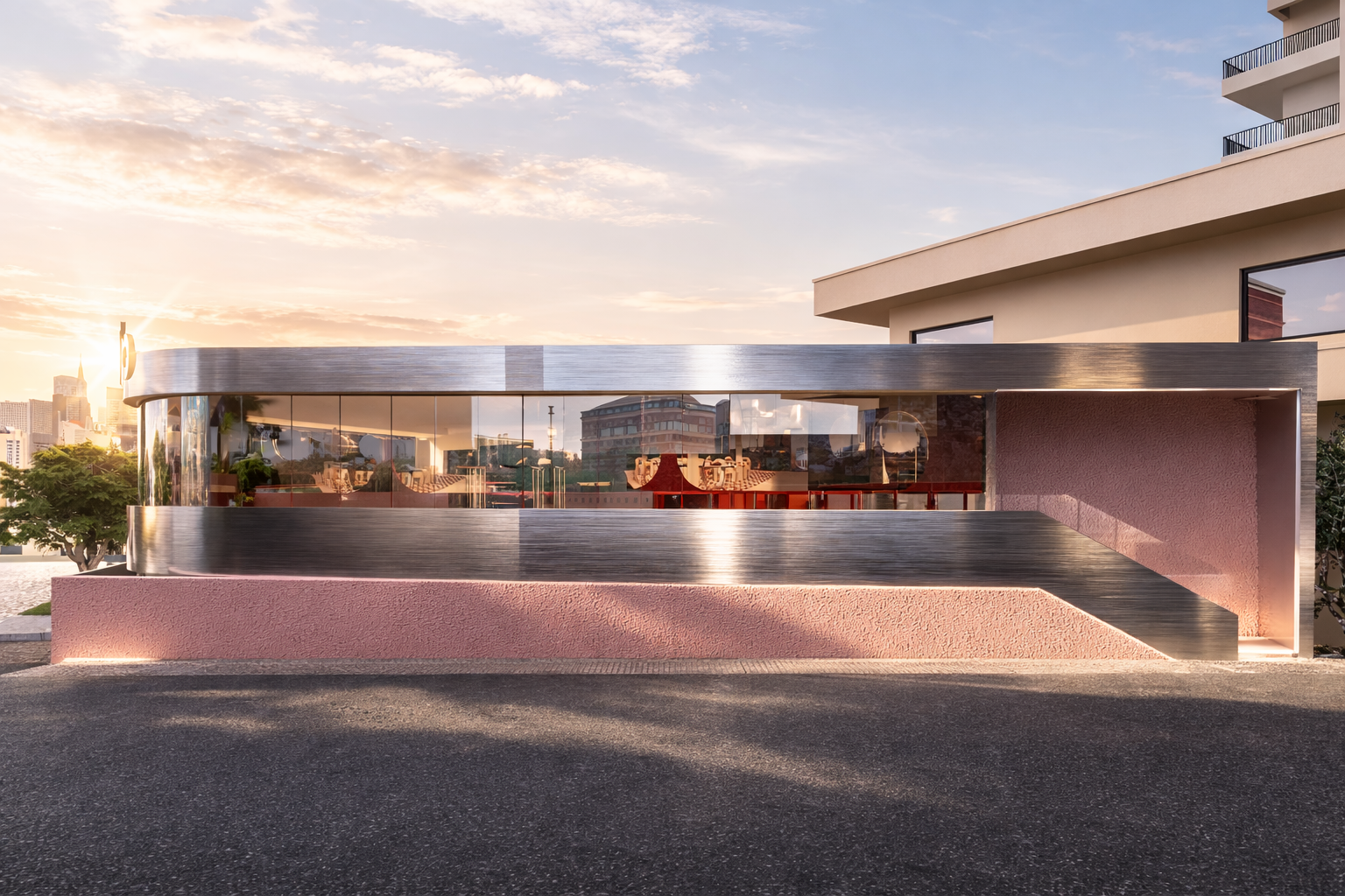
The lab concept starts on the street. Brushed stainless steel bands wrap the corner of the building in one continuous curve, framing full-height curved glazing on both levels. The illuminated Dip n Dip sign sits on top of the curve, where it can be read from both streets.
Below the steel, a base of textured pink plaster anchors the building and wraps around a planted edge at the corner. The main entrance is a pair of brushed steel doors with pill-shaped glass panels. That shape appears again inside, on the restroom doors.
Along the side of the building, the steel band steps down to follow the slope of the street. A stair set against a textured pink wall leads to a second entrance, marked with a vertical Dip n Dip sign.
After dark
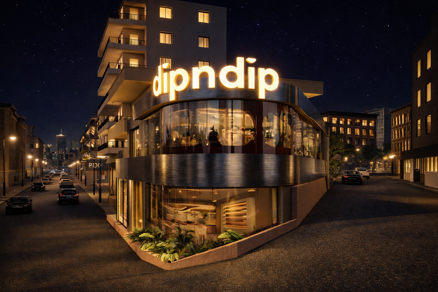
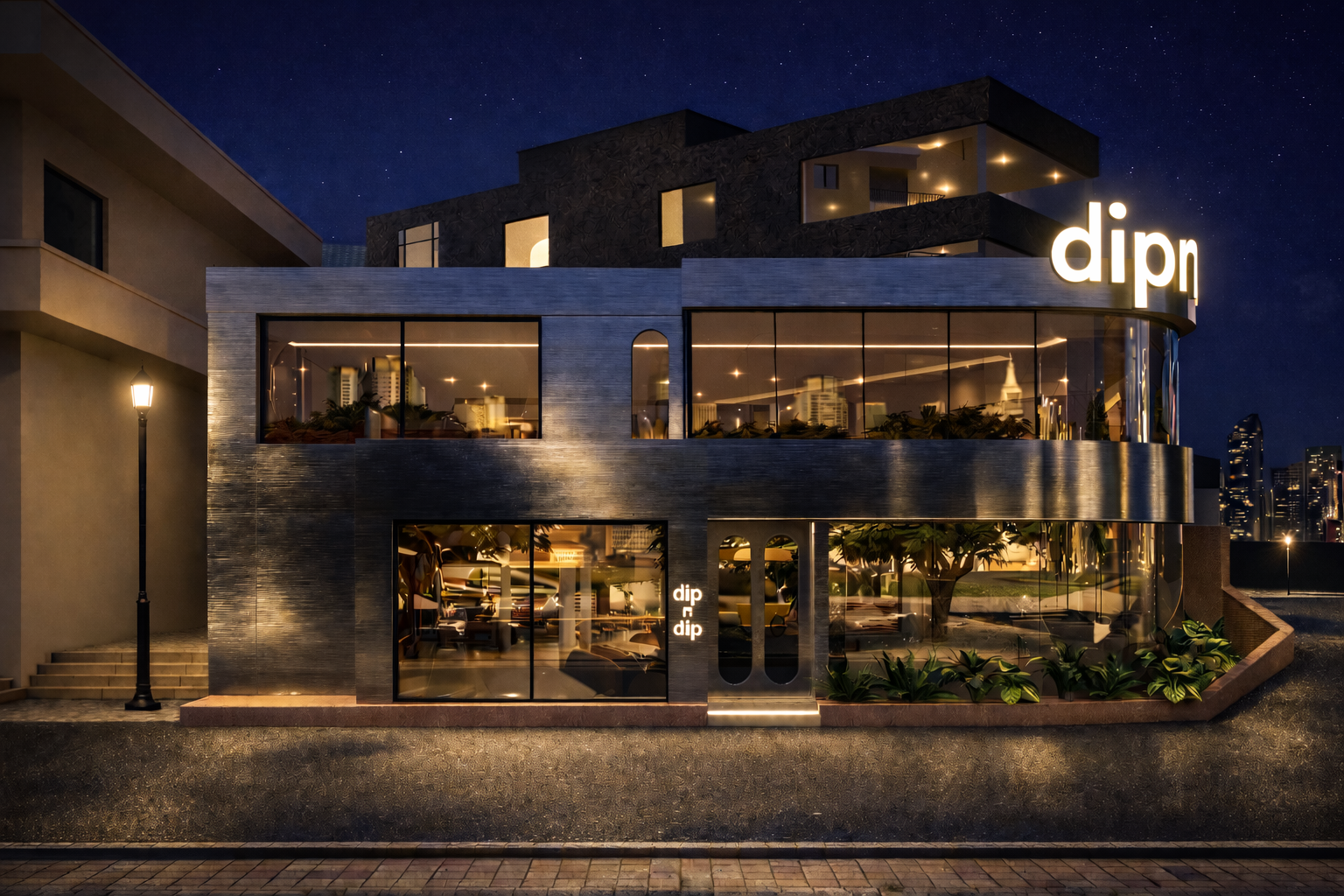
At night, the balance changes. The glazing turns the interior into the main feature of the facade, with the lit counter, the pink lines of light and the seating all visible from the street. Concealed lighting washes the textured plaster and the stair wall, and the steel picks up the glow of the sign.
The counter at the center
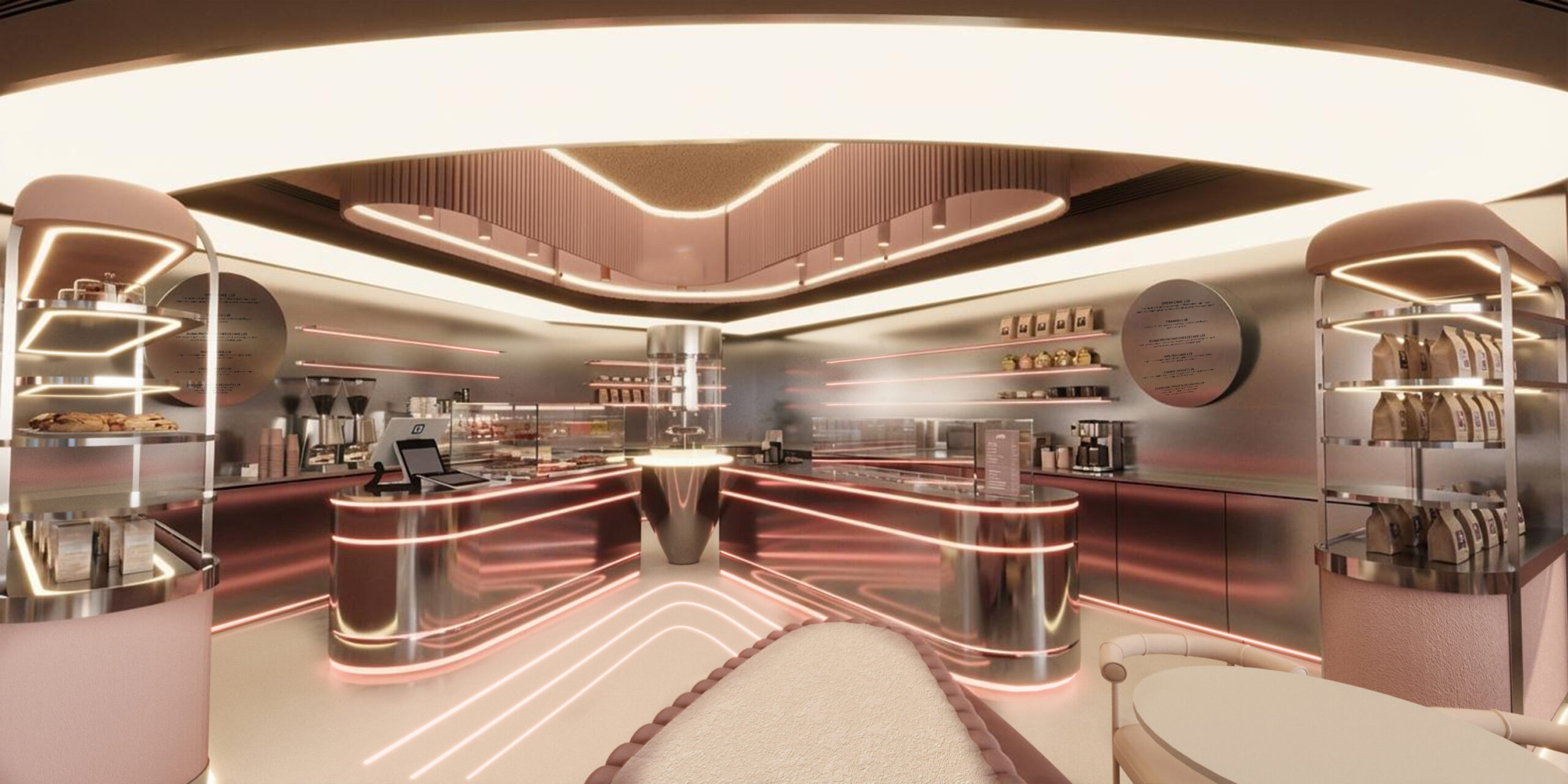
Inside, the whole ground floor is organized around the stainless steel counter. It curves around the chocolate fountain, and its polished surface is traced with horizontal lines of pink light that also run across the back wall and the floor. Every surface in this zone is steel or glass. It’s the working heart of the lab, and it sits in full view.
Overhead, a suspended ceiling repeats the shape of the counter below, with a continuous ring of light around a fluted pink core. Freestanding display towers in steel and glass stand on both sides of the counter, lit shelf by shelf, holding pastries, coffee and retail products. Round steel menu discs are mounted on the back wall.
Seating that follows the curve
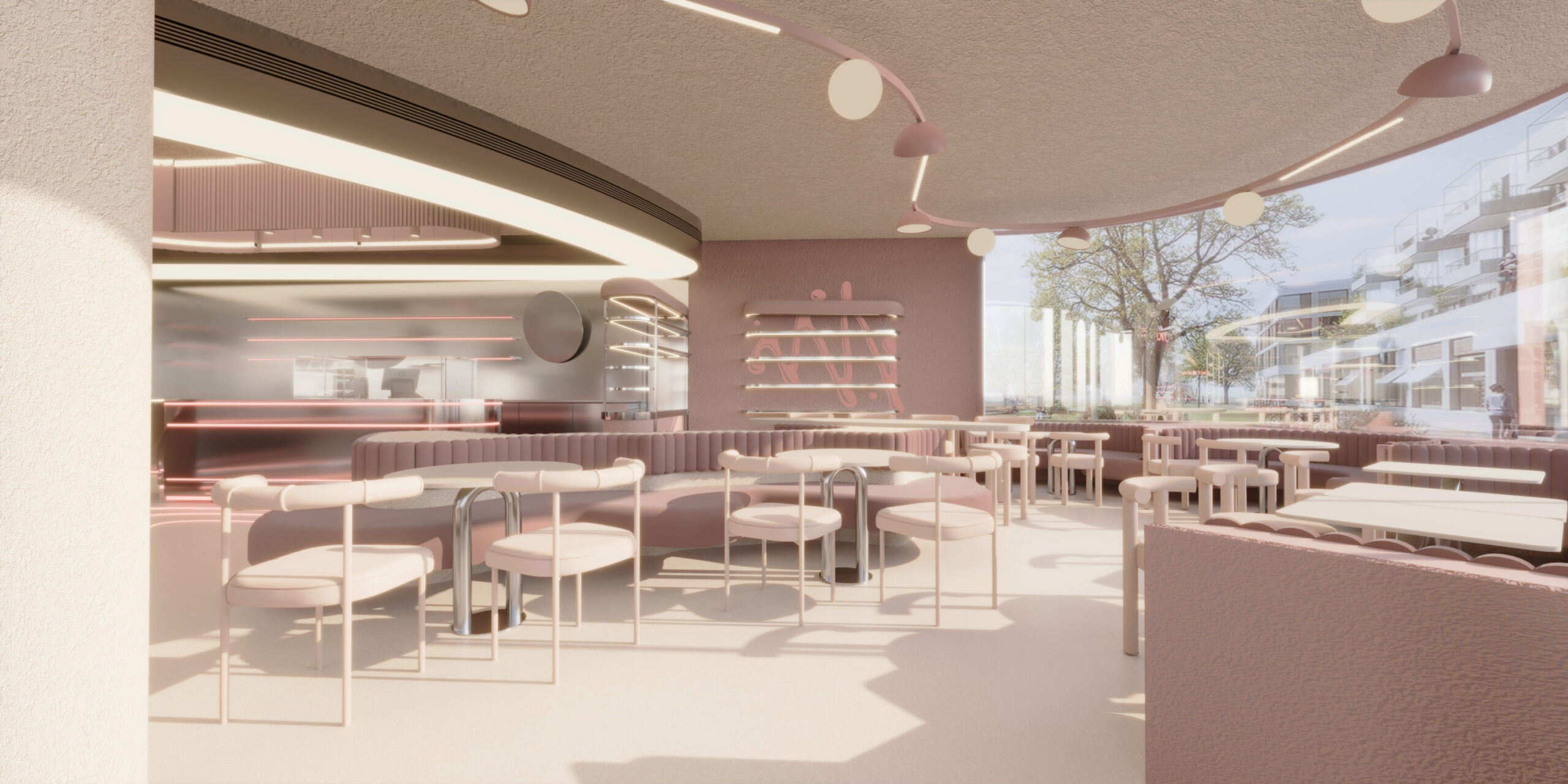
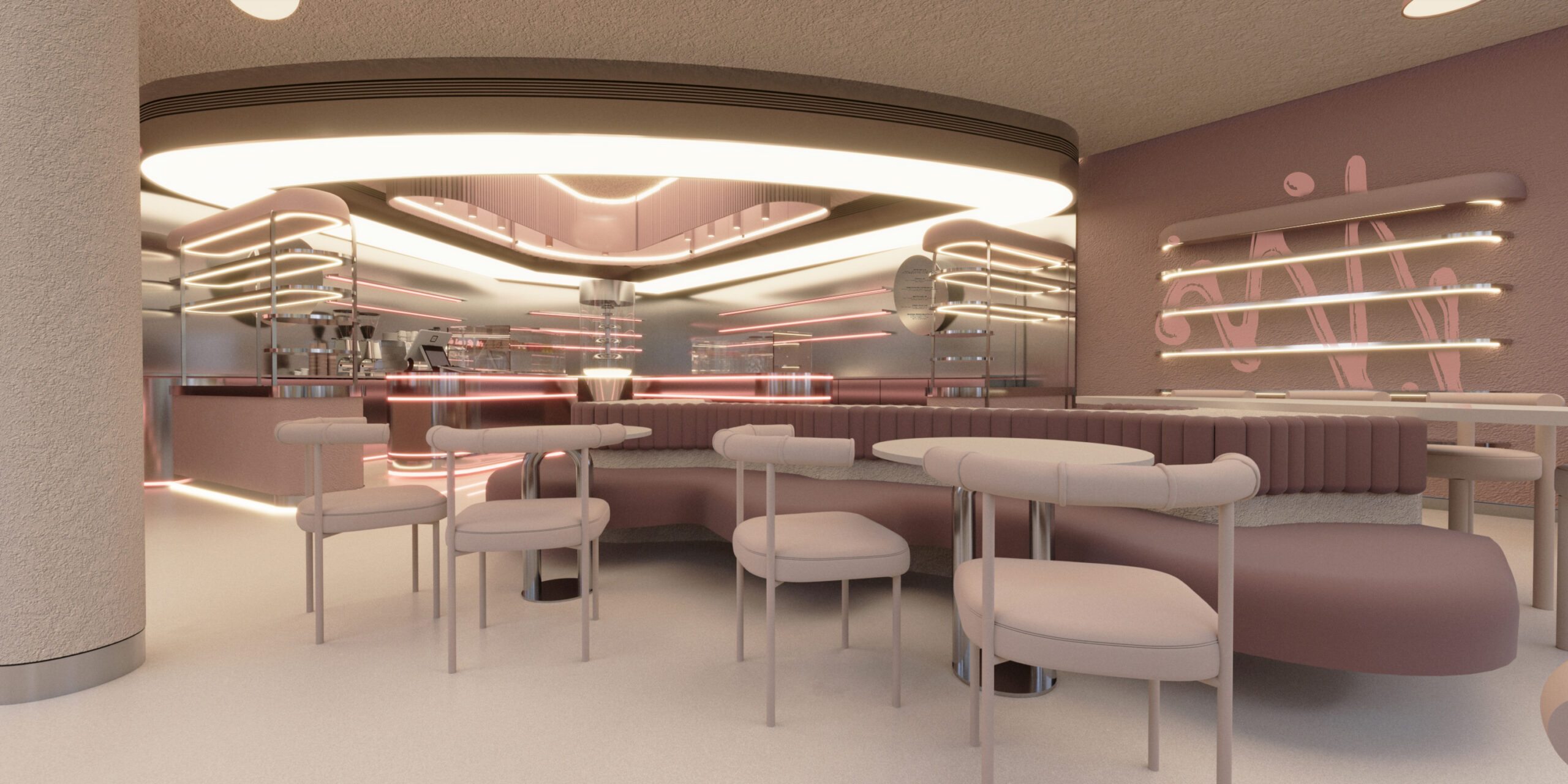
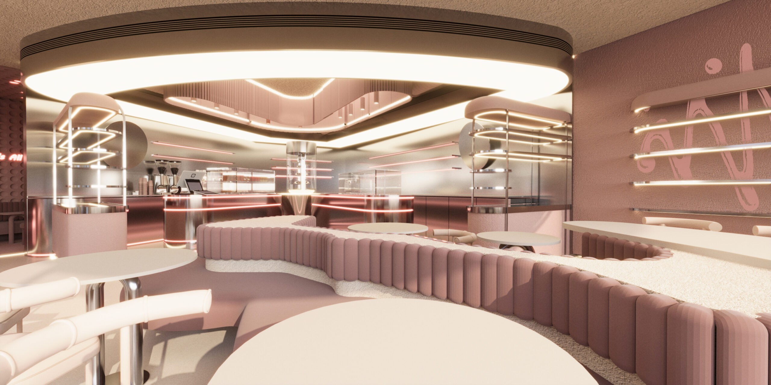
Around the counter, the dining area softens. A continuous fluted banquette in rose pink winds through the space, splitting the floor into smaller seating pockets without walls or partitions. Its top edge is finished in a textured white surface that follows the same winding line.
Around it are blush chairs with rounded tubular frames and round tables on chrome bases. The steel appears again in the table legs and bases, tying the dining area back to the counter.
Above, a pink ceiling track carries pendant lights and linear LEDs along a curving path. On the main wall, the brand’s script mark is painted large behind a set of lit steel shelves. Along the glazing, a long banquette looks out onto the street and the trees.
A room with clear zones
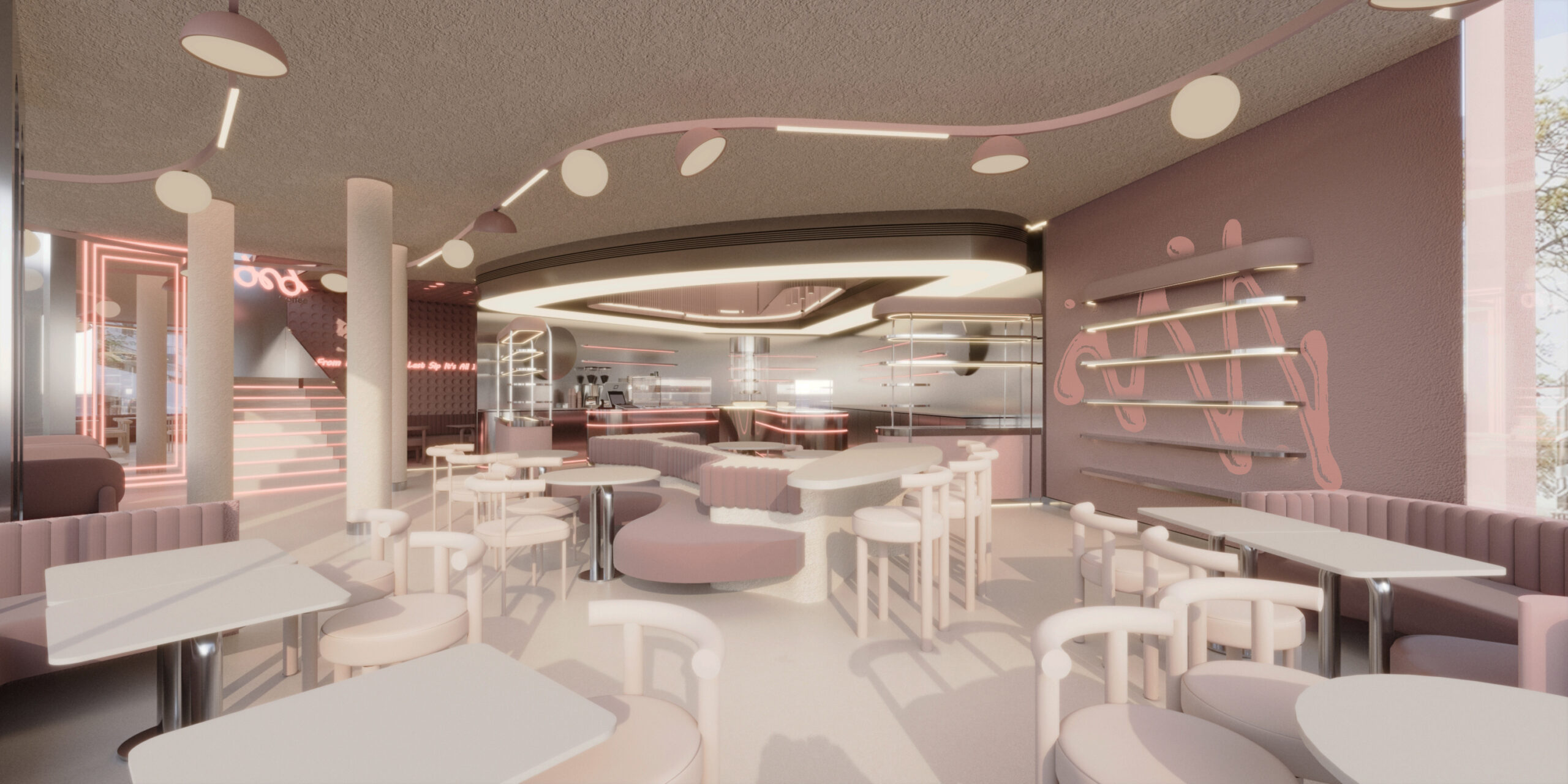
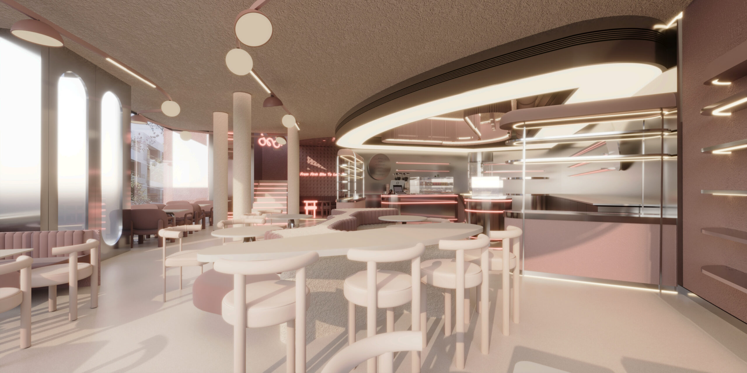
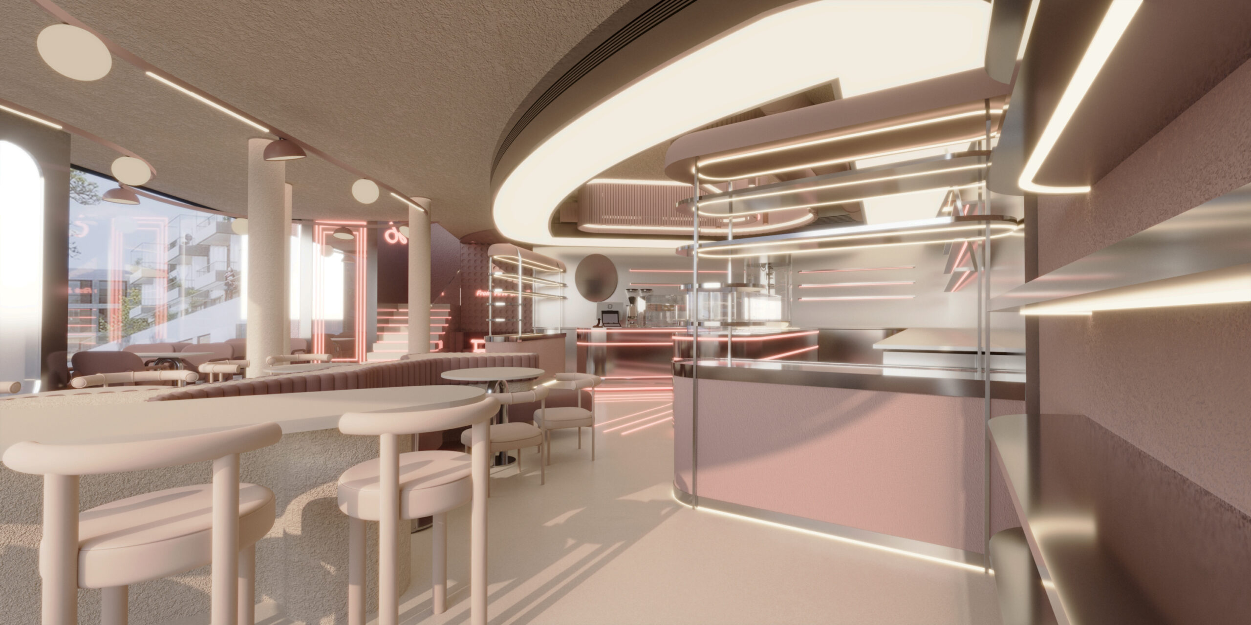
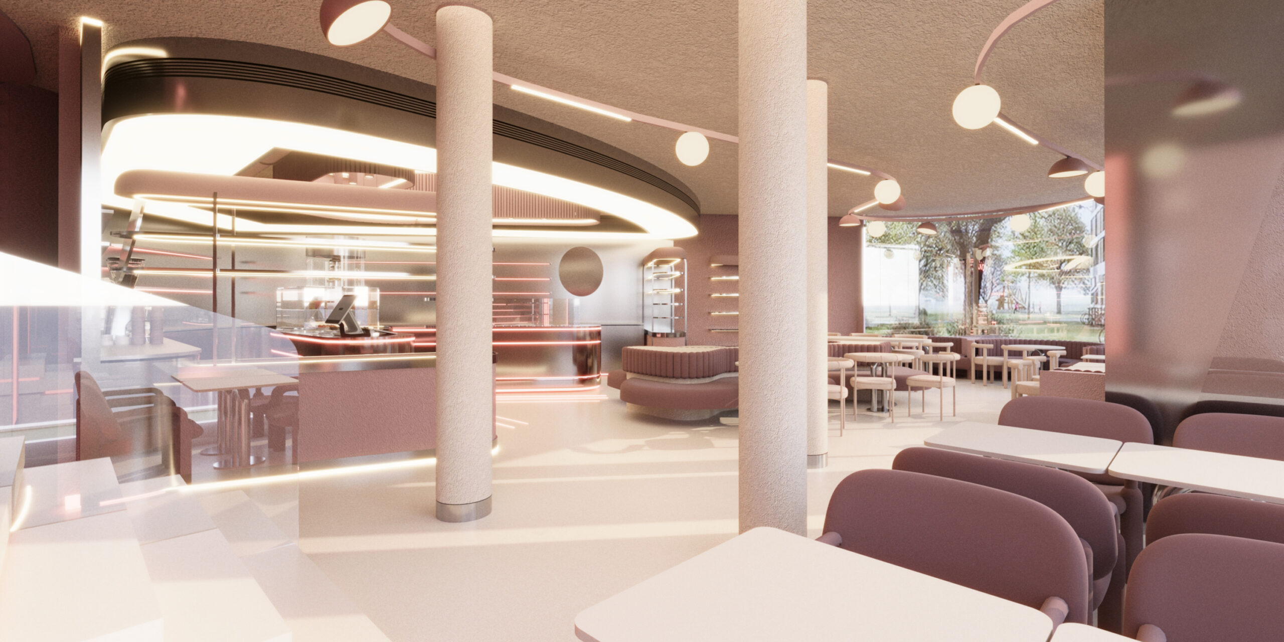
The ground floor holds several ways to sit in one open plan: high tables near the counter, banquette pockets in the middle, window seating along the glass and a long shared table with stools. Textured white columns stand in the dining area, finished with steel bases. Arched openings along one side of the facade frame the view outside.
The nook by the stairs
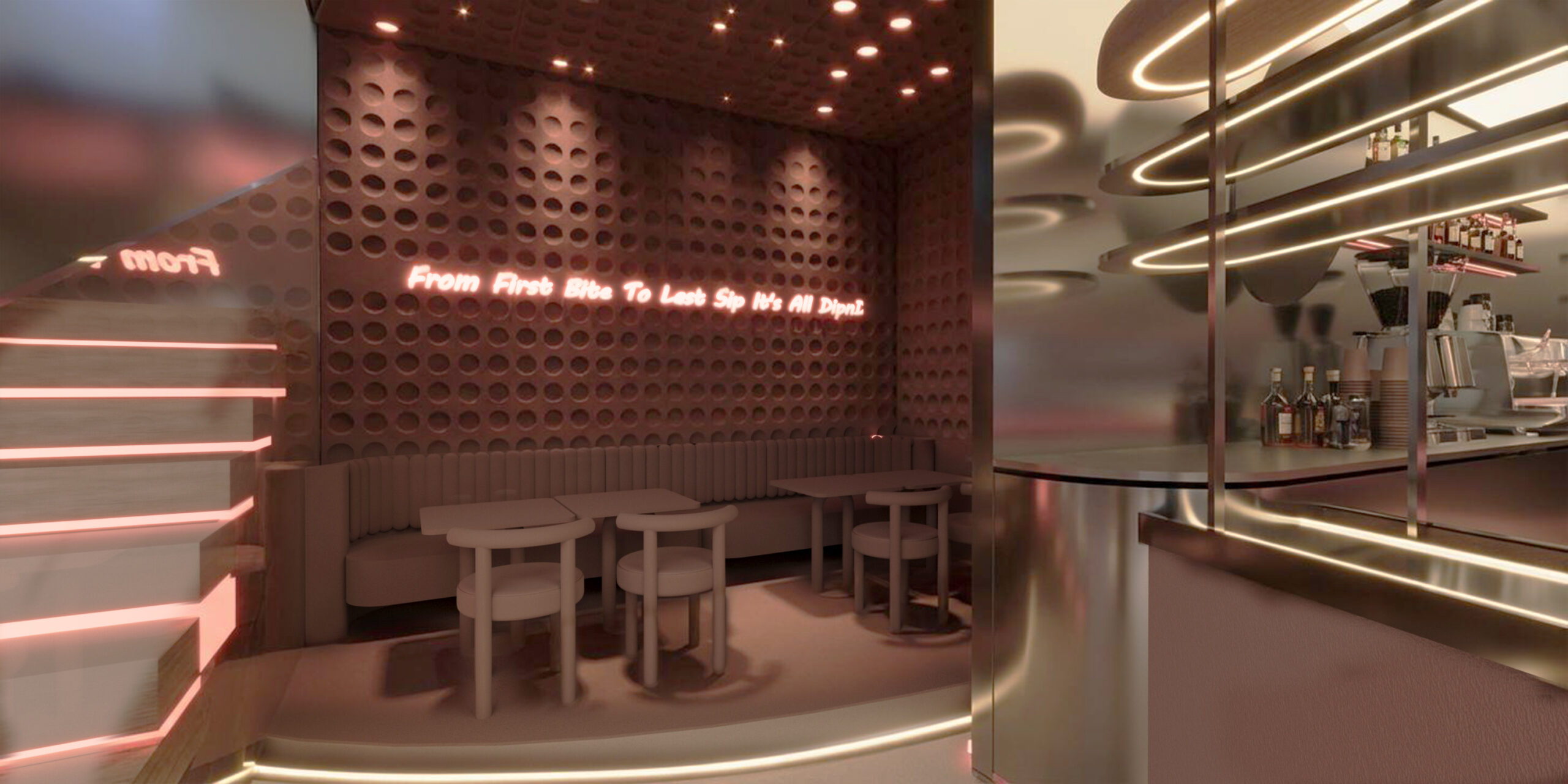
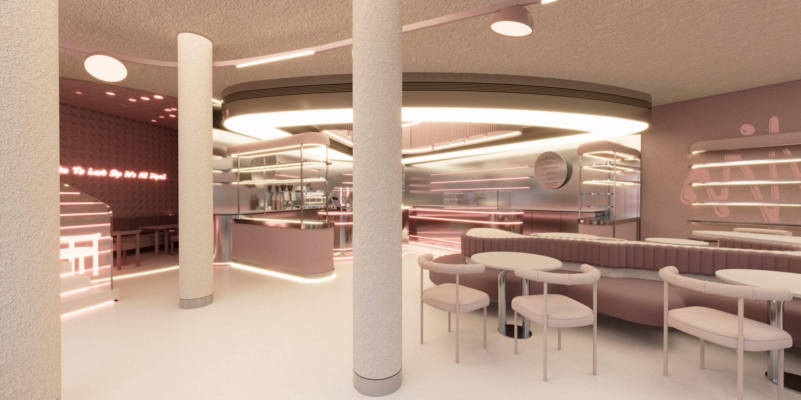
Next to the staircase is a smaller, darker seating nook. Its walls are lined with perforated circular panels, its ceiling is dotted with pinpoint lights, and a neon line runs across it: “From first bite to last sip, it’s all Dip n Dip.” The stair treads are edged in pink light, leading the way up.
Upstairs: a space to stay
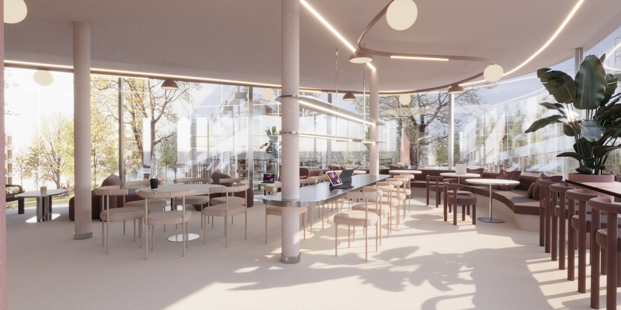
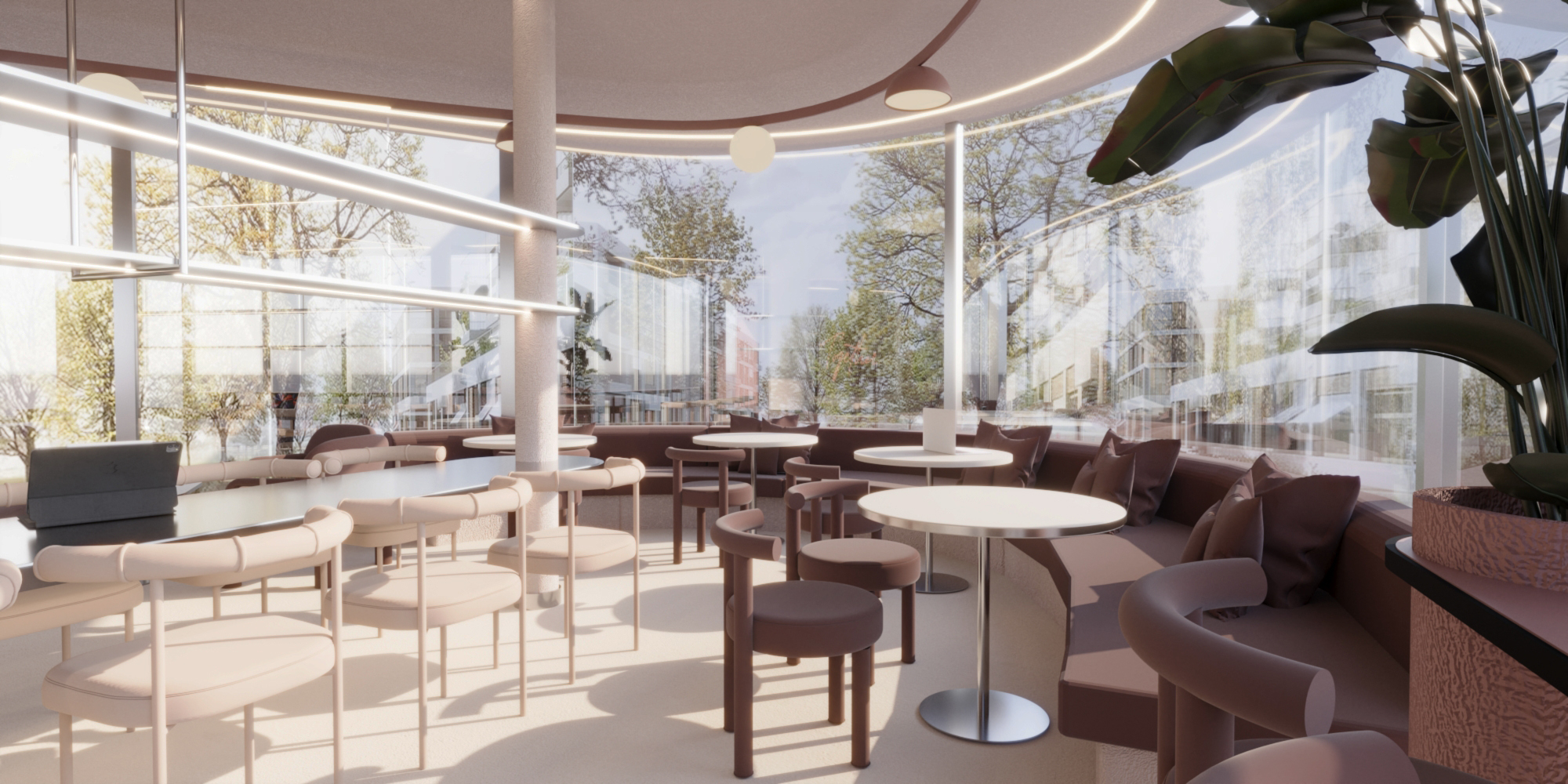
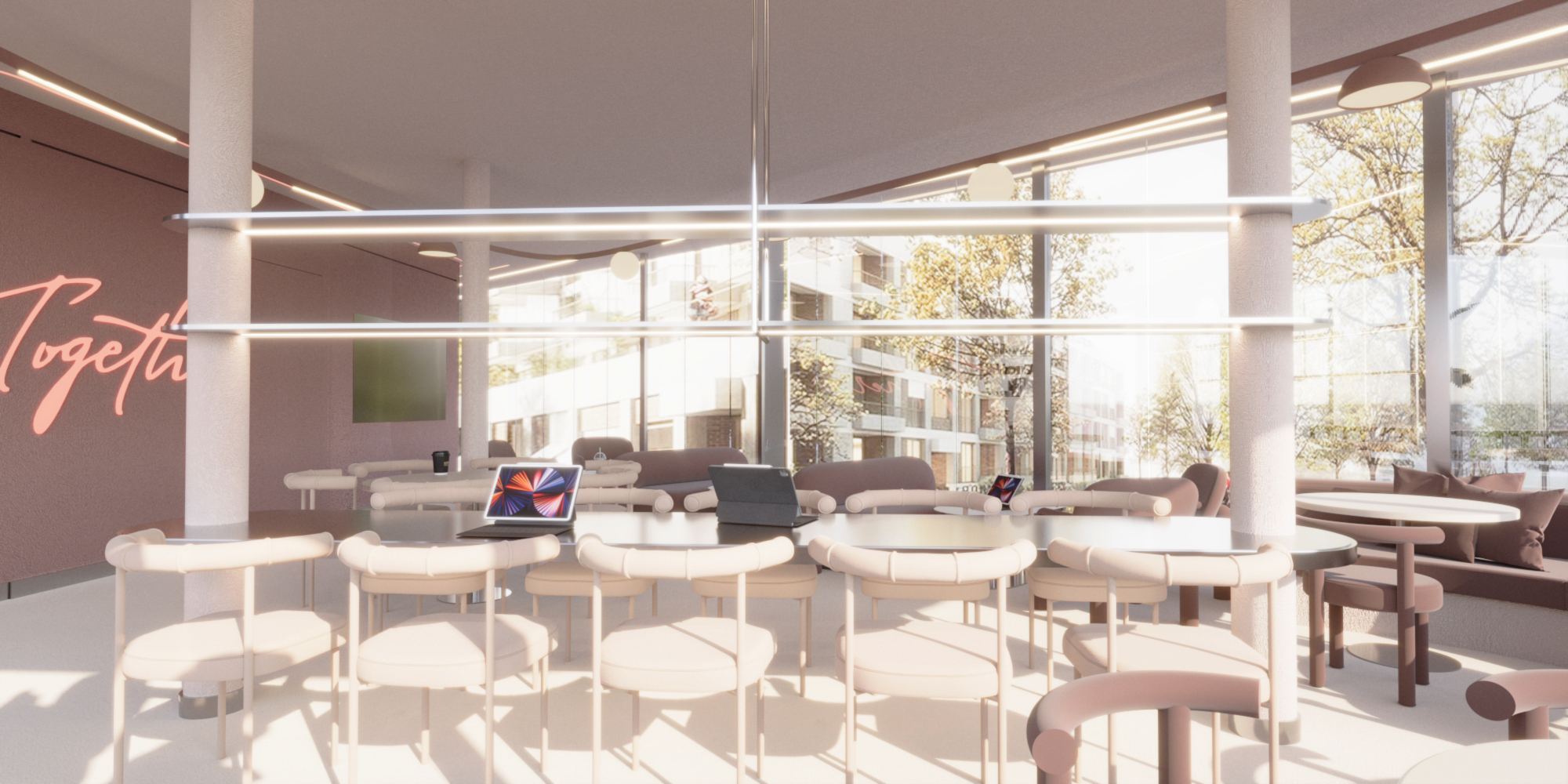
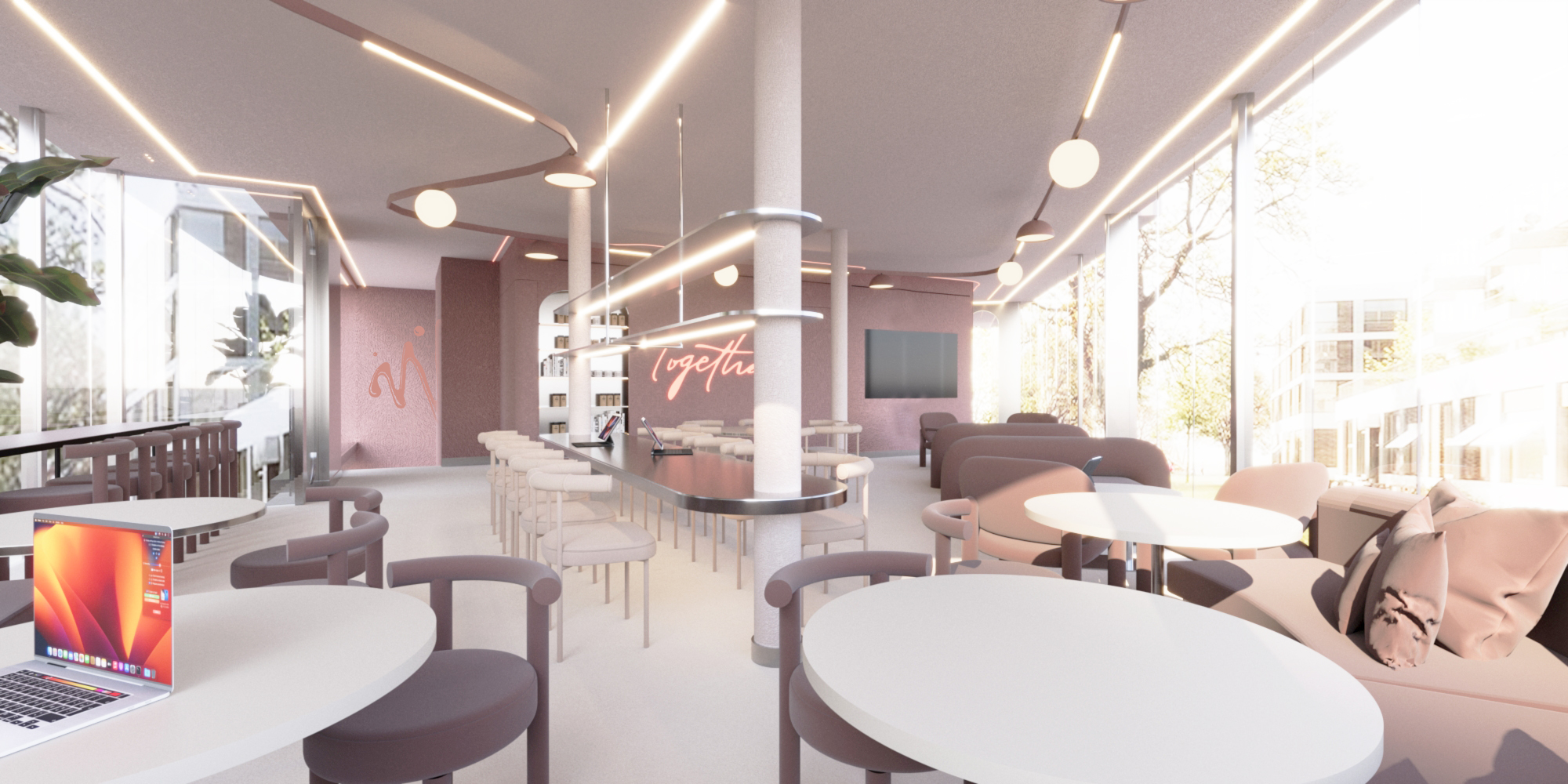
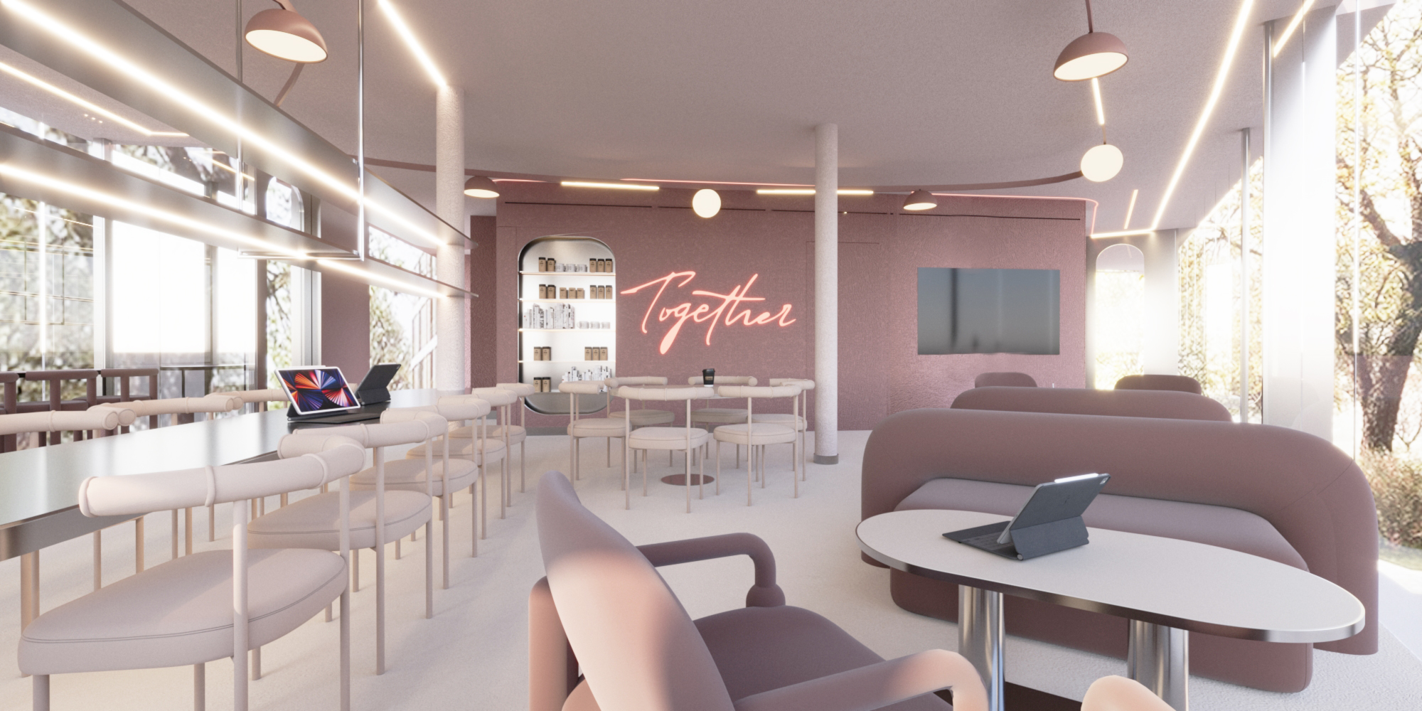
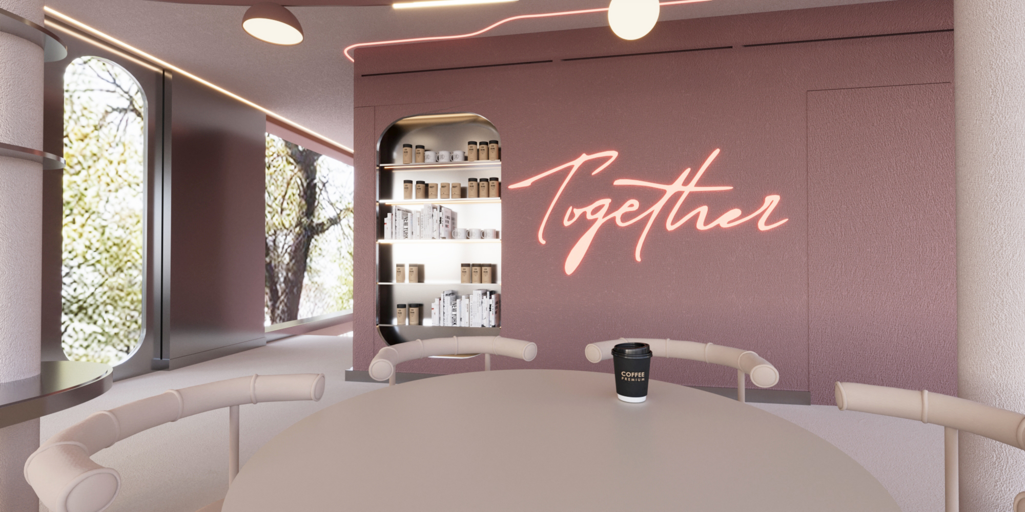
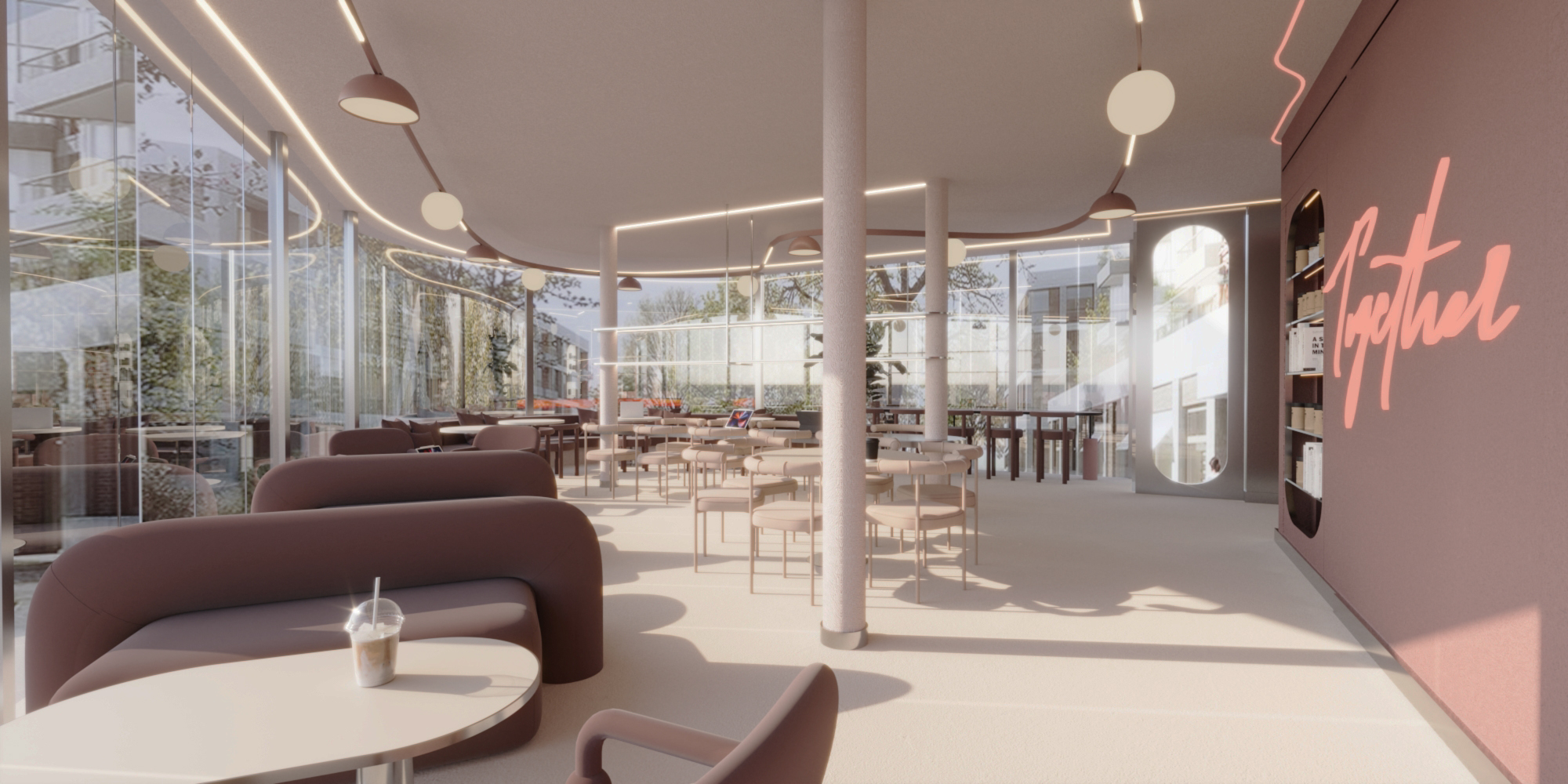
The upper level is brighter and slower. Curved, full-height glazing wraps the room and opens it onto the trees outside. A long steel communal table runs down the middle under a suspended linear light, set up for working, studying or meeting.
Around it, the seating varies: lounge sofas in deeper rose, a cushioned banquette along the glass and smaller round tables for two. On the back wall, a neon “Together” sits beside an arched niche shelved with Dip n Dip retail products and books. It sums up what this floor is for.
Down to the details
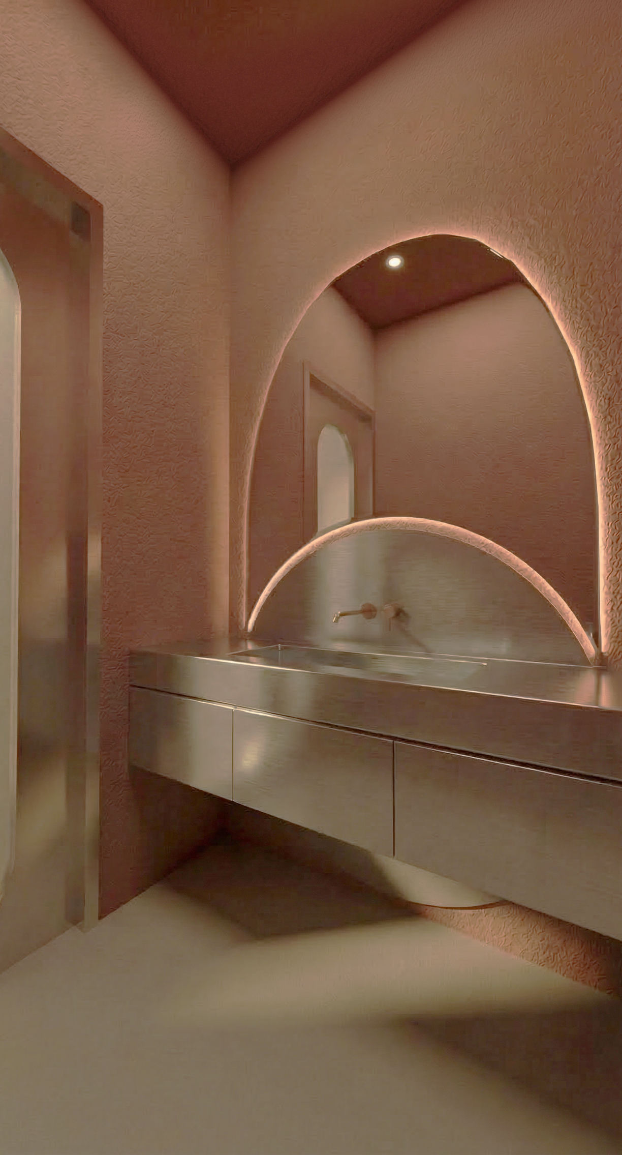
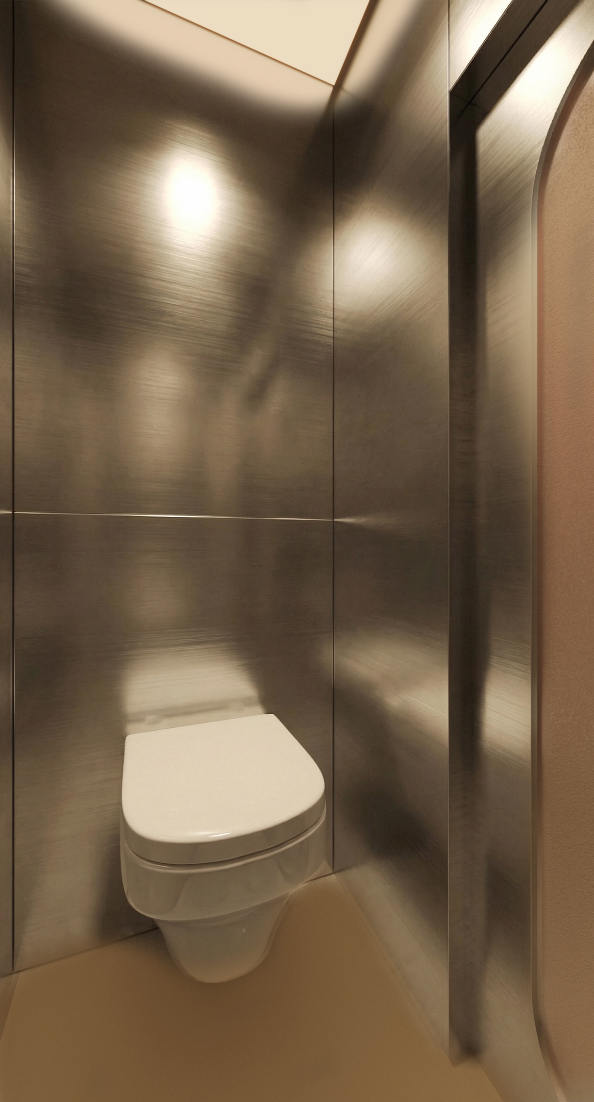
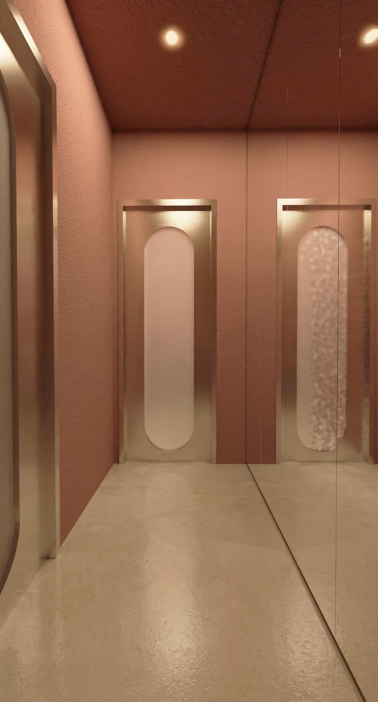
The lab concept carries through to the restrooms. The corridor is finished in textured pink plaster, with brushed steel doors carrying the same pill-shaped panels as the main entrance. Inside, an arched backlit mirror hangs above a floating stainless steel vanity with an integrated basin. The WC is fully clad in brushed steel.
Designing one identity for many markets
Designing for a franchise means designing a system as well as a space. With branches in Lebanon, Saudi Arabia, Malaysia and Libya, our job is to make sure a guest in any of them walks in and recognizes Dip n Dip straight away.
We start by defining what stays fixed in every branch:
- The concept: the chocolate lab, with the stainless steel center counter and the stainless steel chocolate fountain at the heart of each space.
- The core materials: brushed and polished stainless steel, textured pink plaster, fluted rose upholstery and warm white finishes, specified the same way in every market.
- The signature elements: lines of pink light, the brand’s script mark, the neon messaging and the pill and arch shapes on doors, mirrors and niches.
- The palette and lighting: a consistent range of pinks, whites and steel, with continuous linear and ring lighting.
Then we define what adapts. Every site comes with its own footprint, facade, climate and local context. The layout, the seating mix, the number of levels and the way the storefront meets the street are planned branch by branch.
Specifying the same materials across all markets keeps the finish, the quality and the feel consistent from one country to the next. Planning each site on its own terms makes every branch work for its location and its guests. Together, those two sides of the process give Dip n Dip one identity that works in every market.
What’s next
With Kaslik open, the chocolate lab moves to the two remaining Lebanon branches and six international branches in Saudi Arabia, Malaysia and Libya. Each one is being adapted to its location, and each stays unmistakably Dip n Dip.
Taking your brand further
Planning to franchise your brand or open in new markets? We design spaces that grow with you. That starts with a concept strong enough to be recognized anywhere, followed by a material and design system that stays consistent from one branch to the next. From there, we plan each location around its own site and market.
Get in touch and let’s talk about where your brand goes next.