They do not just eat somewhere. They decide whether a space deserves to be in their world.
There is a generation walking into restaurants right now that grew up on screens, speaks in acronyms, and has a sharper instinct for authenticity than any generation before them. Gen Z and Gen Alpha do not tolerate spaces that are trying too hard. They also do not tolerate spaces that are not trying at all. What they respond to — the only thing they consistently respond to — is a real point of view.
When the Anthony’s Diner brief came to us, the first conversation we had was not about the layout. Not about the palette. Not about seating capacity.
We talked about the people.
If you are designing for a generation that was born into visual culture, the space has to speak their language fluently. Not approximate it. Not reference it. Speak it.
The Brief: Build a Diner They Will Actually Choose
The easy version of this project was a colourful, energetic diner. Bold furniture, strong graphics, a couple of neon signs. It would have looked good in photos. It would have felt, to the people we were designing for, like an adult’s idea of what they want.
We did not want to build that.
What we wanted to build was a space with internal logic — one where every decision connects to a position, and where that position is legible to a seventeen-year-old without explanation. The concept had to be native to their world, not borrowed from it.
That required two things: a clear emotional architecture, and a language system that could carry that architecture across a franchise without losing the soul in the repetition.
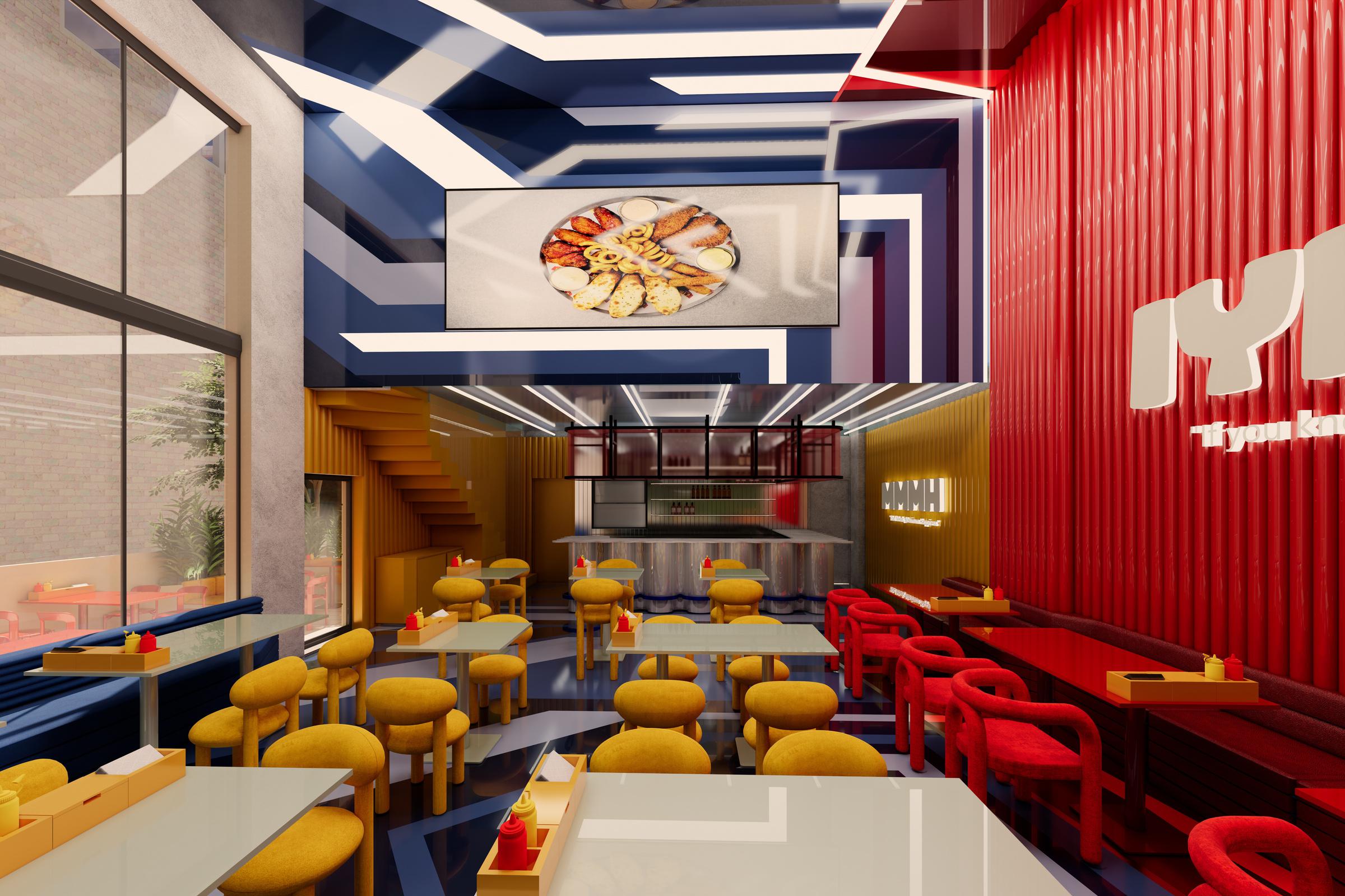
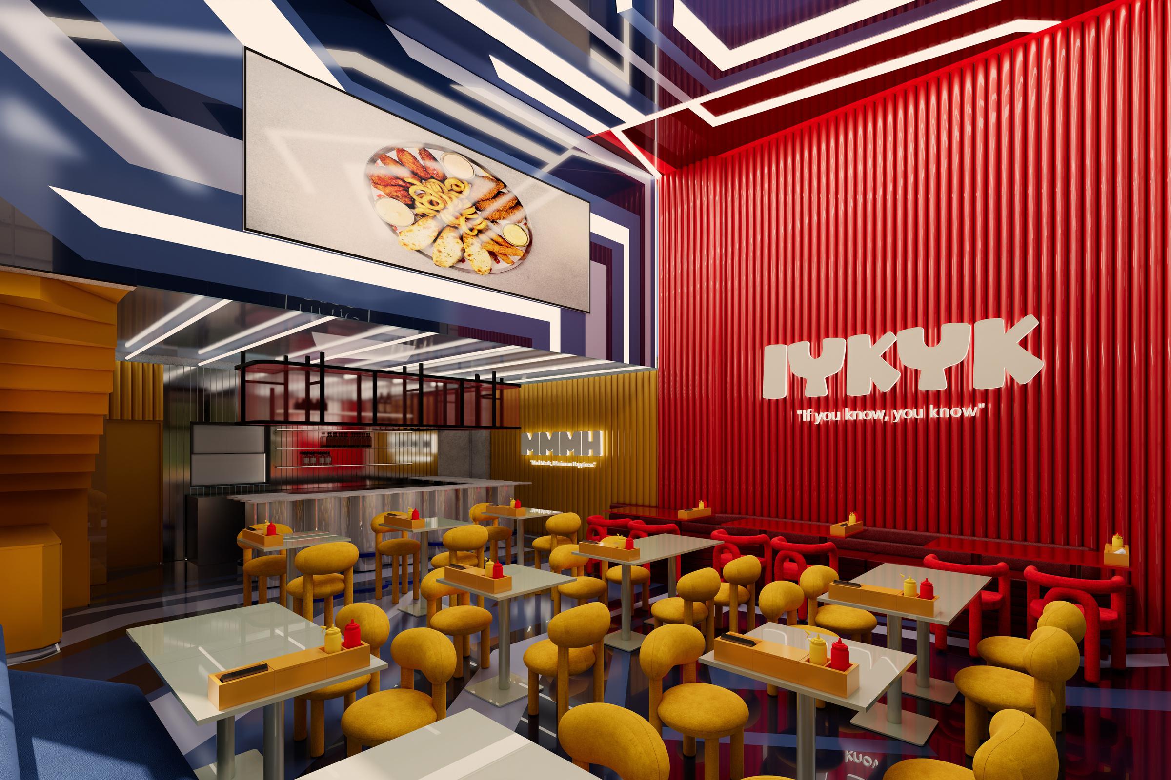
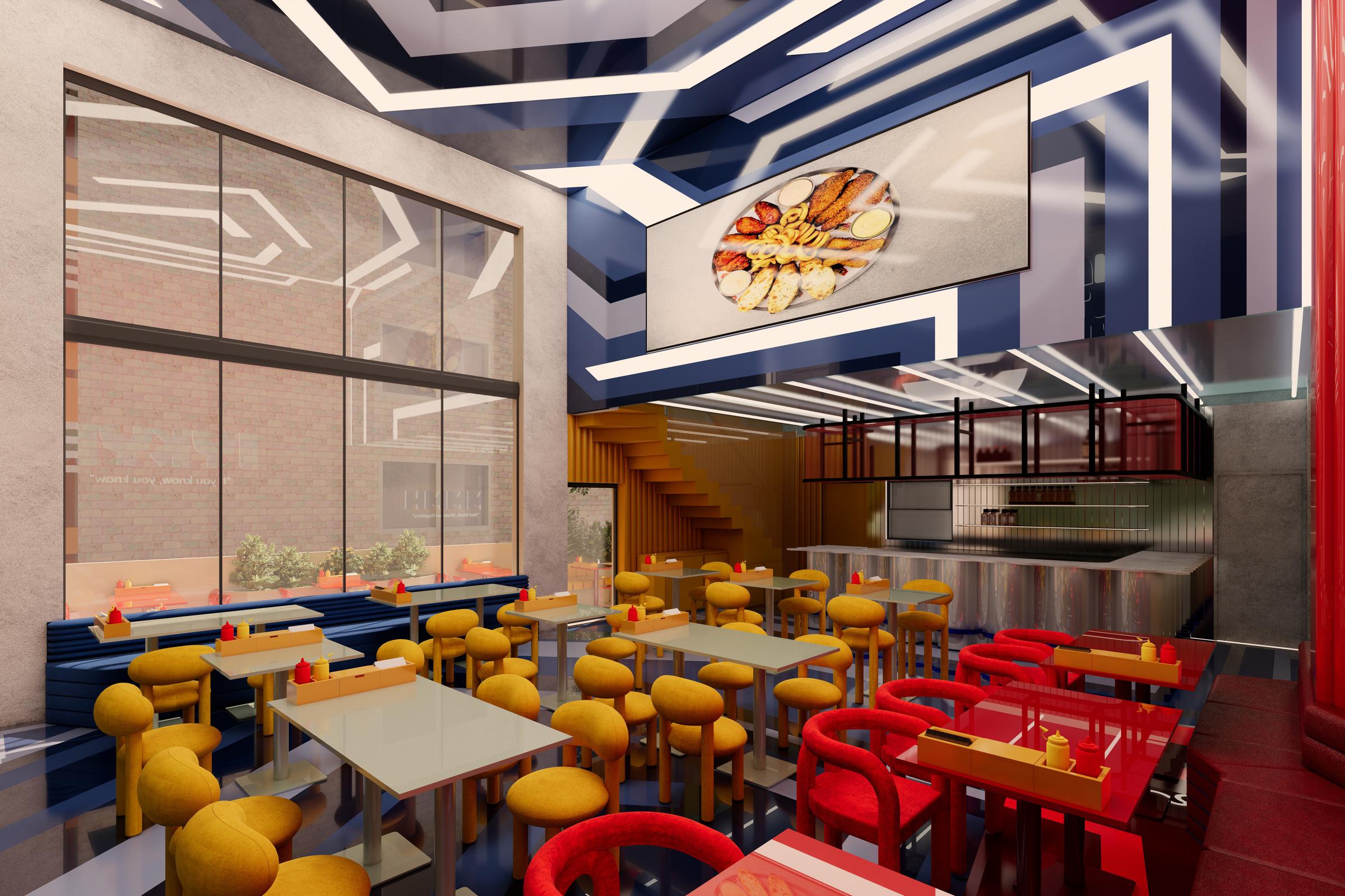
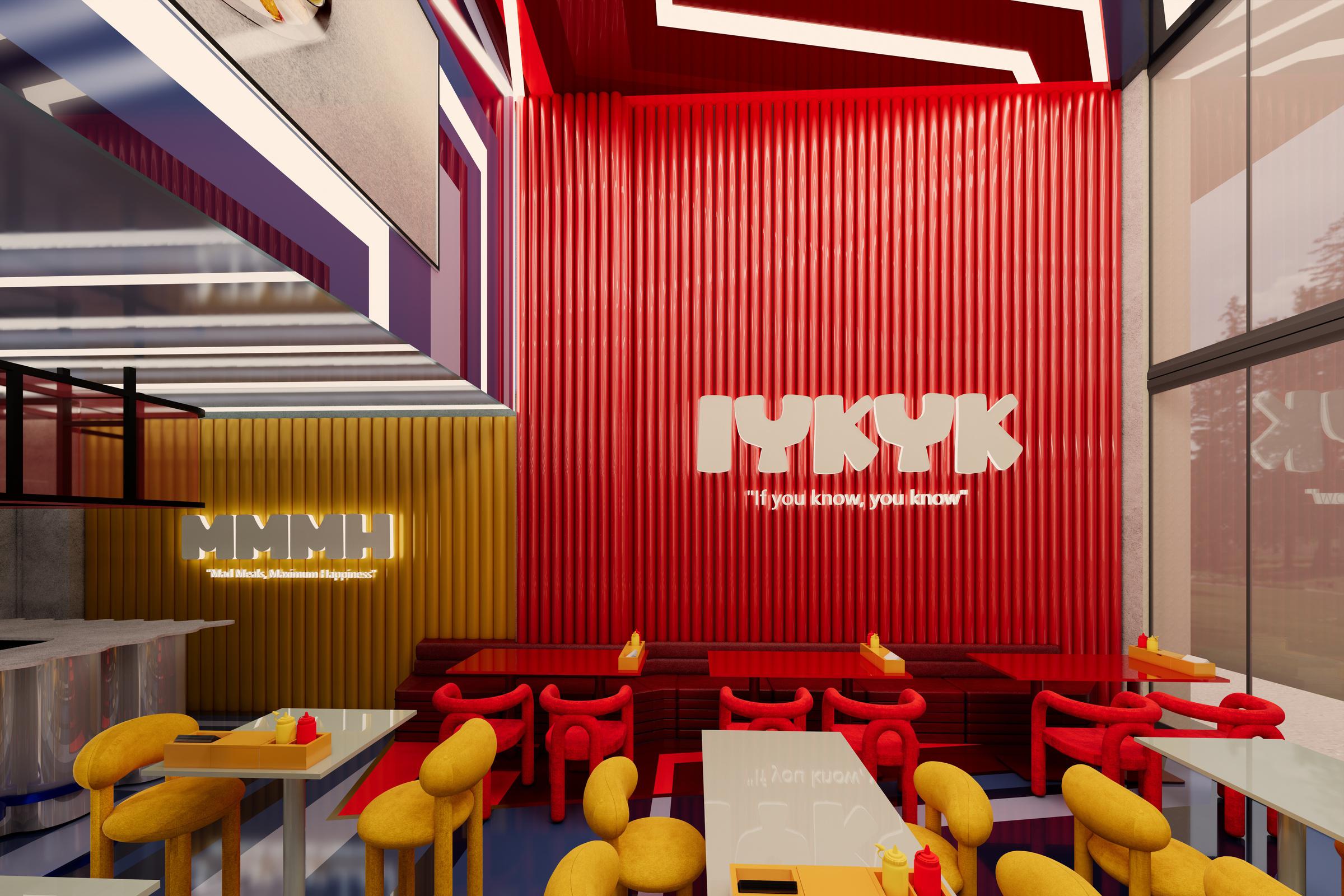
Two Zones. Two Frequencies. One Concept.
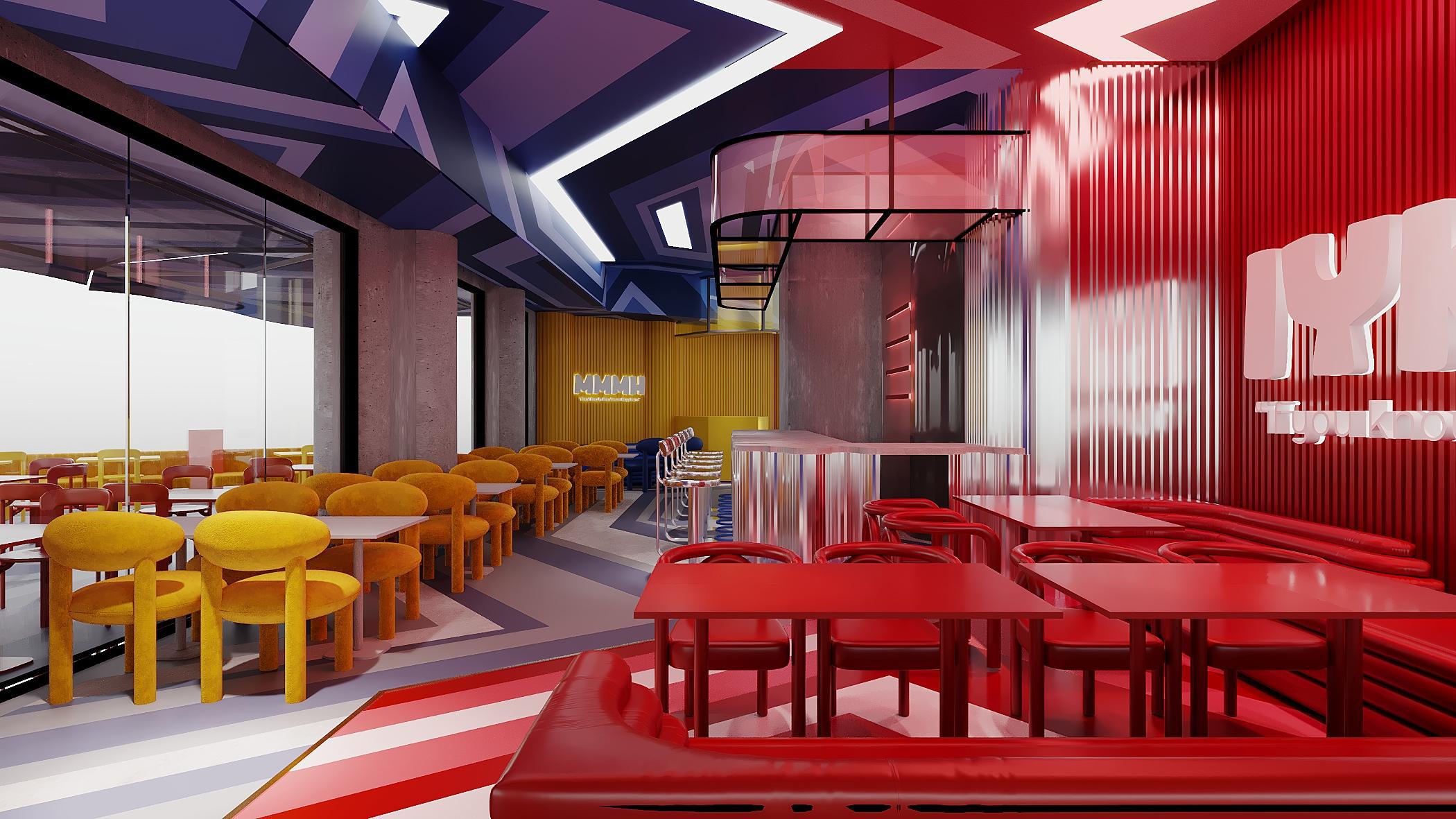
Anthony’s Diner is built around two emotional states, each given its own zone, its own name, and its own complete visual world.
Anthony’s Diner is built around two emotional states, each given its own zone, its own name, and its own complete visual world.
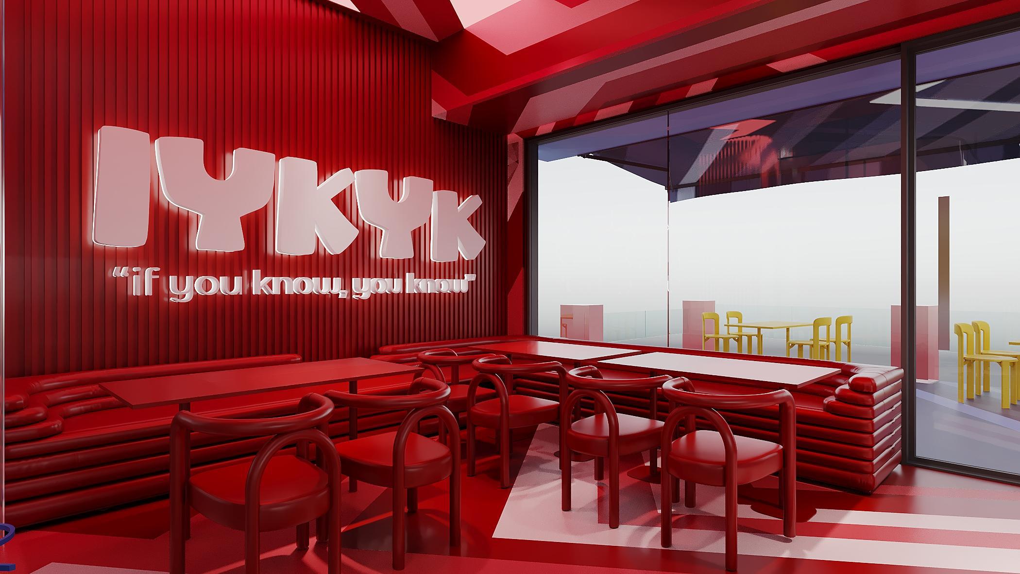
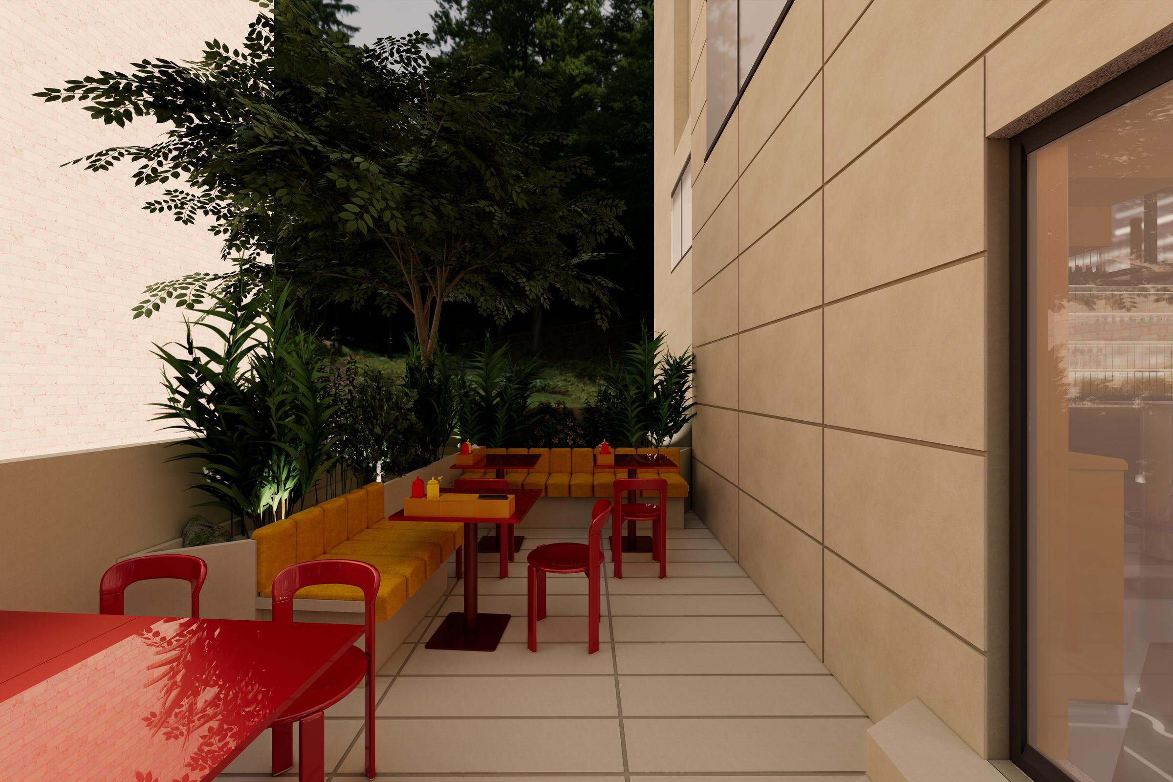
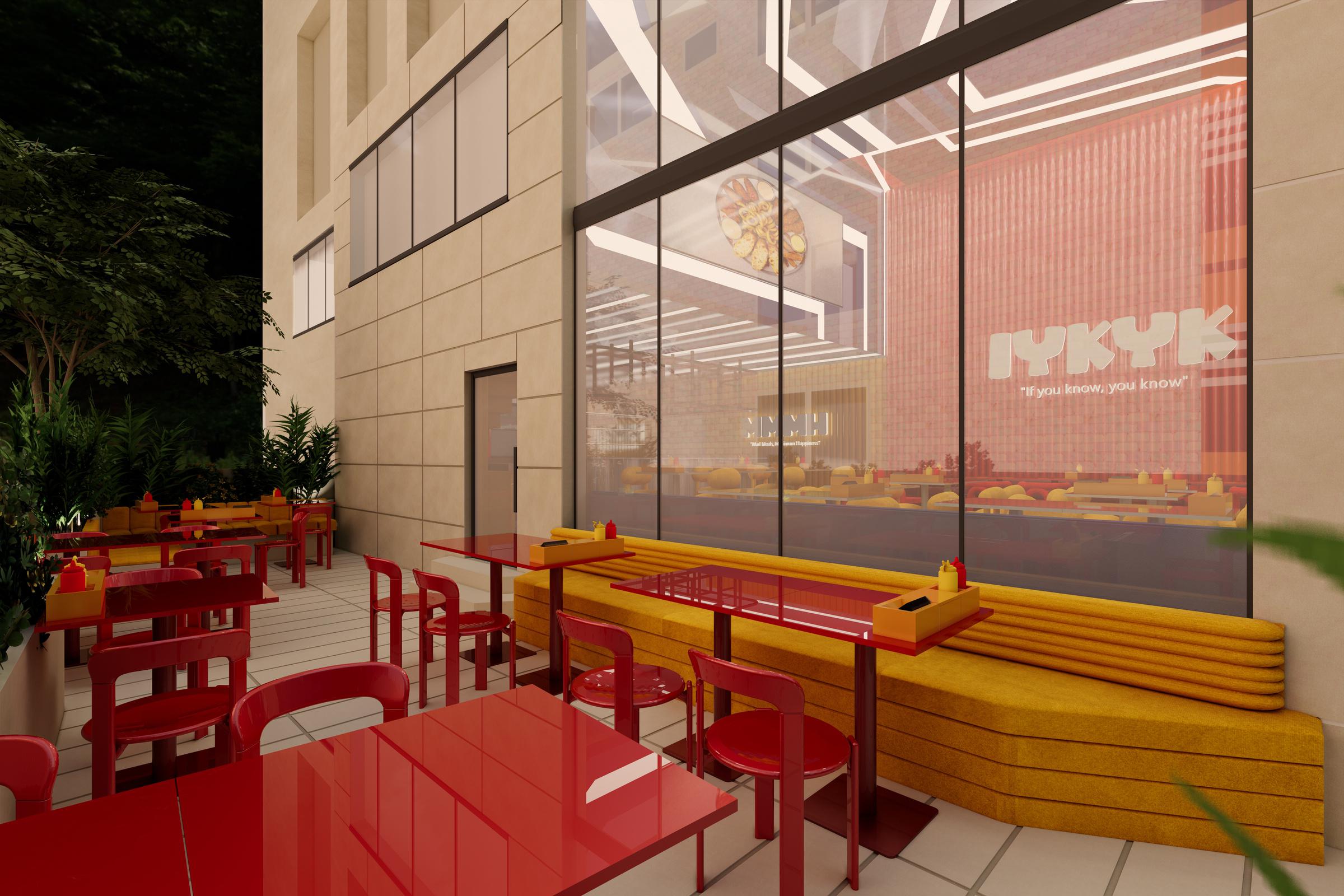
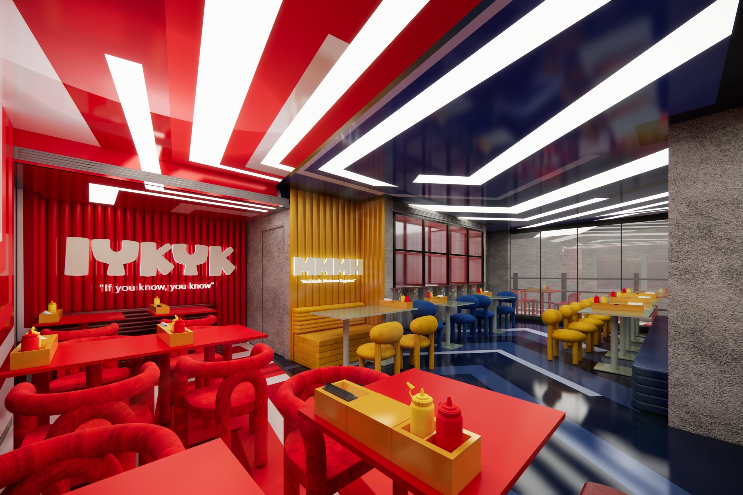
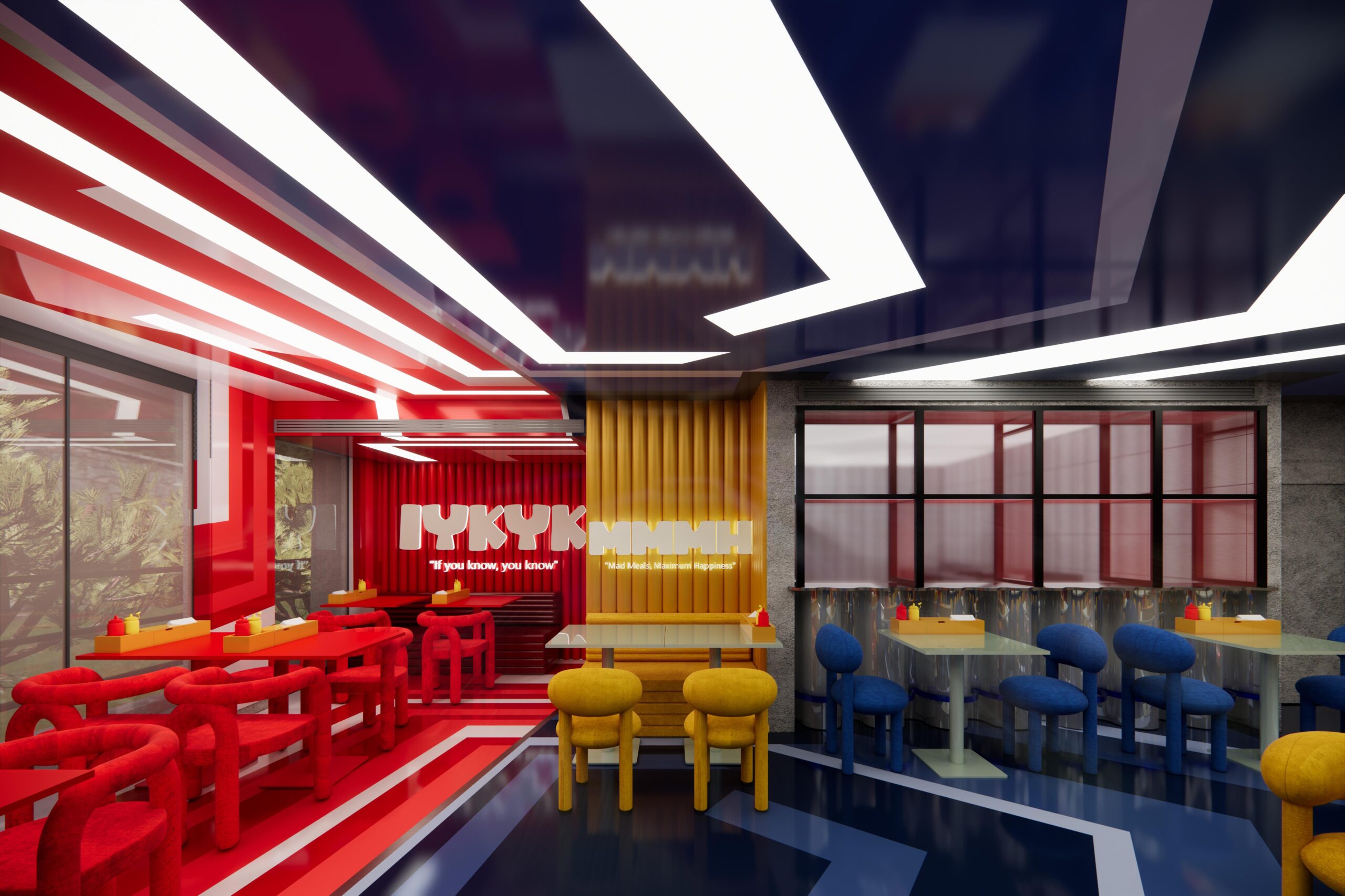
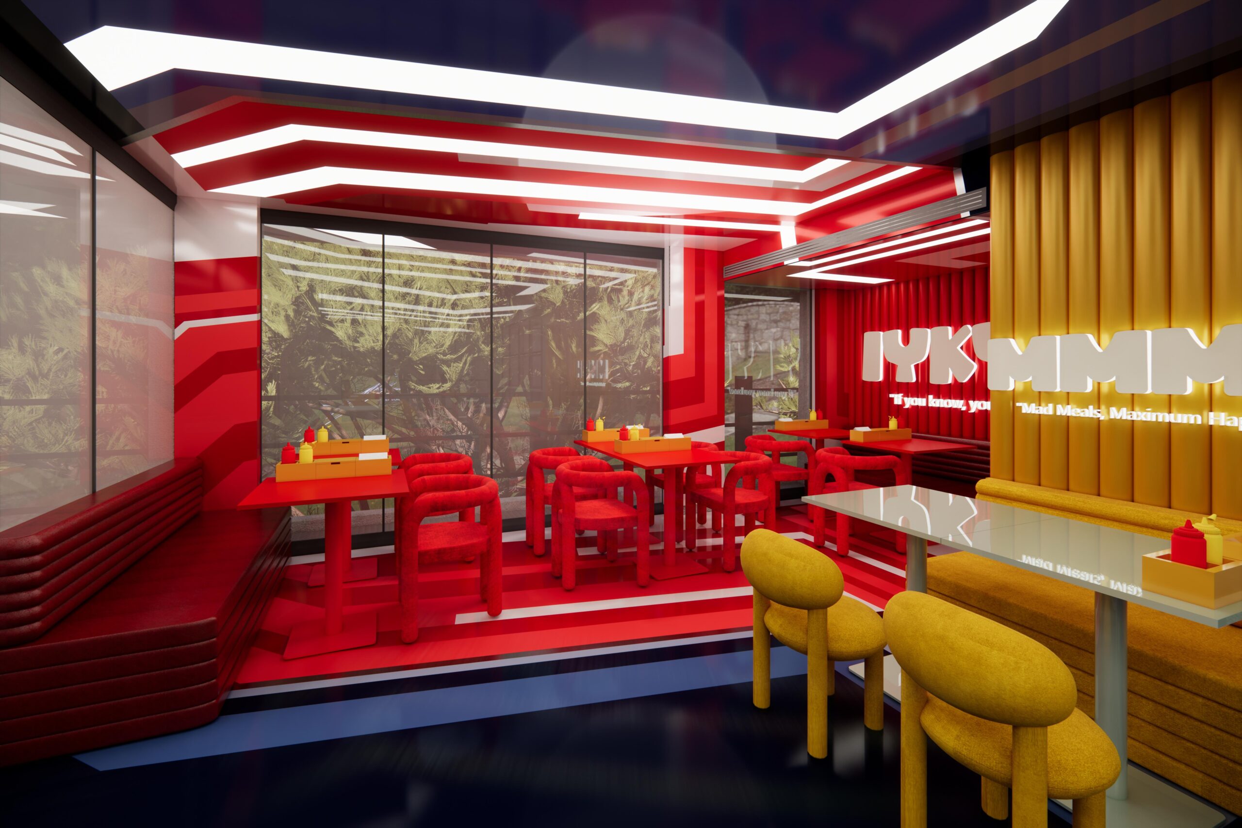
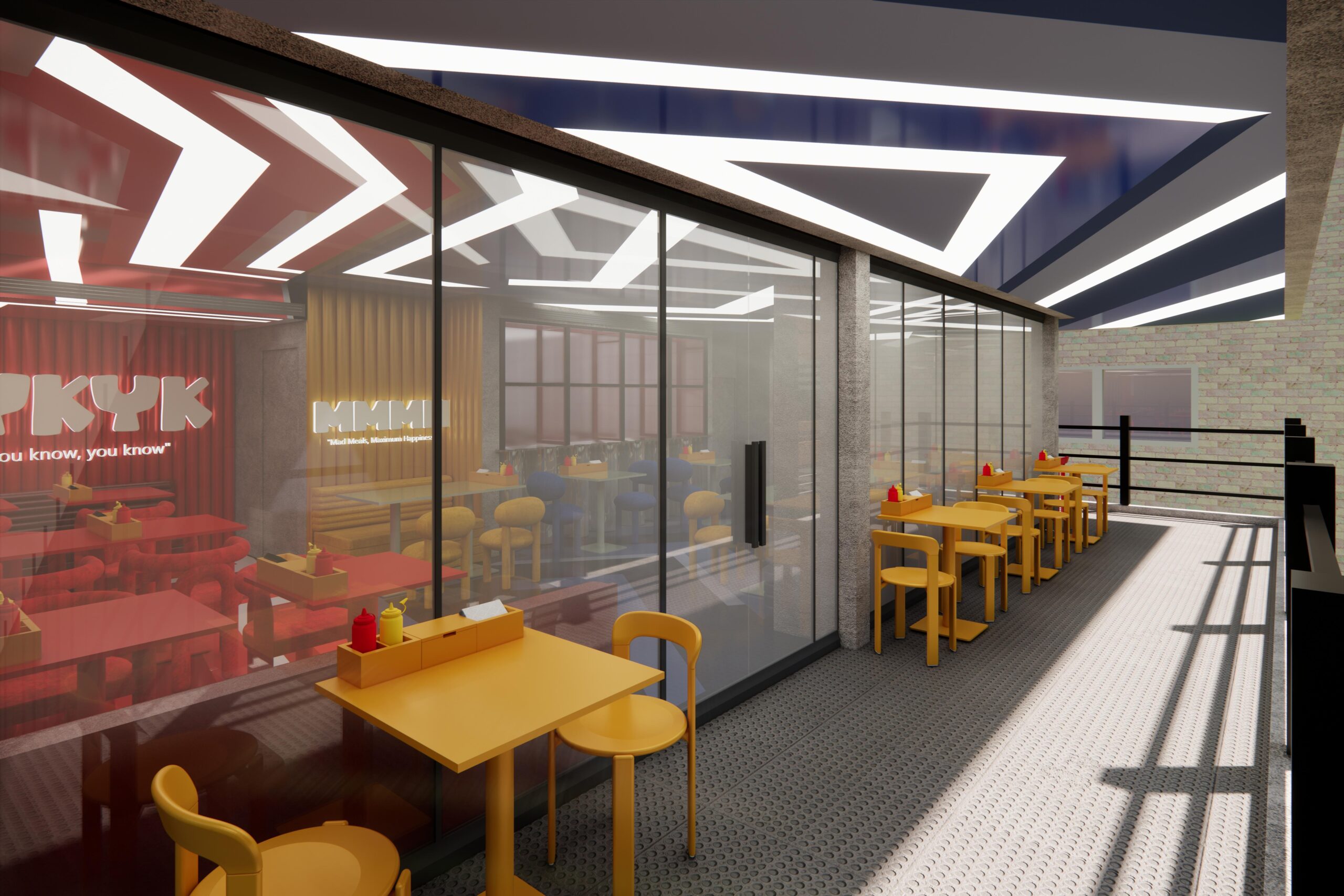
The first is IYKYK — “if you know, you know.” The insider register. The energy of a place worth discovering. A space that does not explain itself.
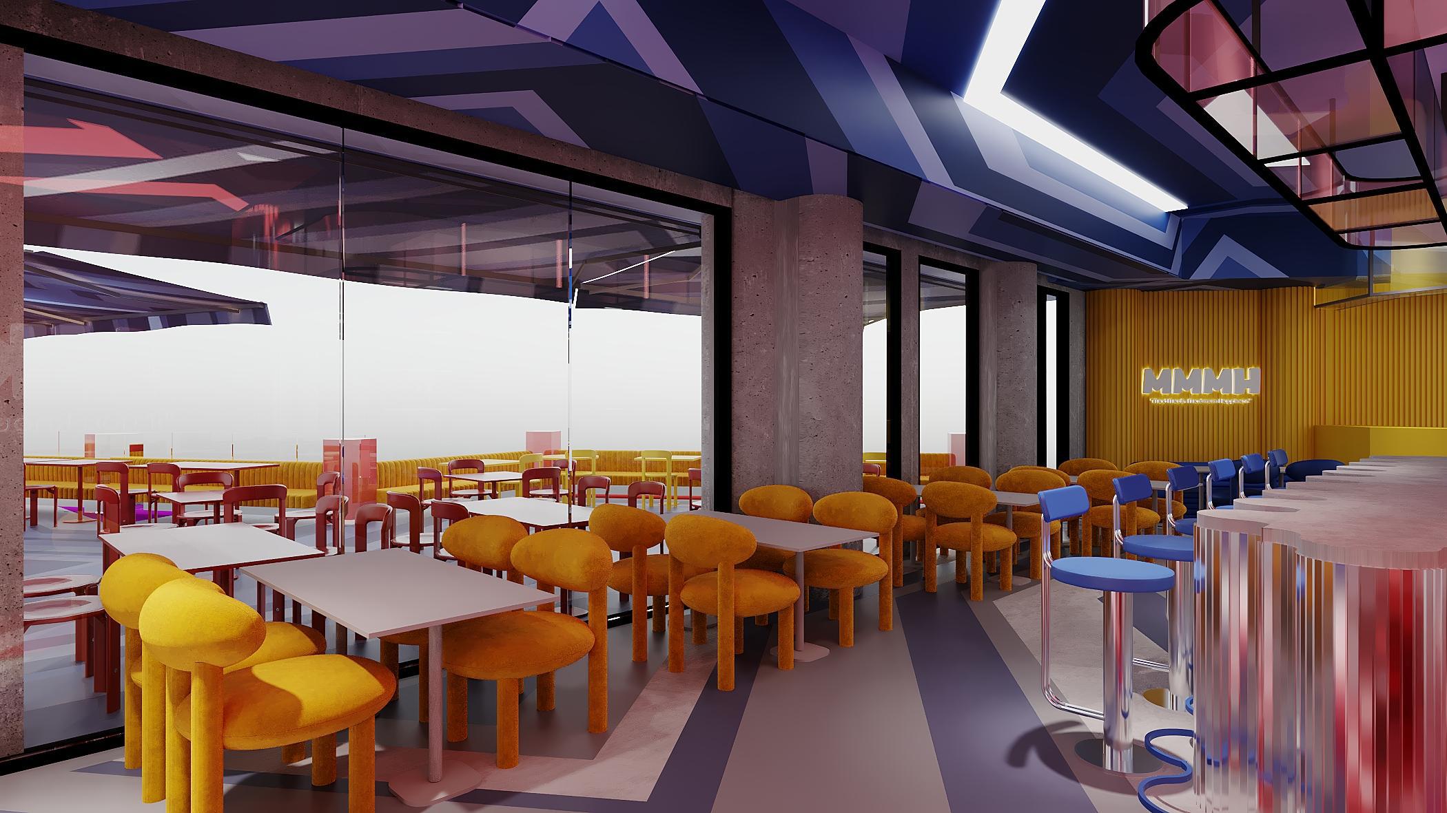
The second is MMMH — “Mad Meals, Maximum Happiness.” The release. The unfiltered pleasure of genuinely great food with people you want to be around.
These are not slogans applied to walls after the design was done. They are the concept. Every material choice, every colour decision, every furniture selection is an answer to one of those two states.
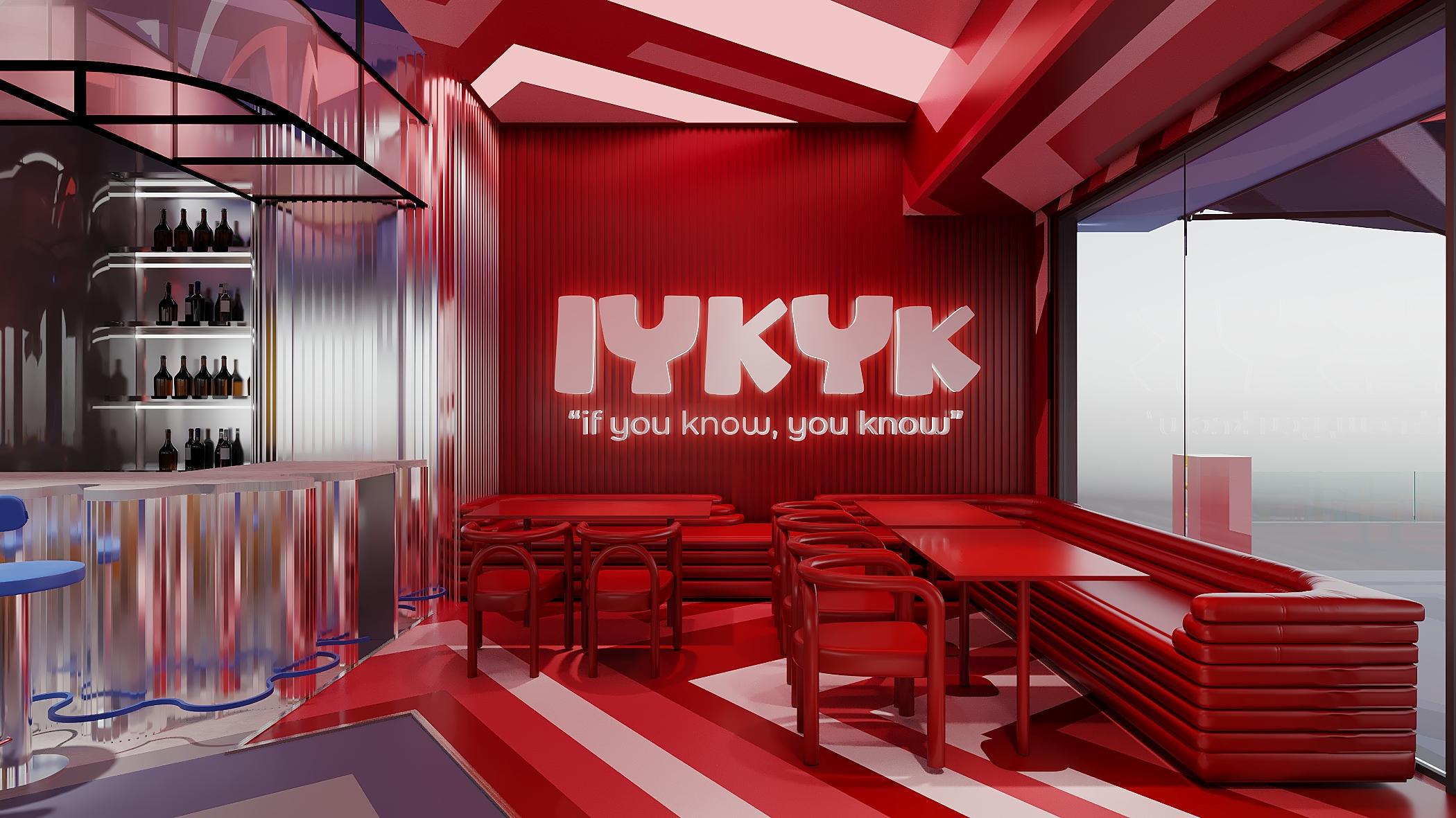
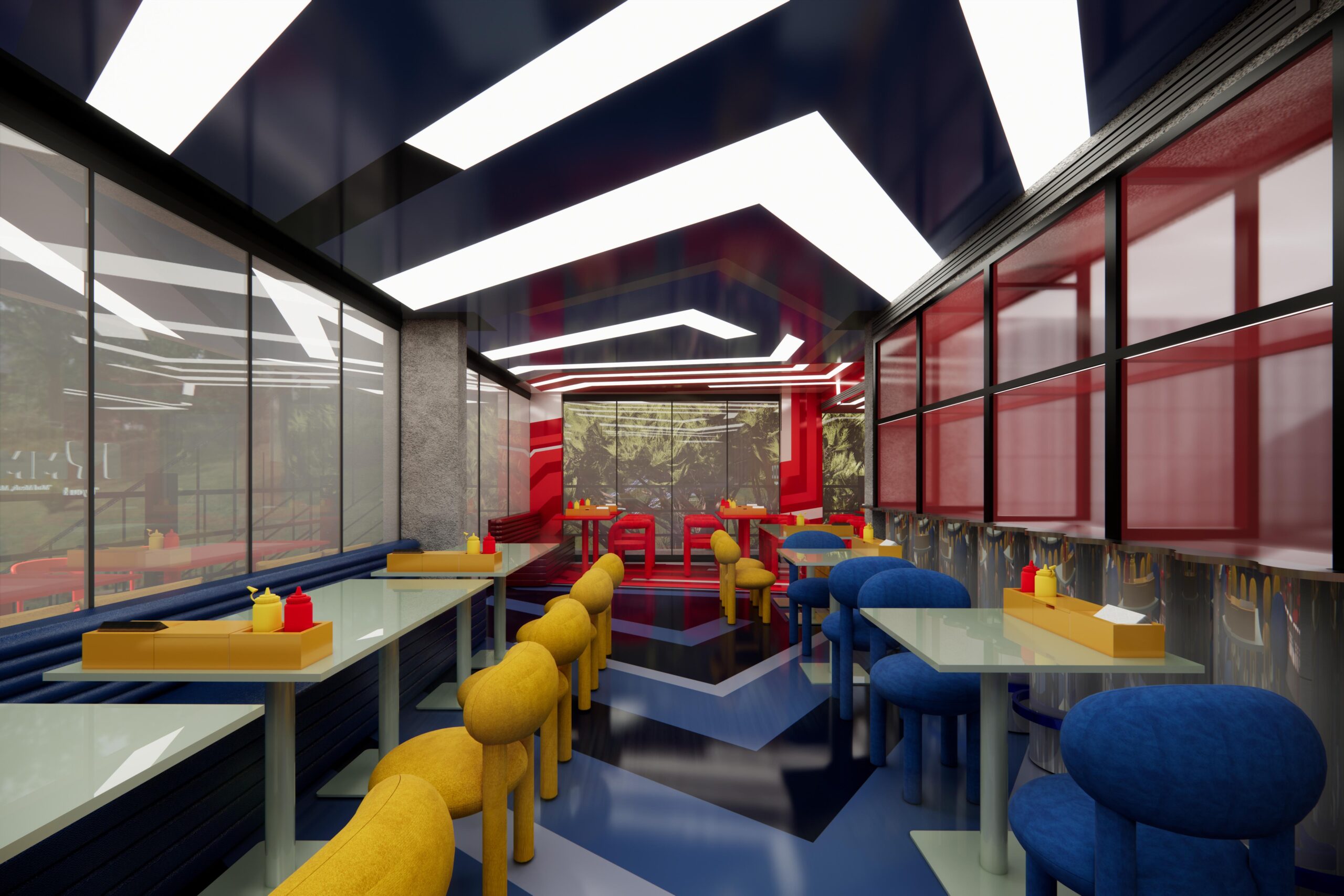
IYKYK lives in deep red. Lacquered corrugated wall panels in full crimson. Tubular loop chairs and stacked banquette seating in the same tone. A red-and-white striped floor that anchors the monochrome without breaking it. When a space commits this completely to a single colour, it stops being decoration and becomes atmosphere. You do not walk into the IYKYK zone and notice the red. You walk in and feel something — and register the reason half a second later.
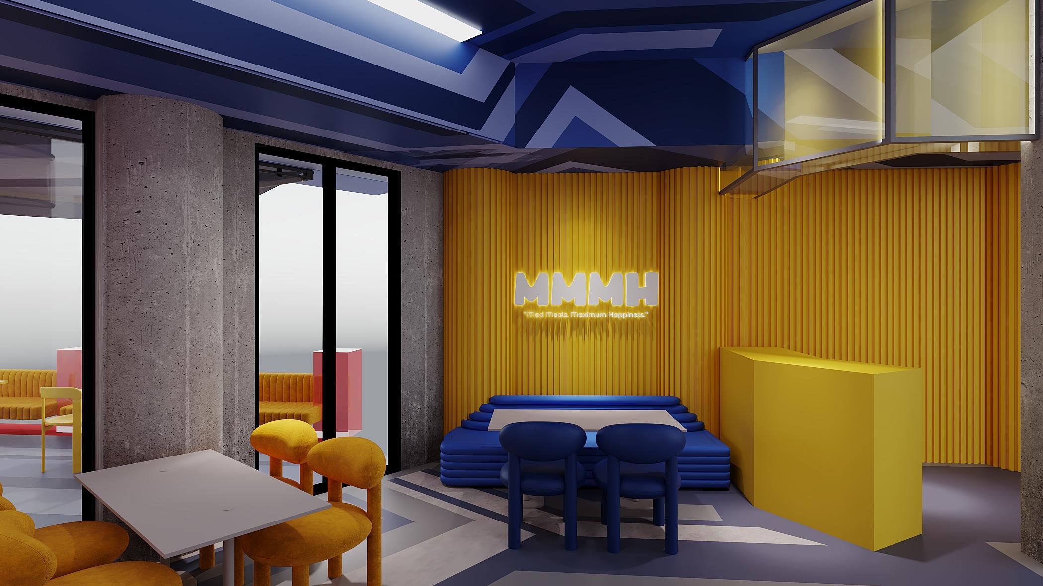
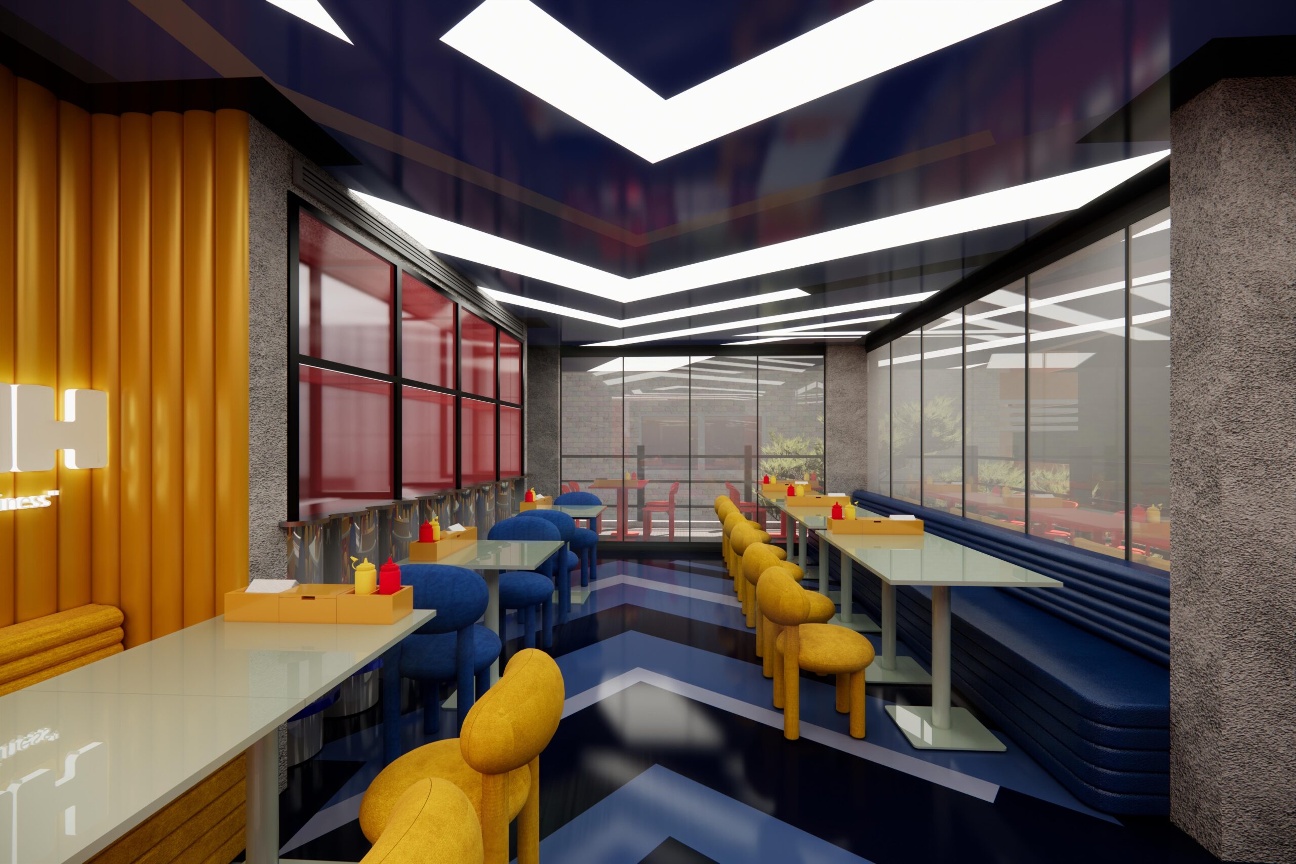
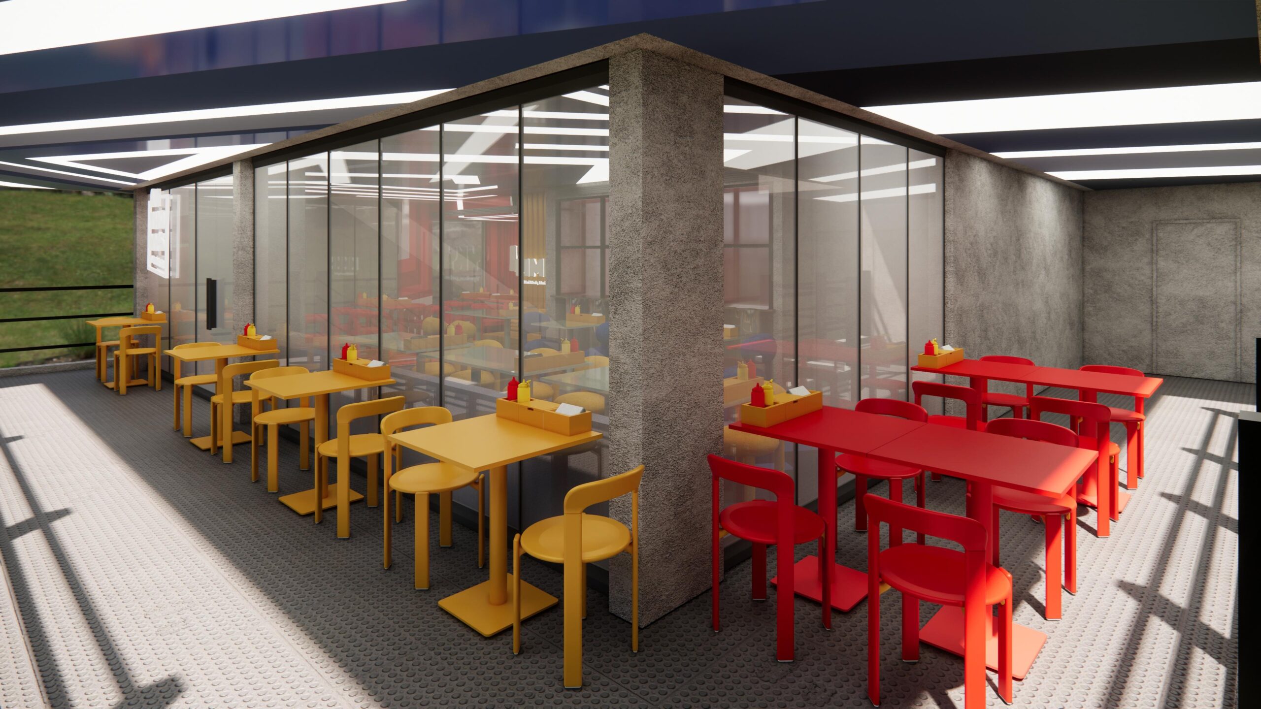
MMMH is the counterpoint. Amber and mustard. Deep ochre corrugated panels — the same material language, a completely different temperature. Boucle seating in rounded, generous forms. Warmer light. Where IYKYK is charged, MMMH is an exhale. The food takes over here. The energy shifts from arrived to settled.

The ceiling above both zones is where the two worlds meet. A geometric lattice in deep navy, cut through with angular light strips running like arrows. It does not hover — it moves. That sense of direction overhead was deliberate. A ceiling that sits still feels wrong for this generation.
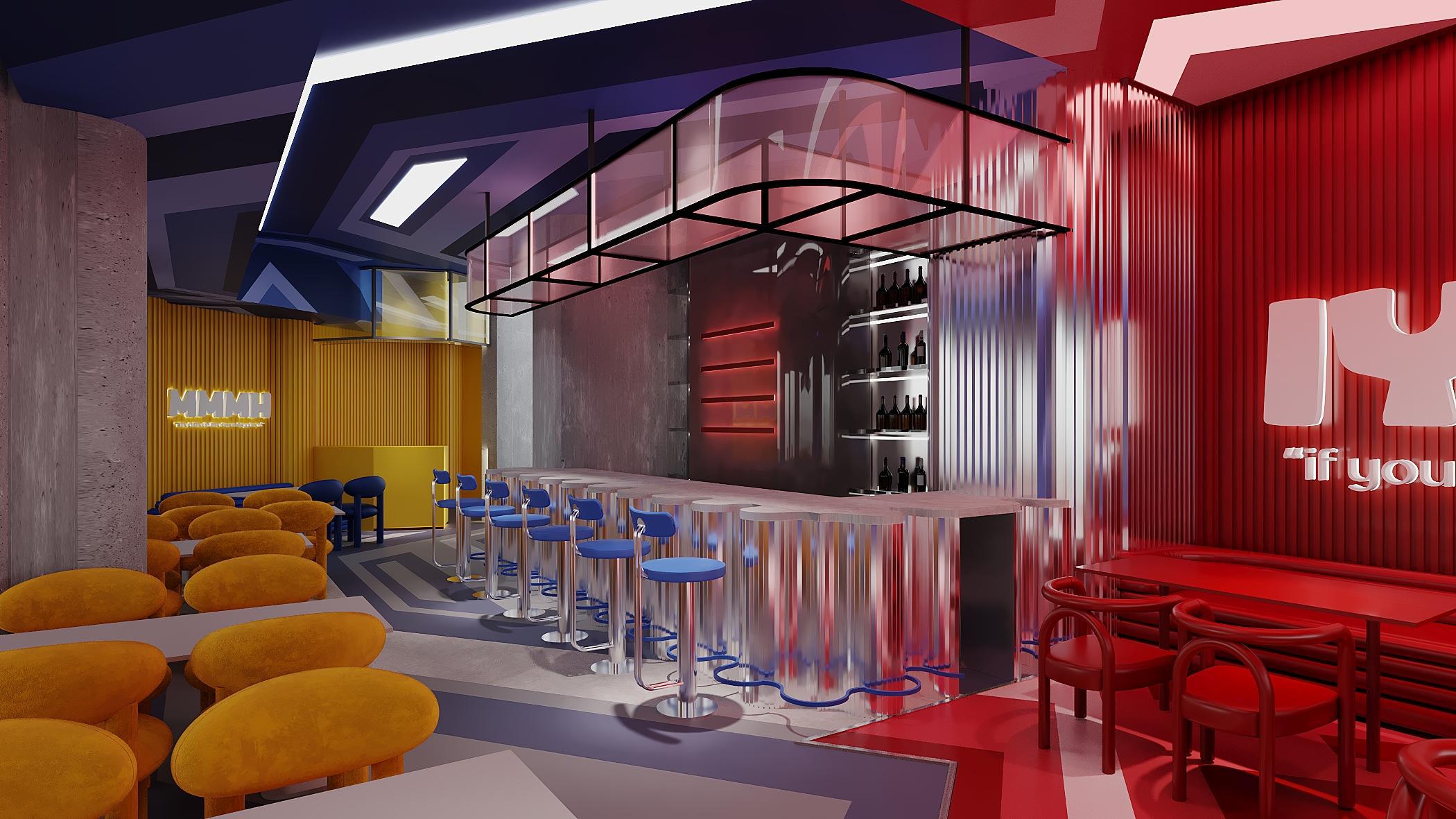
The Bar
Designing a Concept That Franchises Without Diluting
The harder problem with Anthony’s was not the first location. It was building a concept that could travel.
Franchise design fails in a specific, consistent way: it becomes a checklist. Same tiles. Same signs. Same furniture in a different box. You get a brand that looks identical everywhere and means nothing anywhere. The repetition exposes the absence of a real idea.
Our approach was to design the system, not the space. The two zones are structural — they go everywhere. The slogans are structural. The colour logic is fixed. The material language — corrugated panels, geometric ceiling, monochromatic zones — is non-negotiable. Within that framework, each location has room to respond to its actual site without abandoning the concept.
Franchise design fails when it becomes a checklist. What travels is not the finish. It is the logic.
Three Locations. Three Buildings. One Point of View.
Achrafieh
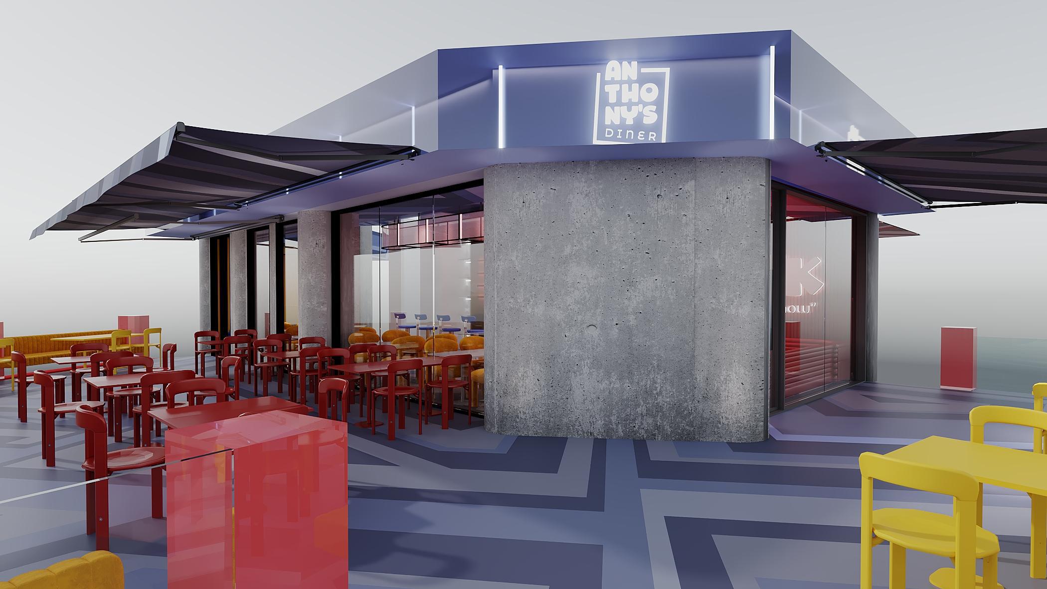
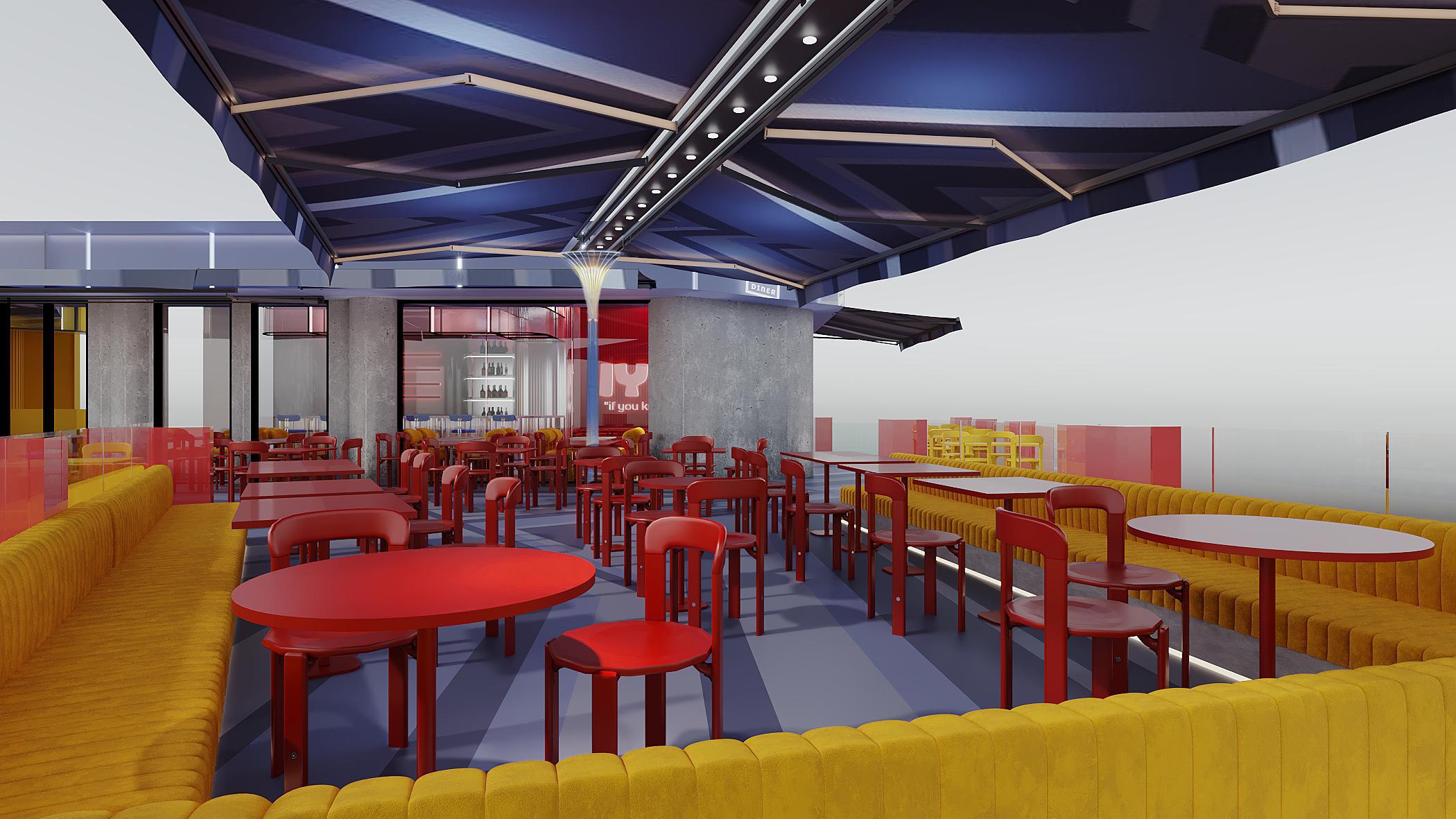
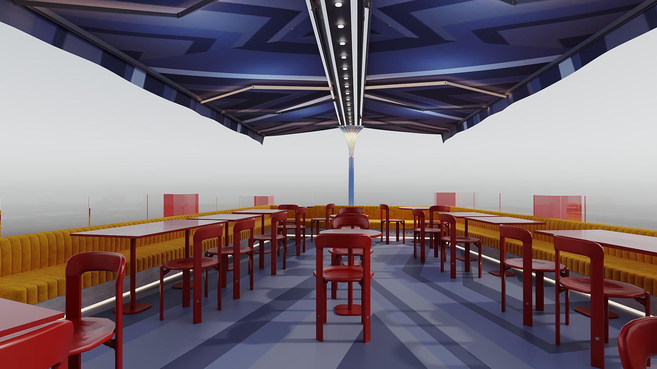
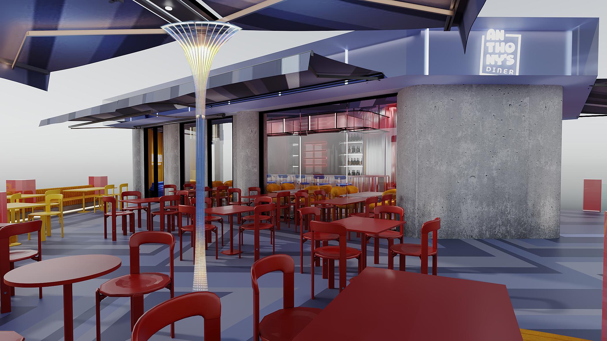
Achrafieh is the rooftop expression. The outdoor terrace is structured around retractable navy canopies and a fibre-optic column that anchors the space from ground to ceiling.
The geometric floor stripe — slate blue chevron — runs from inside to outside without interruption. The corrugated acrylic bar sits at the interior’s centre, the hinge between IYKYK and MMMH, with the terrace opening directly off both zones.
Chekka
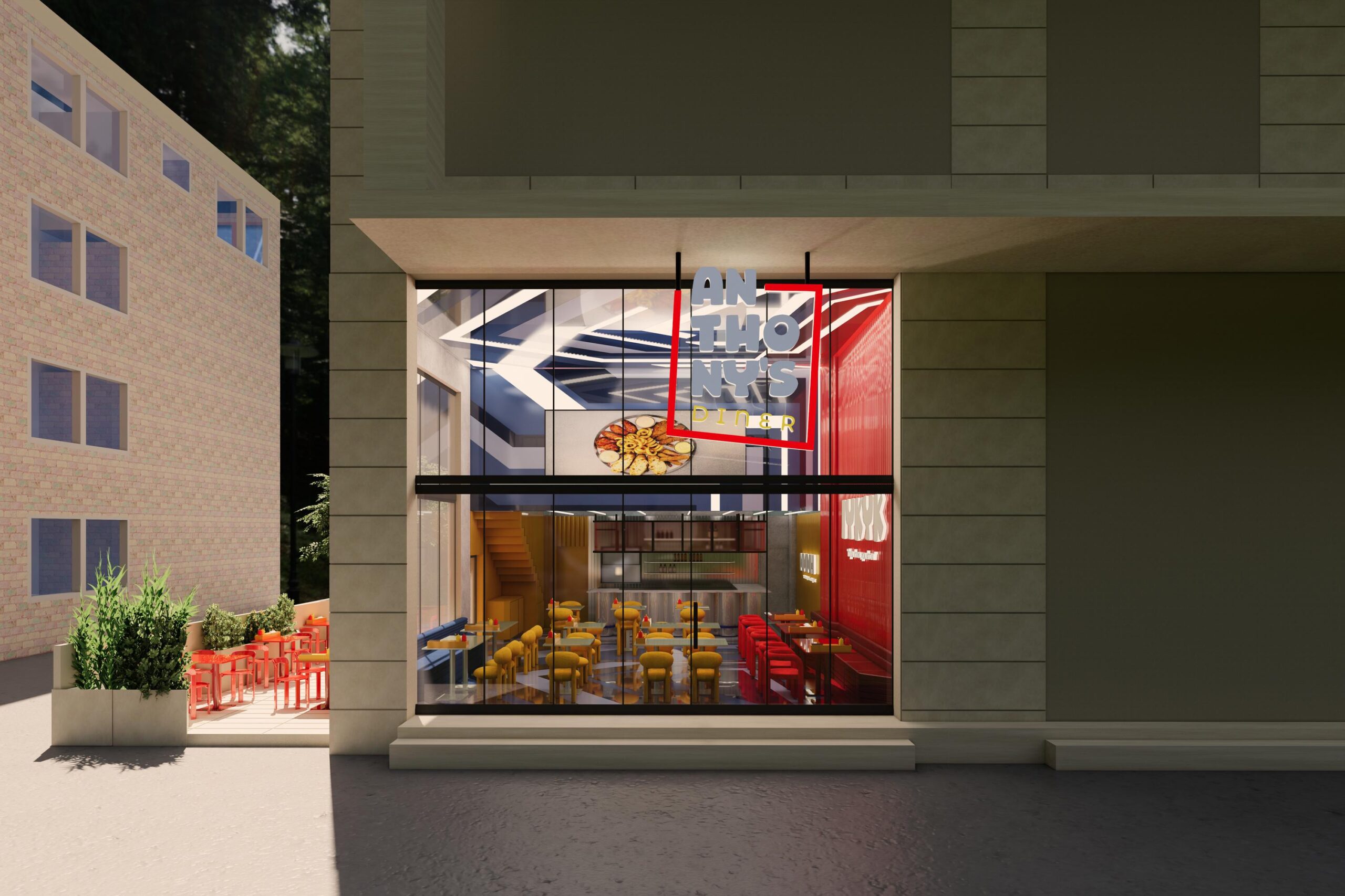
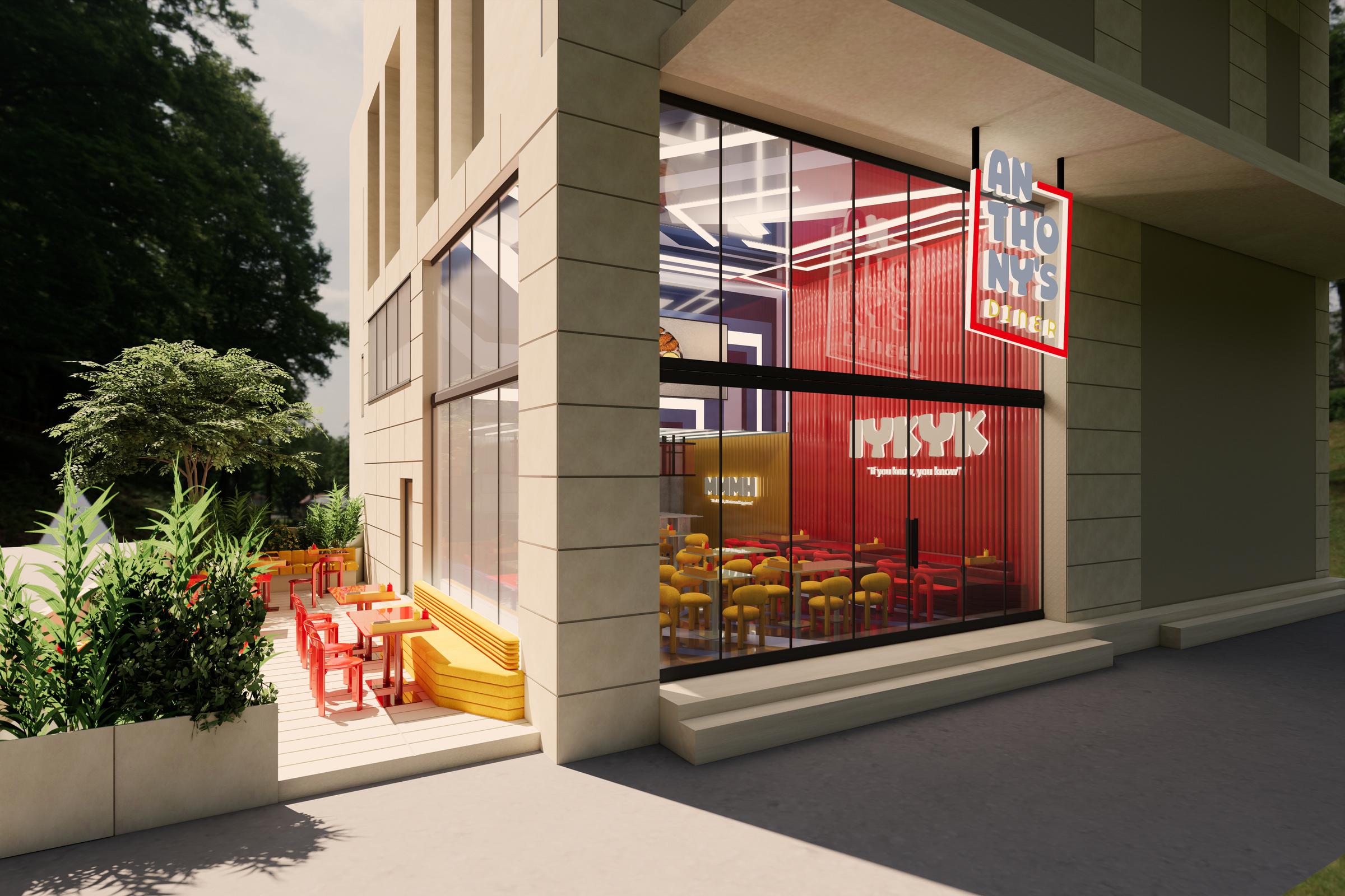
Chekka is a double-height standalone building. The glazed facade puts both zones on full display from the street — IYKYK in red on one side, MMMH in amber on the other — visible from outside like a brand billboard you can walk into.
A mezzanine level carries the geometric ceiling treatment upward, and a large-format food screen is embedded into the ceiling architecture rather than mounted as an afterthought.
The outdoor terrace is ground-level, planted with mature greenery — quieter, more residential, a different context handled with the same vocabulary.
Mansourieh
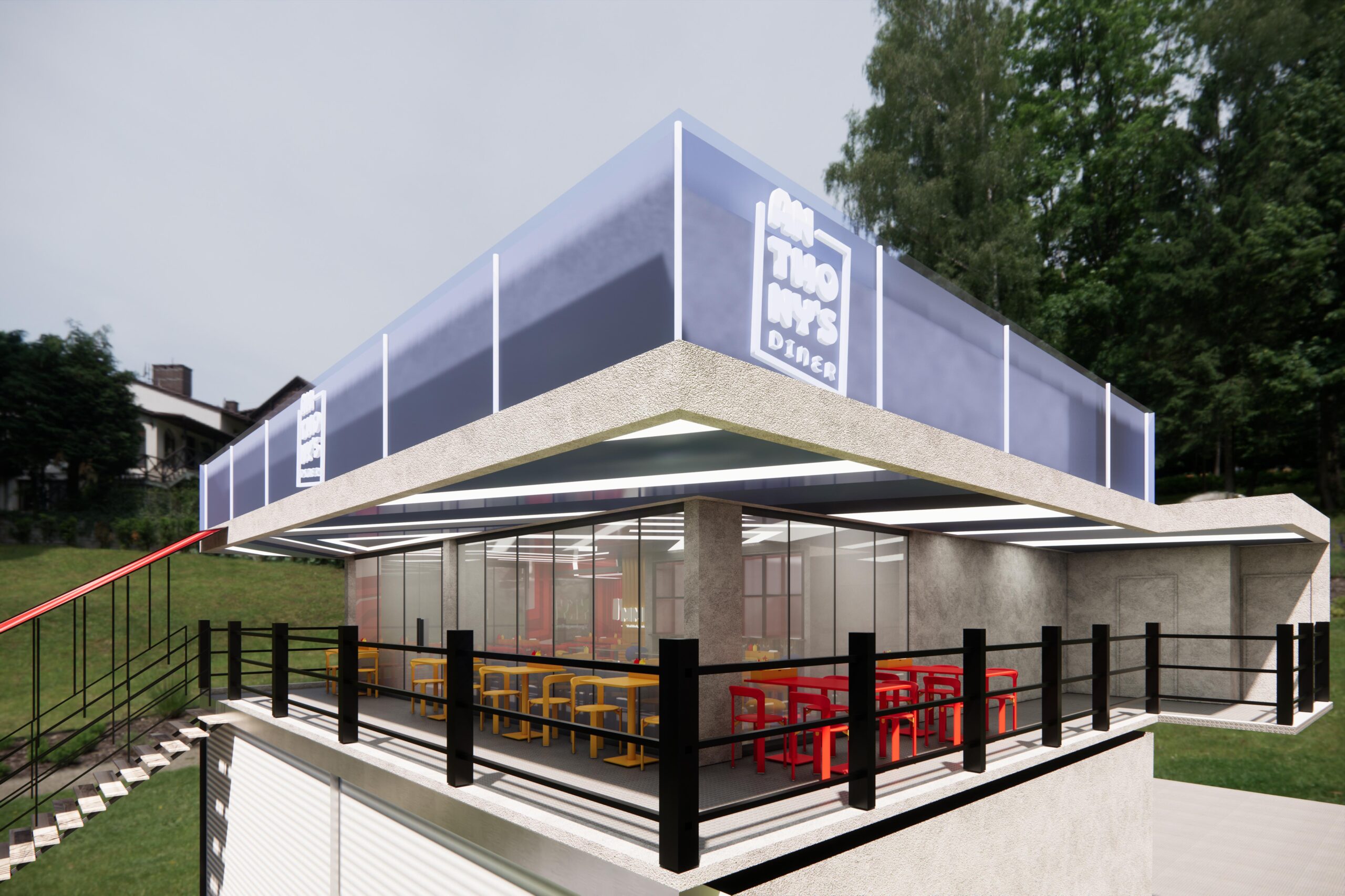
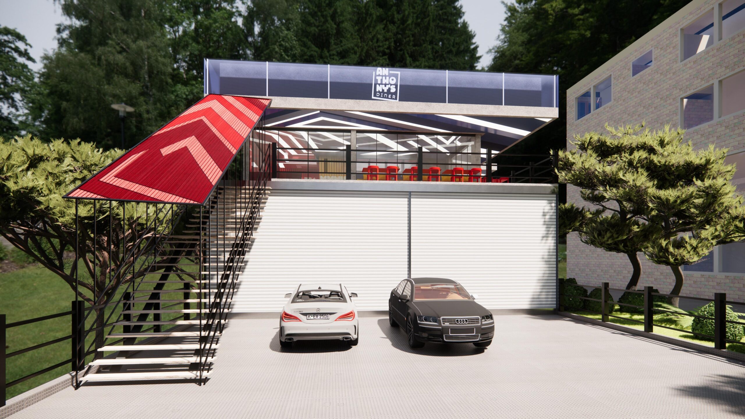
Mansourieh is the most architecturally assertive of the three. The building sits elevated above a ground-floor parking level, reached by an external staircase with a red corrugated canopy blade cutting out from the structure at an angle.
It is impossible to ignore from the street. Inside, a third zone appears alongside IYKYK and MMMH — a blue dining room with navy boucle seating, tinted red glass partitions, and a deep blue-and-white chevron floor.
The outdoor terrace wraps the upper level with a textured dark tile floor and black steel railings, open to the landscape on all sides.
Same brand. Three completely different buildings. The system holds.
What This Means
A concept that franchises well is a concept that was designed with enough internal logic to survive being repeated. The question we ask before we scale anything is the same question we ask before we design anything:
If you removed the logo, would someone still know exactly who this space belongs to?
With Anthony’s, the answer is yes — in every zone, in every location, in every detail down to the bathroom tile.
That is what a real concept does. It does not just make a space look good. It makes the space mean something. And meaning is the only thing that travels.
You are building something. We build concepts.
If you are an F&B operator with a brand you want to grow — and you want to design it correctly from the start — we want to hear about it.