How It’s Shaping Interior Design Trends
Every year, the Color of the Year sets the tone for interior design trends worldwide. It reflects how we live, what we value, and how we want our spaces to feel. In 2026, interior design moves toward calm, balance, and timeless simplicity, a response to fast-paced lifestyles and visual overload.
At L’ARTQUITECTE, we see the Color of the Year not as a rule, but as a direction, one that influences material choices, lighting, textures, and overall spatial mood.
What Is the Color of the Year 2026?
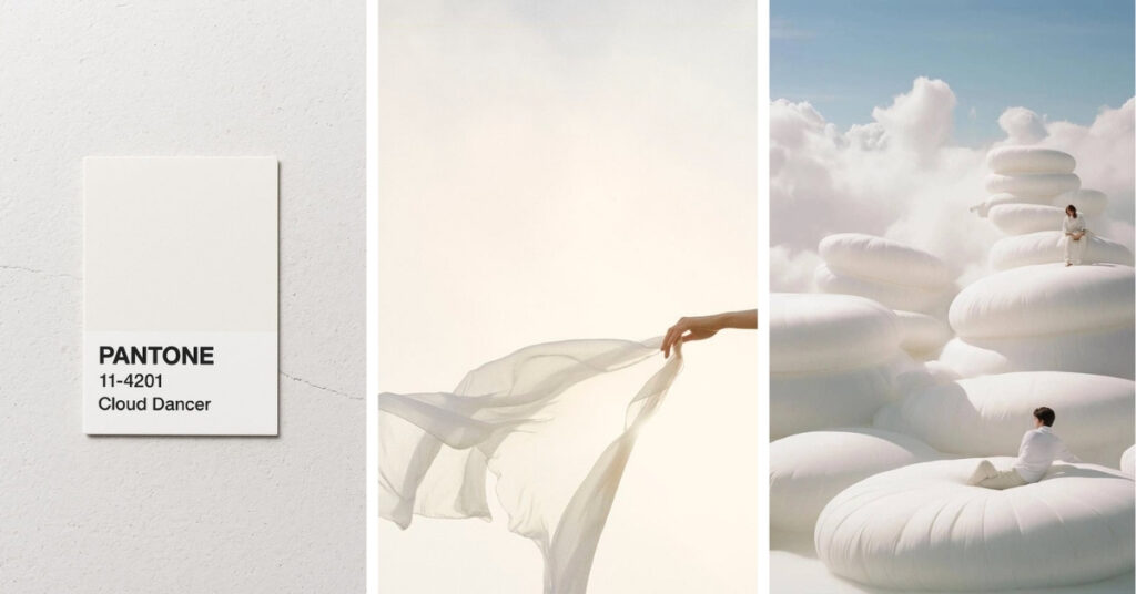
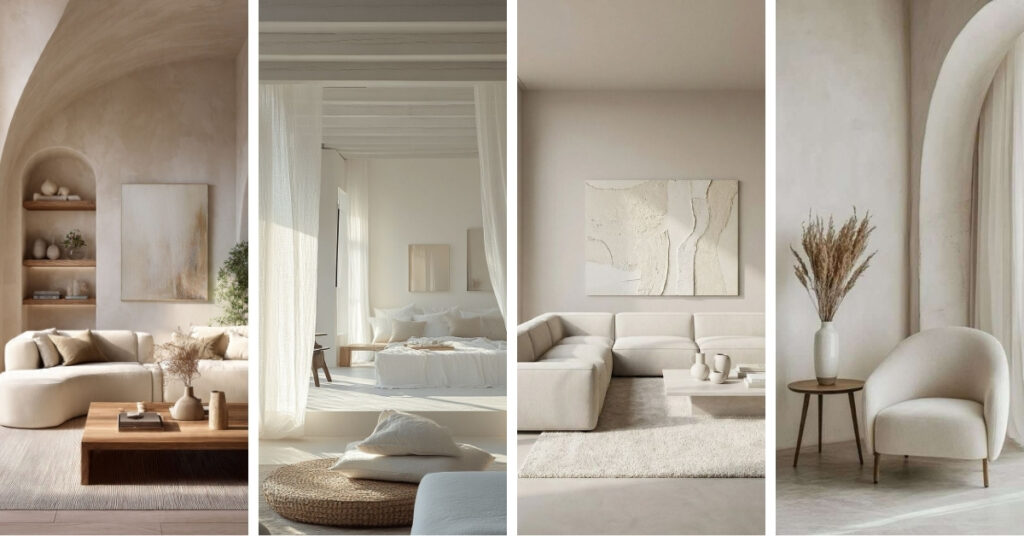
For 2026, Pantone, one of the most influential voices in color forecasting, chose Cloud Dancer (PANTONE 11-4201) as the Color of the Year. This soft off-white hue isn’t a stark, clinical white, but a gentle, airy neutral that brings a sense of serenity and balance to any space.
It’s the first time Pantone has selected a white shade for this honor, signaling a design reset rather than a dramatic splash of color.
Pantone describes Cloud Dancer as a color that “offers a promise of clarity” and encourages a fresh start in our often noisy, fast-paced lives, making room for reflection and creativity.
Why This Color Matters in Interior Design
Color plays a powerful role in how a space is experienced. The Color of the Year often shapes interior design trends by influencing how designers approach balance, mood, and materiality. For 2026, the emphasis is on creating interiors that feel breathable and timeless rather than trend-driven.
Neutral tones like Cloud Dancer act as a foundation, making them ideal for residential and commercial interiors alike. They support long-term design decisions while allowing flexibility as styles and needs evolve.
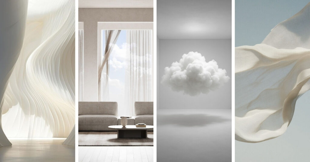
How Cloud Dancer Translates into Interior Spaces
The Color of the Year 2026 works best when applied with intention. Rather than dominating a space, it should enhance the architecture, materials, and natural light already present. When used thoughtfully, it creates a sense of continuity and calm that allows the design to breathe.
Using this tone on walls and ceilings creates an airy, cohesive base that visually connects different areas of the home. It softens transitions between rooms and reflects light beautifully, making spaces feel larger and more open. This approach is especially effective in open-plan layouts, where a unified color palette helps maintain flow without sacrificing depth.
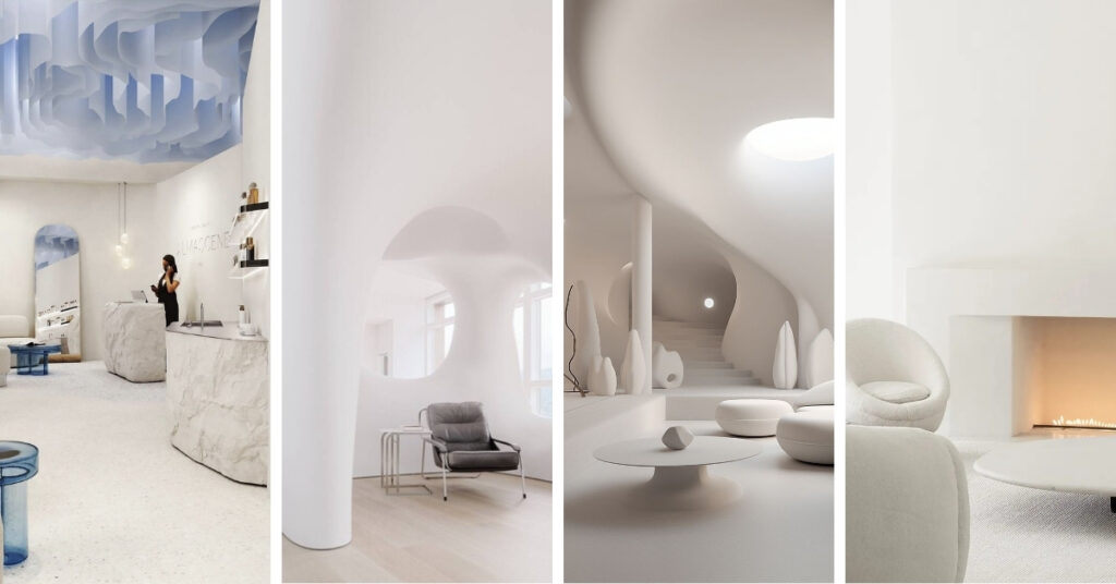
The color can also be introduced through architectural elements such as arches, niches, built-in shelving, or millwork. Applying it to these details draws attention to form and craftsmanship without overpowering the space. Instead of contrast, the focus shifts to texture and proportion, allowing architectural features to feel intentional and refined.
For a more layered effect, the Color of the Year can be incorporated through soft furnishings. Curtains, upholstery, and rugs in similar tonal ranges create subtle continuity while adding warmth and comfort. These elements allow the color to appear naturally within the space, making the interior feel cohesive without feeling overly styled.
In commercial interiors, this color is particularly effective for offices, retail spaces, and hospitality environments where atmosphere matters. Its calming quality supports focus and well-being in workspaces, while its understated elegance elevates customer-facing areas. Used as a base, it allows branding, lighting, and furniture to stand out while maintaining a calm, professional backdrop.
Ultimately, the key is balance. The Color of the Year should support the space rather than define it. When paired with thoughtful materials, natural light, and considered details, it becomes part of a timeless interior rather than a passing trend.
Interior Design Color Trends for 2026
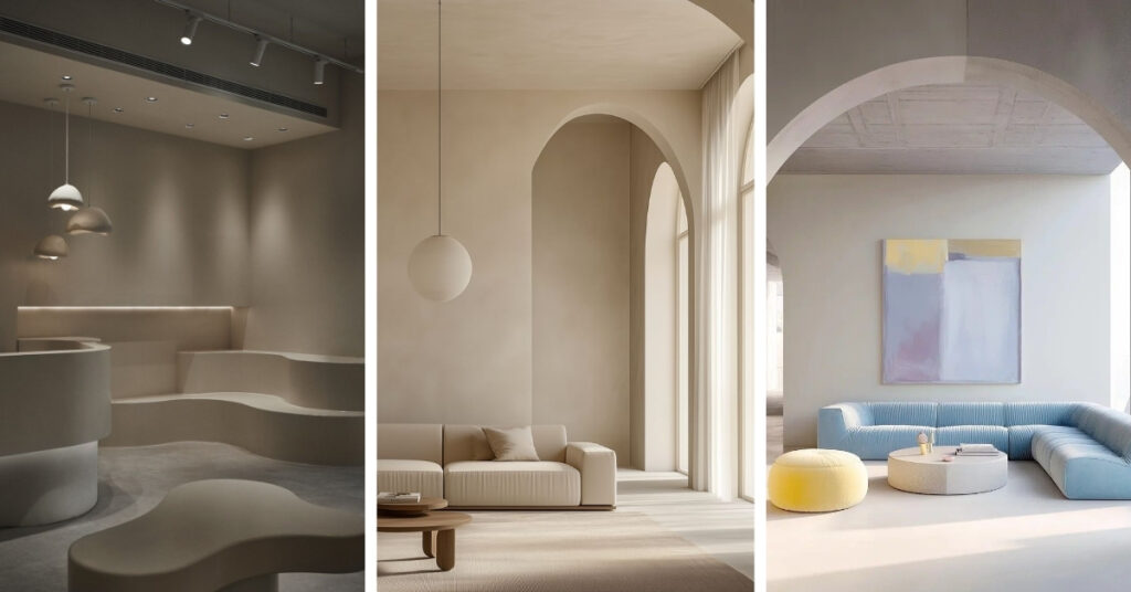
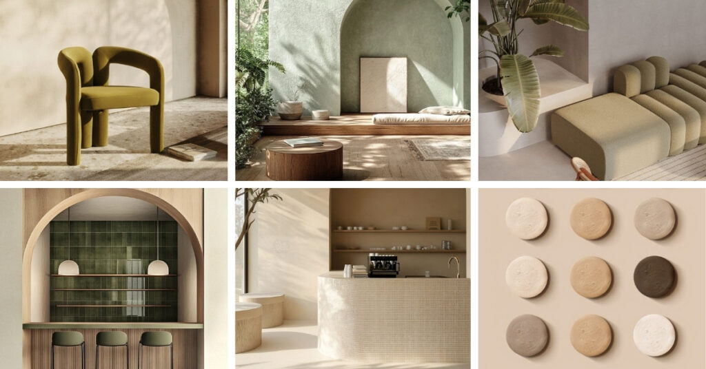
Beyond the Color of the Year, 2026 interior design trends lean toward earthy, nature-inspired palettes. Warm neutrals, muted greens, and subtle accent tones are used thoughtfully to add character while maintaining harmony. The goal is not contrast for impact, but cohesion that enhances how a space feels over time.
This approach reflects a broader movement in interior design, prioritizing mood, comfort, and longevity over short-lived trends.
L’ARTQUITECTE’s Approach to Color
At L’ARTQUITECTE, color is never an afterthought. We consider how it interacts with light, form, and function to shape the overall experience of a space. The Color of the Year serves as inspiration, but our focus remains on creating interiors that feel personal, grounded, and enduring.
For 2026, that means designing spaces that are thoughtful, intentional, and timeless.
Final Thoughts
The Color of the Year 2026 signals a shift toward thoughtful simplicity in interior design. Whether used as a primary palette or as a subtle influence, it encourages interiors that feel balanced, warm, and enduring.
As design continues to evolve, one thing remains clear: the most successful spaces are those that prioritize how we feel within them.